Home 3D Art Showcase & Critiques

Handpainted wooden planks

Hey there,
I just started out handpainting a little and I'd really appreciate some feedback on those planks.
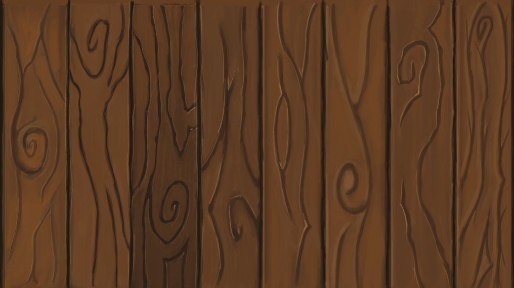
wood_feedback_zpstit1fbtm.png

Thanks a lot!

Replies

  • Awoken
    Hey ChillyWalrus, nice start! Let me start by saying that I'm no expert at handpainting textures so this will just be my thoughts as a viewer.

    The first thing that jumped out to me is that there doesn't seem to be consistency in the look of the grooves across the planks. My favourite is certainly the second in from the right, I think the sharp highlights work really well. I think I prefer the shape of the cracks on this plank too, they are more rigid and have character.

    Its not much but I hope that helps a little, might be something to go on until the handpainters get here and give their awesome advice! Looking forward to seeing more!
  • Earthyn
    Offline / Send Message
    Earthyn polycounter lvl 2
    Is each plank a different style? If not try to keep a theme when you start designing since plank 2 has no real highlights compared to plank 4 and 5.
  • ChillyWalrus
    Thanks for the time and feedback! The inconsistency is kind of intentionally. I started out with the UVs for an 8-sided barrel but found myself at a loss for how to actually paint that thing. I watched a couple how-tos and tutorials but with the grade of stylization and wood in gerneral it seems there are lots of ways to paint. So I thought I could use each side to try different things but in the end I just don't see the strengths and weaknesses in each single plank anymore.
  • theblueturtle_
    Offline / Send Message
    theblueturtle_ polycounter lvl 3
    nice job so far. i prefer the first variant personally. what I think you should do is layer up the brush strokes with slightly different hues (in your chosen color palette) to push the wood grain detail. the light areas and dark areas read well but there doesn't seem to be enough mid level detail. once that's done then add your bright highlights like the second variant from the right. good luck!
  • Filcomet
    Offline / Send Message
    Filcomet polycounter lvl 11
    You are doing well, try to make some the planks slightly differente in shape, reduce the width. Wooden planks are not always perfectly straight.
  • ChillyWalrus
    Hey, thanks for taking the time.
    I tried to redo the planks with your input in mind. The second from the right just didn't work at all. It just looked plain weird.
    So I used the first one as guideline. I tried to push the midtone-grain more and I think that this for itself worked nicely. It's just that the texture as a whole seems a little off to me. Maybe it's a little too noisy? Maybe it's just way the cuts are set up.

    wood_feedback_2_zpsxs051cz4.png
  • dirigible
    Offline / Send Message
    dirigible polycounter lvl 8
    Not bad. Might want to add in some hue/color variation. Right now your wood looks kind of dull and samey.
  • Dethling
    Offline / Send Message
    Dethling polycounter lvl 11
    Very nice work.
    Depending of the style you aim vor I would go with some more square/straight cuts.
    Your planks look like from a child book (not in a bad way), very round and playfull.

    Did some wood a while ago:
    render2_by_dethling-d87yhe9.jpg
    floor_by_dethling-d87y1fi.jpg


    Maybe this gives you some new points of view.
  • lilymac
    Here is a paint over of one of your planks! The lighting seems a bit inconsistent so you really want to focus that along with adding thickness to your planks. Also might I suggest doing only four planks for the 8 sides barrel! It will help you practice tiling textures.
    HLOuJ6k.jpg
  • ChillyWalrus
    Thank you so much! I guess wasn't really working reference-focused enough.. so in my mind I might ended up mixing some bark-texture I've seen with wooden planks.
    Adding thickness to the planks resolves the issue Filcomet mentioned. I see what I can come up with.
  • ChillyWalrus
    Hey, I took your advice to heart and tried myself on something less playful and tileable. More like some planks on a floor. There the lighting would come from more all around it and inconsistent light/shadows wouldn't be that much of an issue. At least I think that would be the case..

    wood_floor_tile_zps7qleegwm.png

    wood_floor_tiled_feedback_zpsnval9xds.png
Sign In or Register to comment.