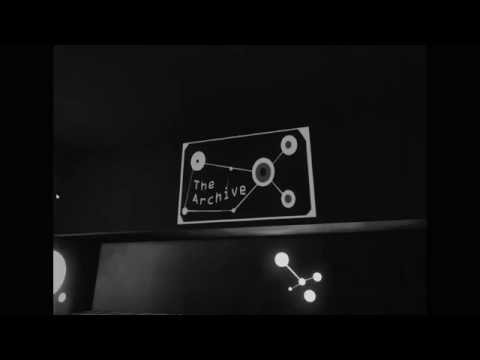
The Archives
Yo guys just wanted to share a level I made about a year ago in udk. I was testing the waters with this one and after looking at it over and over again I learned what not to do in the future. Will gladly take any tips and feedback as well so dont be shy >w>'
[ame] https://www.youtube.com/watch?v=QhScJUZXIro[/ame]
[ame]
 https://www.youtube.com/watch?v=QhScJUZXIro[/ame]
Replies
...Okay, I'm joking, but people click into the thread, see nothing and they will click away. When you make a thread for showin' off, you gotta draw people in with beauty shots embedded into your post, and you can embed YT vids by using the longer URL with only the main parts
eg, [ame]
Additionally, I know this is older now but you should probably render/capture stuff at 16:9 so it doesn't get black bars-- and camera animation can be better than just capturing the player camera walking around the level. Nice sweeping motions and pans can be a little more professional.
You probably learned a lot from this and would do better technically, but I think your presentation needs a bit more work.