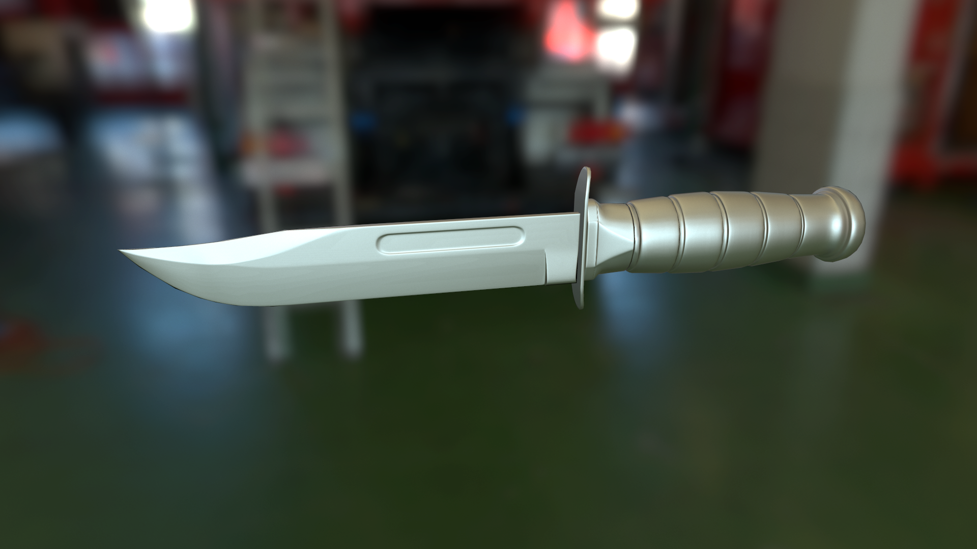
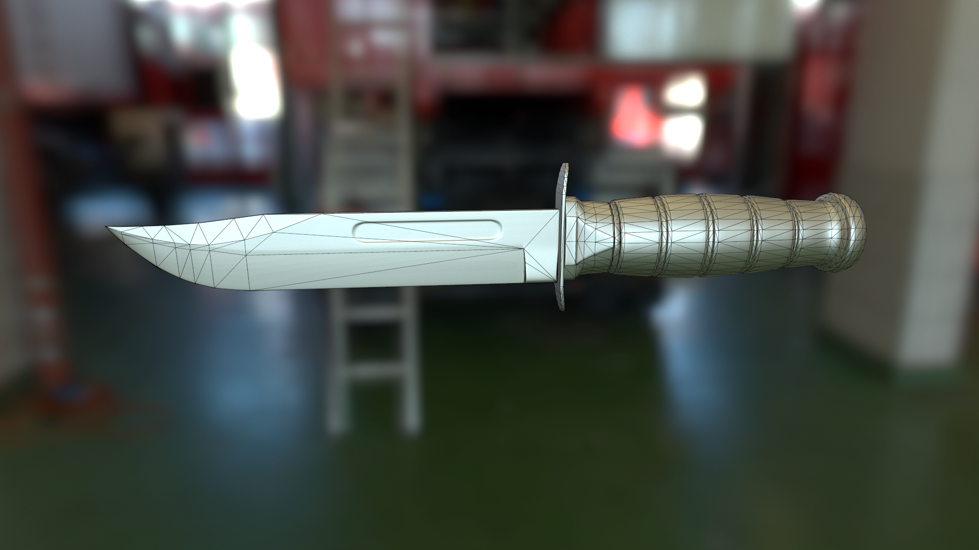
KA-BAR knife model
****I hate noticing a spelling error in the title after I post***** KA-BAR Knife
So after a crappy few weeks struggling on getting a normal map for my tar-21 baked (still having issues with shading errors too) I had to take today off and make something simple to at least prove to myself that I do know what I am doing. So here is a KA-BAR that I made this afternoon
High

Low


and the reference I used

when I texture I Intend on doing the variant with a black grip.
So after a crappy few weeks struggling on getting a normal map for my tar-21 baked (still having issues with shading errors too) I had to take today off and make something simple to at least prove to myself that I do know what I am doing. So here is a KA-BAR that I made this afternoon
High

Low


and the reference I used

when I texture I Intend on doing the variant with a black grip.
Replies
I have not yet made the Materials for the hilt, pommel and guard yet. was only looking at the blade.
and I would like to be able to put wear like this on the actual edge of the blade where it has been sharpened. I'm thinking I may have to go into photoshop or substance painter for that.
Bake a cavity map for the dirt, base your dirt map on it, for the scratches, try to think where they should be. And used ref, a lot, lot of ref. ( "kabar old", "kabar used", etc. ) And yeah, photoshop is a nice tool for all those things.
Don't rush the texturing, it's as important as the model, if you want to give the knife a look.
I think I am getting used to substance designer. I'm still just focusing on the blade.
Is this better?
First, use ref
What do you do with a knife ? You chop, and sometimes, you thrust. So logically, most of the wear will be on center part of the blade. ( Also, it's the part that you'll sharpen the most, so it's even more wear/polish. ) You can also see that nearly everywhere there a concave shape, there's dirt. ( You still have to take in account the use, for example : The concave part of a spoon wont have dirt on it, cause it's a "used" surface, that will often be on contact with something, like the center or the blade, for a knife.
Now lets see what you've done
The handle looks ok. ( No dirt treatment yet, but the wear is ok. )
Now the bottom back of the blade : It's ugly. First, why would this part be used so much, it's really close to guard, wich protect from impact if the knife was to fall, so it might never touch anything ( Unless you cut with back of your blades ?
Also that concave circle, why would there be so much wear here ? Ok it's a hard corner, but will it have that much contact with anything ? And again, it's so even, and boring ...
Nothing on the blade. Nearly, nothing. Wow. How ?
And finally the tip. Why not, if a knife if often thrown, it could have this kind of wear. ( Don't know if you can throw a kabar efficiently, mass distribution, etc. )
Finally, the orientation of those scratches. here's one of my old kitchen knife. Used it a lot.
You have to think about the shapes of your scratches : I chop a lot with it, so the scratches follow my different chopping moves. On your blade, most of the scratches look like splatters, and the few one on the blade ( Again, wow. ) are just dots. Why ?
So, voil