Home 3D Art Showcase & Critiques

SciFi_Osprey

Huntard
polycounter lvl 12
Offline / Send Message
Huntard polycounter lvl 12
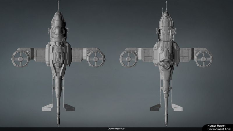
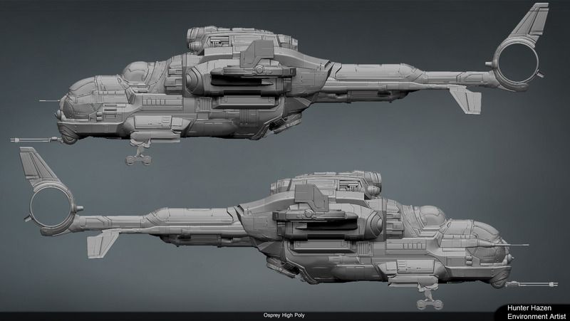
I have been working on this for a while off and on just recently got a fire lit under my ass to finish. The high poly is nearly complete i just need to finish the landing gear and tail rotor. C&C would be appreciated
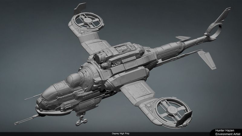
Osprey_Persp_01.jpg
Osprey_Side_01.jpg
Osprey_Top_01.jpg

I will try to find older images to show a bit of the process to getting here and i will continue to post as i get closer to finishing

Replies

  • Zaelus
    Offline / Send Message
    Zaelus polycounter lvl 4
    Looks amazing! I would definitely be interested in seeing your process photos, because this level of modeling complexity is what I'm really striving to achieve some day.
  • smessier
    Offline / Send Message
    smessier polycounter lvl 9
    Totally bitchin man. I love the sense of silhouette with this helo, but I feel like It's going to need a stronger balance between the front end and the tail, it's looking very front heavy. I think you can solve this by angling the wings, and increasing the rotor sizes to properly propel this beast. Beyond this, I really can't wait to see this textured. What's your workflow, for hipoly and texturing?
  • Cibo
    Offline / Send Message
    Cibo polycounter lvl 10
    Yeah the rotor size is my concern too. Its looks to heavy to fly. Not only are the rotors to small but the wings must hold the whole mass. The Orca helicopter from Command&Conquer is better in my opinion for a believable design.
    Gen2_EU_Light_Rocket_Helicopter.png

    Another point is the smooth surfaces, or the lack of smoothness. Is it a Spaceship with no air resistance? Without the rotors i have said Spaceship with bumby design.

    The work itself is very nice, the high poly rocks but the plausibility lacks.
  • Huntard
    Offline / Send Message
    Huntard polycounter lvl 12
    Thanks for the feedback guys! I have reworked the rotors into directional engines increasing the size of the rotors would make it feel a little mickey mouse like in the silhouette. The idea behind this is that it is a sci fi gunship in a world where space is limited due to overpopulation. Its design heavily references Russian design because there designs always seem to stress durability over aerodynamics.
    As for process i generally block in with Maya then detail in Zbrush

    Osprey_Persp_02.jpg

    Osprey_Persp_03.jpg

    Osprey_Side_02.jpg

    Osprey_Top_02.jpg
  • skyline5gtr
    Offline / Send Message
    skyline5gtr polycounter lvl 11
    looks great but bigger pics are needed. Its hard to see the detail
  • kunalht
    Offline / Send Message
    kunalht polycounter lvl 2
  • Brian "Panda" Choi
    Offline / Send Message
    Brian "Panda" Choi high dynamic range
    I feel like it's been over designed. More specifically, there's way too many plates and piece separateions, and greebles, in the high poly. It just feels really unweighty overall.

    If there's a way to clean up the unnecessary separations, etc. I'd recommend doing that.

    Maybe the color scheme in the end will help make it less noisy, I'm not sure.

    Silhouette looks good to me, it's mostly just internal reads.
  • Dethling
    Offline / Send Message
    Dethling polycounter lvl 11
    From Top-Rear it looks very nice.
    but I have to agree to Brain here, the panels are to much, it creates a lot of noise.
    Also the body mass seems totally of compared to the tilt engines.
  • Damian Nachman
    Offline / Send Message
    Damian Nachman polycounter lvl 6
    Likew the others said, I feel like theres a little bit too much small detail all round.
    Try to remove some of the greeble on certain surfaces, since there's barely any negative space.

    Also, some of the forms look abit mushy, but I guess that's normal with Zbrush stuff.
  • Theodoric
    Offline / Send Message
    Theodoric polycounter lvl 10
    Hey, nice idea and I really like the main mass for the chassis. However the engines even with the new design look small IMO. The original osprey easily recognizable because it is a medium chassis between two freakin' huge engine. Go crazy and experiment. I could imagine this engine twice as big if not bigger. Also the landing gears look weak for this huge mass. The tail looks weak too compared to the massive structure in the main chassis.
    But this concept can be really awesome just push it a bit more ;)
  • Shrike
    Offline / Send Message
    Shrike interpolator
    looks great but bigger pics are needed. Its hard to see the detail

    Detail is the least important, what he should care about at that stage are proportions, logic and visual balance, of which all could be vastly improved

    helicoo.png

    I would also advise taking some detail away from the not so important areas, like the back, to give the eye some rest with clean shapes that go with the flow. tons of small scale detail that does not fulfill purpose will only give visual noise and make it feel overdone, try putting more time into proportions and authenticity, it will upgrade the model far more than detail can and im sure people will trust you on the hard surface part either way, but nothing can hide weak proportions, i know it sucks tweaking things again but it will be worth it

    helicooo.png

    Hope that helps!
  • Huntard
    Offline / Send Message
    Huntard polycounter lvl 12
    Wow thanks for all the really great feedback. This project originally started as a learning experience to really dive into Zbrush using hard surface. I will be addressing these issues over the weekend I will retain some of the clunkyness that is intentional but all of your advice has been helpful and will mess with the proportions. Thanks again i will hopefully have a new update soon
  • skyline5gtr
    Offline / Send Message
    skyline5gtr polycounter lvl 11
    Shrike wrote: »
    Detail is the least important, what he should care about at that stage are proportions, logic and visual balance, of which all could be vastly improved

    helicoo.png

    I would also advise taking some detail away from the not so important areas, like the back, to give the eye some rest with clean shapes that go with the flow. tons of small scale detail that does not fulfill purpose will only give visual noise and make it feel overdone, try putting more time into proportions and authenticity, it will upgrade the model far more than detail can and im sure people will trust you on the hard surface part either way, but nothing can hide weak proportions, i know it sucks tweaking things again but it will be worth it

    helicooo.png

    Hope that helps!

    welll shit i learned something lol
  • Huntard
    Offline / Send Message
    Huntard polycounter lvl 12
    Thanks for the feedback guys, especially for the paint over. I have adjusted the proportions of the side silhouette however i am trying to stay away from the more aerodynamic silhouette in the paint over. I want this thing to have a certain amount of tank like awkwardness. I also am not a fan of the short thick engines so i elongated them instead of thickening them. Here is my current progress. I will be moving on to the low poly and adjusting the high poly dialing back the greeble crazyness as i bake down. I got a little nuts in Z brush

    Thanks again for all the feed back.

    A54SH3t.jpg

    SU5Rbli.jpg

    X5zb9qg.jpg

    fFBT3Td.jpg
Sign In or Register to comment.