Faceted [UE4]
[Update]
Final of the First video
[ame] http://www.youtube.com/watch?v=q8_QhDyYSvY[/ame]
Second Video:
[ame] http://www.youtube.com/watch?v=fM5OeRgA1Y4[/ame]
Third Video:
[ame] http://www.youtube.com/watch?v=g8PRJueadsE[/ame]
Hello all,
I've been solo working on creating a 2 minute video for a client and figured I'd share some of the stuff (I'm allowed to show my own work and process, but basically have to take out all mentions of the actual client/voice over/logos until the final)
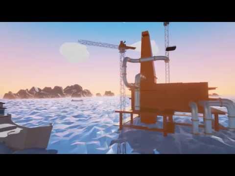
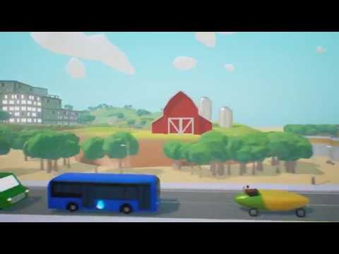
The projects deadline is somewhere around the ballpark of a month+- to create all of the models, animate them, and finalize the video so I ended up deciding from the very beginning to use a simple faceted style that uses solid materials of color versus textures. Basically my client wants to show a journey of fuel/gas as their software deals with fuel sales taxes.
For inspiration I've been drawing from the amazing Timothy J. Reynolds: http://turnislefthome.com/ , Simcity, Godus, and a few various other sources.
I decided to run with UE4 for this, due to renders basically being almost instantaneous versus something like mental ray or even quicksilver, which I think is turning out as a pretty nice solution for working on a singular laptop.
There's still a ways to go, and I hope I get enough time to polish everything up though the deadline will be tight. Camera angles and animation are basically going to change as I work out the flow of everything. I may revisit this style later on afterwards in my own personal time as I find it quite enjoyable to play around with. Queue the inevitable zombie takeovaaah
[ame] http://www.youtube.com/watch?v=Ojb4hlZfgAQ[/ame]
Fun parts of the learning experience: getting some time in to mess around with matinee and the fine quirks of its cameras and keyframe interpolation
Figuring out how to make the earth (composed of two spheres, one for the land and one for the water. the land being a bitmap of the earth passed through displacement in 3dstudio max and then faceted to hell with optimize/pro optimize modifier + a little bit of fractal noise).
The moon was quite fun to make too considering it was basically a lot of spheres being booleaned out and then cleaned up with the cut tool. Of course, this stuff isn't the best for "game-ready" models (Take the water being composed of thousands of triangles for example=currently godawful in realtime for what it does), although I'm not concerned with that for this project as the final result is a baked rendering.
Oil pump was kind of fun to figure out how to animate too (still needs the actual drill part though), figures it ended up being as simple as 3-4 bones with an ik solver linked to a point helper that rotated in a circular axis.
Anyways feel free to tell me whatcha think, I plan on posting some various shots and process as I continue on.
Final of the First video
[ame]
 http://www.youtube.com/watch?v=q8_QhDyYSvY[/ame]
Second Video:
[ame]
 http://www.youtube.com/watch?v=fM5OeRgA1Y4[/ame]
Third Video:
[ame]
 http://www.youtube.com/watch?v=g8PRJueadsE[/ame]
Hello all,
I've been solo working on creating a 2 minute video for a client and figured I'd share some of the stuff (I'm allowed to show my own work and process, but basically have to take out all mentions of the actual client/voice over/logos until the final)
The projects deadline is somewhere around the ballpark of a month+- to create all of the models, animate them, and finalize the video so I ended up deciding from the very beginning to use a simple faceted style that uses solid materials of color versus textures. Basically my client wants to show a journey of fuel/gas as their software deals with fuel sales taxes.
For inspiration I've been drawing from the amazing Timothy J. Reynolds: http://turnislefthome.com/ , Simcity, Godus, and a few various other sources.
I decided to run with UE4 for this, due to renders basically being almost instantaneous versus something like mental ray or even quicksilver, which I think is turning out as a pretty nice solution for working on a singular laptop.
There's still a ways to go, and I hope I get enough time to polish everything up though the deadline will be tight. Camera angles and animation are basically going to change as I work out the flow of everything. I may revisit this style later on afterwards in my own personal time as I find it quite enjoyable to play around with. Queue the inevitable zombie takeovaaah
[ame]
 http://www.youtube.com/watch?v=Ojb4hlZfgAQ[/ame]
Fun parts of the learning experience: getting some time in to mess around with matinee and the fine quirks of its cameras and keyframe interpolation
Figuring out how to make the earth (composed of two spheres, one for the land and one for the water. the land being a bitmap of the earth passed through displacement in 3dstudio max and then faceted to hell with optimize/pro optimize modifier + a little bit of fractal noise).
The moon was quite fun to make too considering it was basically a lot of spheres being booleaned out and then cleaned up with the cut tool. Of course, this stuff isn't the best for "game-ready" models (Take the water being composed of thousands of triangles for example=currently godawful in realtime for what it does), although I'm not concerned with that for this project as the final result is a baked rendering.
Oil pump was kind of fun to figure out how to animate too (still needs the actual drill part though), figures it ended up being as simple as 3-4 bones with an ik solver linked to a point helper that rotated in a circular axis.
Anyways feel free to tell me whatcha think, I plan on posting some various shots and process as I continue on.
Replies
My main crit is on the camera work though. I think you're using too many animated cameras and multi-axis sweeps in particular. The whole piece feels a bit frantic and it's hard to read what, exactly, you're trying to communicate in each shot. I know you said there will be text and logos and whatnot, but I'd imagine they would be hard to read w/ the camera moves in there.
Don't feel like static shots are bad. You can use them the breakup the piece and give the eye a place to rest, so to speak. I'd try to limit your camera moves to 1 or 2 axis. Try to consider the physical constraints of moving a real film camera around and work within that. Obviously we can move digital cameras free from the forces of gravity, but real world cameras, bound by the laws of physics, have established the visual language of story telling. Multi-axis sweeps can be cool, but use them sparingly.
In short, if you can't easily classify a shot as a pan, tilt, dolly, zoom, etc... I would consider changing it.
I would spend the time to really nail the camera work now so you can work efficiently to what's visible, lighting for the camera angle, etc...
Good luck with the project!
I'd love to explore some of those gradients you mentioned, I noticed some of the faceted-style artists tend to have a variation of relative colors per poly across their models though I have yet to figure out how to do that in a relatively quick manner. (My boss looks at me strange when I explain to him what UVs are.) I kind of want to work on refining the style in my own time, though I'm locked into an hourly contractor deal 9-5 while at their office deal so I'm not too sure what to do with that. Do I work on it in my own time and basically do free work for them, or do I do what they give me time for and then repolish it in my own time after its "done."
I agree completely with the camera work. Part of it was a few of the scenes are currently underdeveloped compared to the others and missing pieces of animation, especially in the part that's supposed to be an oil refinery/oil rack next to a network of trains. I had to rush through building that part in about half a day. (ideally there's going to be alot of movement following the trains carrying barrels of oil, which transfers over to the gas trucks in the city, etc.)
I'll definitely keep that in mind not to go too crazy with the camera movements, and use the multi-axis sweeps sparingly. I think the world animation at the end suffers from it as well as I was basically trying to fill screen time in another half day. Part of the problem is my client wants to have the sun shown over the horizon most of the time with an orange sky, which tends to look interesting for about 3 seconds before I get sick of everything else being lit poorly/covered in shadow due to the nature of how that angle works. That whole bit needs to be thought out more.
I think part of the solution might be to have multiple camera cuts for those scenes, so I can still get the shot the client wants with the sun being visible and then cut away to the other side which is lit more traditionally/properly/three-fourths lit with one side in shadow if that makes sense.
I was wondering if you had any thoughts on how it should come to lighting everything when it comes to the video? I think I read somewhere that Epic's matinee sequences typically move the lighting all over the place during their camera cuts in the same scene and was wondering if that's standard practice. My main concern being that I wonder if it would be too noticeable to constantly shift the light since it's basically a singular dominant dynamic light source (plus a couple of low setting skylights and light propagation volumes enabled in a few scenes.)
Thanks again!
[ame]
I should probably see if I can make it so it'll switch the material to have an object (in this case, an exterior model of a business-looking/office with possible store fronts on the bottom) composed of masked glowing 0's and 1's during the dissolve as my client was talking about that, hopefully it won't look noisy as hell.
Unreal's material editor sure seems a lot more powerful than the usual color/met/rough bitmaps I'm used to doing. Kind of fun figuring out things I normally wouldn't look into if it wasn't for this project.
This tutorial was a god send in case anyone wants to do something similar in making Unreal Engine 4 a little bit more in having motion graphics-ish animation:
[ame]
[ame]
Yay technically finished/sent as final. Still wanted to add in a few things and polish it up some more but the agency and client were happy with it as is.
Now to focus on the second video.
Dun dun dunnnnnnnnnnnn
[ame]
One thing that was new to it was using Particle flow in Max to animate the papers spawning and following splines, each path basically being a separate animation sequence chunk that was brought into Unreal Engine 4 using a script that baked out the particles to meshes with keyframes, which were then played via matinee. I also ended up spending my free $30 for the UE4 marketplace and bought a nice set of dissolve materials to help me get started with creating the effect for when the objects are supposed to turn orange.
Time to focus on the third video.
^I think thats what youre getting at here. I tried getting a similar effect in Unity last year, getting color gradients by boosting bounce lighting to unnatural levels.
Im trying to do something similar in Unreal but its difficult to get good baked lighting that doesnt wind up with artifacts or blurry edges on faces. It takes really big lightmaps and bake times even longer than traditional rendering. Have you had any success with that?
You might also take a look at PolyWorld for Unity. That package comes with a tool that gives low poly models random color variation based on colors sampled from a diffuse texture. No idea if the results are transferrable, though.
http://qt-ent.com/PolyWorld/scripts/
Again, nice work! Hope to see more.
Yeah I'm actually using purely dynamic lighting for these videos (no baked global illumination), due to the possibility that it might look strange when having baked shadows when a lot of the objects might be moving. I'd love to try out some baked lighting setups and possibily baked AO/playing around with texturing though if I continue to play around with this style outside of the current job.
The lighting is mostly a dynamic dominant directional light for the sun, a skylight for the fill and lightening the dynamic shadows, and in some scenes I experimented with light propagation volumes/dynamic GI at a low intensity in the post process settings, though that's a bit finicky and not really accurate as it requires alot of seperate models to work properly. (One building model on one world model will not look as good with light-propagation volumes as compared to have multiple seperate instances of buildings on a world model split into chunks)
Most of the materials are rather simple, being material instances based off of a master where I basically can adjust the color, roughness, metallic, and fresnel. I also sometimes have emissive with it's own color value that I can adjust, which is also multiplied by a constant value that I can adjust as well. Obvious materials are the ones that are glowing like crazy, although there's some not-so-obvious emissive going on which was basically used just to lighten the shading even more so the object's color still remains relatively "bright and happy" even when covered in shadow.
I also did a lot of stuff that you'd normally wouldn't do in a PBR environment, such as having metal set to 0.5 or so rather than just 1 or 0. Basically because again, the metal behaves "too real," and will become dark on certain angles like metal does in real-life, which doesn't necessarily equate to bright and happy. The roughness/gloss is also greatly over-done on a lot of materials to exaggerate the polygonal shapes and brighten them up as well.
Cool, I wasn't aware of light propagation volumes in UE! Good tip.
I wonder if you could combine the two, using a half-metal to get colored highlights and offset the extra darkness with emissive?
Really interesting stuff, thanks for sharing.
[ame]
A few of the art assets like the actual model of the 50 states and the new vehicles and gas station/bus depot were made by another artist, but he unfortunately left early on in the beginning of the storyboard/concept stage so I took over and repurposed them. (Stuff like moving the icons from the back to the sides so they can be seen more clearly, detailing the biofuel truck a bit more, turning what was going to be an open bus depot in the orginal concept board into a garage, etc.) Other than that I modeled and animated everything else.
I ended up going a bit differently with this one, choosing to have most of the video consisting of tiny little vignettes for the lines of script, and pushing it a little further into simpler motion-graphicsish space if that makes sense (hence why I came up with the cube), so I was able to focus more on animating versus having to sculpt out and piece together large linear scenes like in the other videos. (Those larger linear environments get a bit tricky when there's a major script change halfway through animating
I did have fun with the whole cube thing as I always wanted to do something similar, ended up using a lot of linked point helpers to keep the animations aligned correctly to each face.
The book bending animation was also fun to figure out, after trying a couple of different methods. Since modifiers like bend basically won't work for animating until UE4 gets vertex animation support, I ended up going with a spline of bones following the curvature of the book, with an IK HI solver with its preferred angles reversed.
The smoke stack smoke was also fun to make, basically just a baked out particle flow animation of a bunch of roughed up subdivided cubes going straight up and scaling over particle age, with a space warp pushing them leftwards to give it a bit more of a wind feel.
[imghttp://i.imgur.com/YUO1HyN.jpg[/img]
Got a mini project inbetween the last video and the next video I have to make. The agency wanted me to utilize the earth/trucks/factories/stuff I made for this client on a project for another client showing their proposed global supply chain.
Anyways the piece ultimately will have little simplified buildings marked on the world with their global location (they take care of building the actual factories and supply infrastructure for companies like Apple's ipad manufactoring as an example), showing the ship/truck routes between them, the network, and how their proposed new network will be more simplified.
Anyways I felt it would be a fun little piece to teach myself some of UE4's particle systems, so I'm thinking about having each of the vessels leave behind these trails showing their formed network.
Here's the little test that I did yesterday, messed around with 4.8's new post process controls (love the amount of control over colors now), modeled the plane in a couple of hours, and made a simplier test version as I figured out how to make animtrails.
[ame]
Here's the tutorial I followed to figure out what I needed to know to make it if
anyone else wants to explore something similar
[ame]
Basically it's supposed to show the current complicated way things are done versus what they propose, although in reality the main difference in the diagram it was based upon was one main warehouse/assembly instead of two and large ship cargo versus airplanes and smaller ships carrying less cargo.
Still want to change and fix a few things like polishing the camera movements and replacing the animation for the model representing Disney World so it's not so freaking awkward and spastic. Totally need to mess around with the keys/pacing is a little screwy.
Having everything as one camera and animating everything on a sphere proved a little more frustrating to work with than I would of liked, although I did have some fun coming up with the little models for the buildings and castle!
[ame]
[ame]
Also here's the two animated gifs that the other client wanted for the news letters (they wanted the paper going up to the orange cloud of a small one person business, and a caterer where the messaging changes on the monitor. Blank space left at the top for space that the graphic designer would plug in whatever headline they wanted)
Hoping I get to start the fourth video soon/waiting on information, copy, and a start meeting so I have plenty of time for polishing and making new stuff
Am just starting to work on the latest video, this time its for automating taxes for communications: VOIP, Competitive Local Exchange Carriers, and long-distance/phone service companies.
I'm hoping to have a lot of fun with this one, with the idea of building a city with heavy communications visuals integrated within (satellite dishes, telephone lines, data transferring over, radio towers etc.), although that can always change since it's in early storyboarding mode
Here's a little sample of how the intro might go, with the idea of cross-dissolving into the city once it begins to zoom in on the US. (Had fun figuring out how to make the solar panels move as I built it)
[ame]
And here's just a simple test for one of the possibilities of showing alot of data moving in and out of the buildings through phone lines. Basically its set up so the spline is UVed to a simple panner material in UE4, so ideally I'd be able to place a ton of them around the city for some secondary environmental animation/background complexity while I focus on laying everything out and creating additional set pieces like the satellite or moving dish vans.
[ame]
[ame]
Probably will require some additional playing around for fun, it's sort of the same issue between the grass using textures versus the solid trees. Whether I go more for a classic textured look for the terrain and introduce more textures in the other areas, or tone what is textured down to be a lot more subtle.
Not that it necessarily would turn into something like this for this piece since it is part of a series for a client versus my own art project, but I'd love to play around with taking the low poly look and mixing it in with a variety of textures, similar to children's book illustrations done in college:
I sort of see the style evolving from the first video which was very faceted and solid like this:
to a smoother yet still shaped look
to possibly mixing in a more textured look versus everything being solid
That's in theory/in the back of my mind as I play around with it anyways.