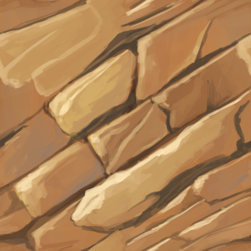
Recently i started doing some handpainted rock textures and i want to do many more and also other materials. I have only minor hand painting experience, but i want to get better at it and I think it will support my acrylic painting skills as well and vice versa.
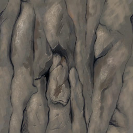
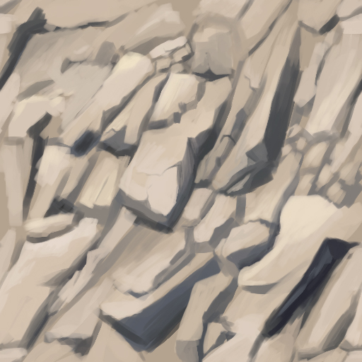
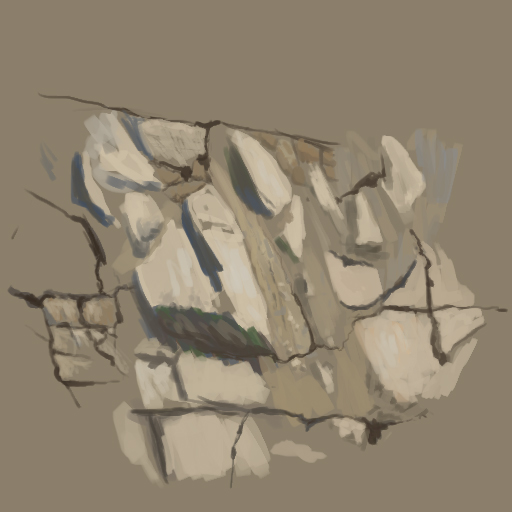
Most of the textures below are done by grabbing a reference photo from cgtextures and try to catch the essence of the rock in about 45 minutes. The rocks are maybe a bit too realistic and not so stylized at the moment, but i think I will practice that over time.
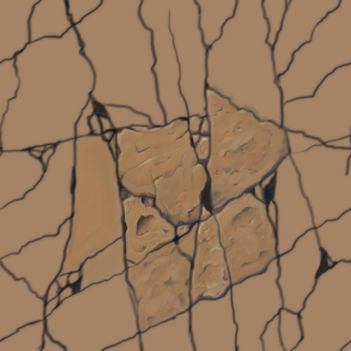
Tried some rock tile floor texture by using another handpainted texture as a reference. only detailed 2 1/2 tiles so far, but i feel i need to understand the shapes and the cracks better.
Continued to work on the brick floor texture. I'm satisfied with the result so far, although I don't quite get the hard and rocky feeling from my reference texture. I think I'm going to start a diorama scene soon to put the textures to use on 3d models.
Made a roof tile texture this time. Was nice to cheat a bit with copying over one roof tile across the whole texture and using drop shadow layer style to get some quick basic shadows
New day, new texture! This time a wood planks texture which turned out quite well in my opinion. I didn't use a specific ref other then have a google image search window open with 'handpainted wood texture' as keywords. The tiling is quite small so I feel couldn't vary the color and light between planks too much or else it will look very tiled. C&C welcome as always!
I made a brick wall texture after reading Jonathan Fletcher's article in Vertex 1 about handpainted textures. The article is really nice, but i feel there's quite a quality gap from my texture to his and i'm not sure what the most important differences are. But here it is including a nice GIF of wips this time :
And here you can see the tiling of both the wood and the brick texture (i know the textures don't fit eachother well atm)
Hey, I can't really give much critique but keep up the good work dude, I'm looking into learning hand painted textures soon and seeing other peoples progress threads is always nice to see as I'll be starting one myself next month.
If you're trying to make the texture seamless, you may want to make the texture as plain as possible, it looks really repeatable because of that dark block on the top right and that saturated one in the middle
Yeah I noticed it aswell. I think i'll leave it for now untill i actually use the textures in a scene. I think it also looks repeatable because i only paint a few bricks/planks to save time and focus more on quality then quantity. When i make textures for actual use, I will probably zoom out and put more bricks/planks on a texture which will give me freedom to put more variation across the texture without looking repeatable. But thanks for the comments!
Yeah, the tiling is pretty noticeable, but I think you did an excellent job on the wood so it's just a matter of adding a couple of planks and it'll be a solid texture.
I want to make a small diorama scene to practice hand-painted texturing and here I have my start (being inspired by the throne room contest ). The geometry is not final, so if you have any suggestions, please reply!
Took me almost half a year but I decided to pick up my diorama scene again. Most of the things are quickly filled in so I know it looks quite rough right now. Next update will follow sooner then this one
Some progress on the diorama. I think overall it can use work on what is currently there but I think I also need to add some extra stuff like flowers or mushrooms to add some more color to it. C&C welcome!
Much better i agree about the coins and perhaps darken the hill dirt and chest? saturate the chest a bit more if anything it blends with the tree.
Do some scan back action and when it starts blurring together then you add colors to see how much saturation it takes to make it stand out.
Nice little scene, continue.
This is looking better, however I think you should do another pass on highlights on this model... some hard edged highlights will really bring out the next level of the development of this, since you don't have many hard edged highlights on this it's coming off a little blurry and flat.
Also, I'm more of a person for directional lighting so at this point everything seems quite evenly lit... hopefully your UV's are laid out in a manner that's easy for you to paint in directional lighting?
Thanks for your constructive criticisms! I tried to incorporate it in the model and it's looking better now Here are the improvement points I'm currently seeing:
-the transition between the grass and the dirt is a bit weird (like a bulge). Maybe i should add more grass spikes in the texture.
-placement of the flowers. I think i can get a better composition by placing the flowers better, I just don't know how currently. Also they look a bit small maybe, compared to the big shapes of the other objects
-leaves of the tree look too sharp and copy pasted. It might need a pass where it will look more handpainted/handcrafted.
Replies
ref:
ref:
http://4.bp.blogspot.com/-_kOkIRjYlks/UhJ641lAo6I/AAAAAAAABO4/B1unt8dwdaI/s1600/Stone.jpg
Reference: https://www.pinterest.com/pin/516084438524654903/
And here you can see the tiling of both the wood and the brick texture (i know the textures don't fit eachother well atm)
http://www.polycount.com/forum/showpost.php?p=1609465&postcount=14
And tiling view:
The tiling is still pretty noticeable but again I think it is due to the small scale I draw on. Maybe the darker red parts could be a bit more yellow.
Try working with double what you have and maybe you will find it harder to see the tiling!
Keep it up
I want to make a small diorama scene to practice hand-painted texturing and here I have my start (being inspired by the throne room contest ). The geometry is not final, so if you have any suggestions, please reply!
It's also loosely based on this concept: Link
Do some scan back action and when it starts blurring together then you add colors to see how much saturation it takes to make it stand out.
Nice little scene, continue.
Also, I'm more of a person for directional lighting so at this point everything seems quite evenly lit... hopefully your UV's are laid out in a manner that's easy for you to paint in directional lighting?
Other than that this is going well (Y) Keep at it
-the transition between the grass and the dirt is a bit weird (like a bulge). Maybe i should add more grass spikes in the texture.
-placement of the flowers. I think i can get a better composition by placing the flowers better, I just don't know how currently. Also they look a bit small maybe, compared to the big shapes of the other objects
-leaves of the tree look too sharp and copy pasted. It might need a pass where it will look more handpainted/handcrafted.
What are your thoughts?