Sci-fi gun WIP
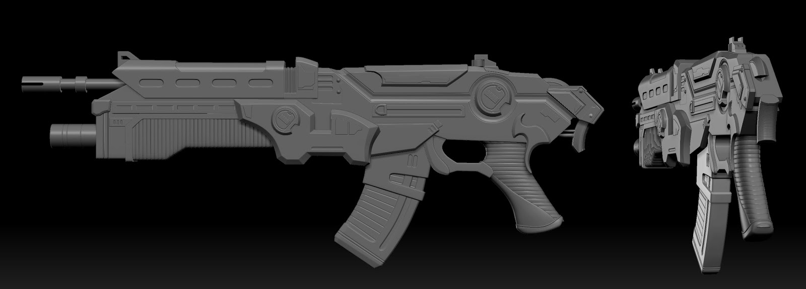
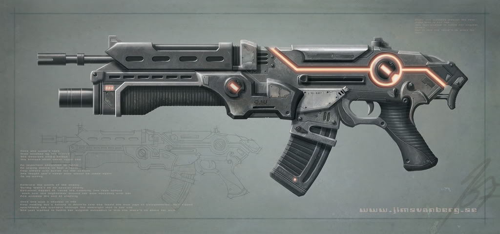
Working on a new gun from a concept art. (Concept art by Jim Svanberg)
I would love to catch any obvious modeling issues as early as possible before I start really finalizing the detail. This is the initial block. There are some areas that are clipping through that I plan on fixing now. I am keeping all of the mirrored geo on one side for now. Once I finalize them then I'll mirror it over.
Like always, feedback is always appreciated! Thanks!


Replies
Also, just above the clip is the lever to cock back the internal hammer. On the side view from your sculpt it looks like you just have it a small thumb tab, when it should actually stick out enough for a hand to grab it and pull it back.
Like this ^^^
Awesome, thanks for the feedback, I'll make those adjustments =P
Quick edit to have another angle
I think this part should be U shaped. Other than that great
Still got a few minor modifications to make, but I figured it's at a good stage to post an update of.
Some edges, like the ones on the barrels at the ends (don't gun parts) looks a bit too hard. Otherwise, its looking neat.
I am glad it looks clean! I've been using a mixture of xnormal and painting normals. Anything that I can layout in a straight line (like the linear padding looking patterns on the handle/ammo clip) I cleaned up in photoshop since it was easier to do.
Either way, here is the current bake, now all that is left is mirroring it over to the other side and merging all of the maps into one unified texture sheet. Fun stuff!
Here is the game rez model. The final version is at 6,631 polies. I used black for the normal background just to make it easier to see the uv spacing, the final version will have the proper flat normal color.
Now, the fun part begins (assuming no one spots any obvious mistakes/errors in the current model that can easily be fixed). I'll be texturing this in substance painter. I've been having a blast learning how to use the program.
You just need to integrate the two barrels into the rest of the gun more. I know you can't see that part in your concept, so you should take some liberties and make something that works.
Other than that, I still think it looks great. Really nice bakes.
I still need to figure out what what to do with the aim thing. I might just add some simple geo and connect it to the barrel a bit. Nothing fancy.
I also took the opportunity, given that I had to go back in anyway and re-bake the map, and smoothed a lot of the edges of the core piece.
For my red marks, idk how you have your UVs packed so this may not be an option, but try and really darken the inside of that lower barrel (not sure if your lighting is brightening that up or not). With that 3/4 view you have right now, it just stands out as well lit inside, and there is the wearing away of that inside edge. I would suggest giving that a darker black color, to give it that "sooty" used look.
Also the lighting in the barrel is from the light. Here is another shot that better illustrates what it looks like. It's actually quite black inside the barrels =P
Here are some maps