The BRAWL² Tournament Challenge has been announced!
It starts May 12, and ends Oct 17. Let's see what you got!
https://polycount.com/discussion/237047/the-brawl²-tournament
It starts May 12, and ends Oct 17. Let's see what you got!
https://polycount.com/discussion/237047/the-brawl²-tournament
Environment WIP. Critiques Welcomed!
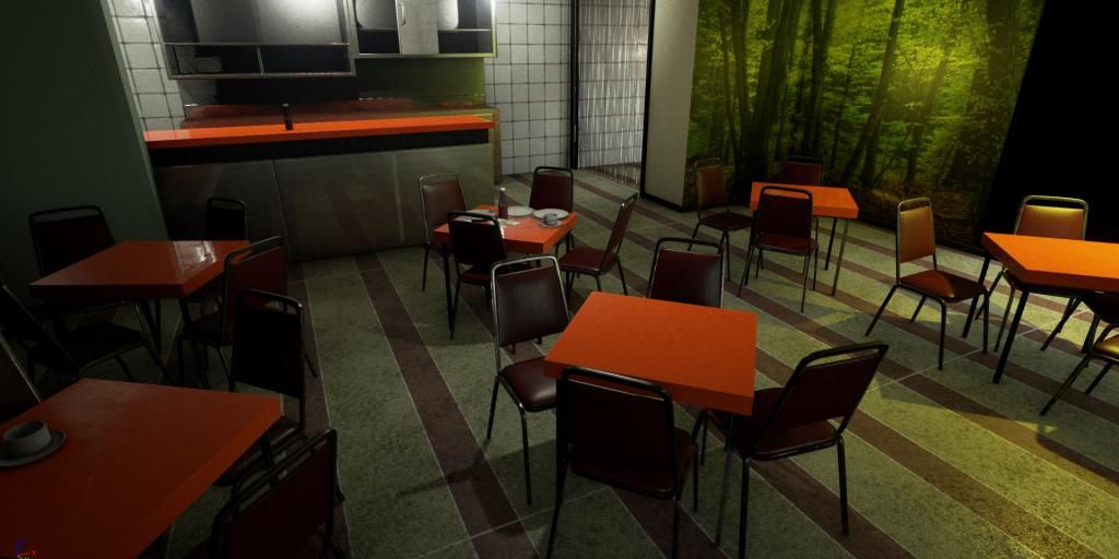
Hey everyone. Decided to try a concept I found a while ago in one of the noob challenges. I was told that my material definitions are not the greatest and this environment seemed to have a lot of different things to practice on.
I was hoping someone would help me with a few problems I have with the concept. First I am having trouble doing the see through plastic for the strips on the cool room. And secondly I can't tell if thats yellow glass or a yellow light coming from outside.
I am really wanting to get to the point where I might be employable so ANY critiques would be very welcome. And don't go easy on me
Here is the concept:

And here is my attempt so far:

I was hoping someone would help me with a few problems I have with the concept. First I am having trouble doing the see through plastic for the strips on the cool room. And secondly I can't tell if thats yellow glass or a yellow light coming from outside.
I am really wanting to get to the point where I might be employable so ANY critiques would be very welcome. And don't go easy on me
Here is the concept:

And here is my attempt so far:

Replies
I wish I could help you out with that plastic area you were talking about but I don't have much experience with that myself, but hopefully someone else can chime in.
I'm very impressed with how close to the concept you've kept it at.
Some people might advised against it since it's still being worked on by Epic but have a look into dynamic lighting and dynamic global illumination, the latest UE4 has improvements on dynamic lighting and it's features do vastly improve the scene without having to click the Build button again and again.
Also the light in the kitchen is brighter in the concept. Think of fluroescent tubes for hygenic places. I might as well tone down the blueish light and go back to your first lighting set up for the right wall. With the increased light from the kitchen & the yellow lamp you should get closer to the concept.
I would bevel the table edges a little bit more for the top side of it in this scene.
Last thing I would add some brownish/greenish color into the diffuse of the plastic curtain.
Overall its a good scene, but you will also need the props to add some more life to it
I will try a bevel but I was thinking that it would have to be pretty small, I baked one in but it doesn't show up because of the lack of light. I wish the lighting would match the concept but I think some of it because it is drawn can never match physically what would happen in real life.
I have to redo the curtain I think. I tried for that brownish tinge but it came up a little bit weird.
Well heaps to do.. Thanks again.
I hope it helps.
For lighting, use IES Light Profiles if you aren't already! They really help with lighting a scene properly.
https://docs.unrealengine.com/latest/INT/Engine/Rendering/LightingAndShadows/IESLightProfiles/index.html
http://www.usa.lighting.philips.com/connect/tools_literature/photometric_data_1.wpd
http://www.lithonia.com/photometrics.aspx