Modern Elf Girl Sculpt
Hello~Second thread here, this time my female character. Same rules, start with concept design and then I proceed to modeling!
Her name is Vashti, she lives in a future not too far from ours where the third world war started. I wanted to imagine a universe where elf continued to exist among humans while technology continues to flourish but magic has dissapeared. The elf are minority now, they are trying to adapt into the human society and culture by wearing their makeup, clothing using their weapon and etc. However, they sort of stand out.
Ps. If you are interested you can check out my almost done Victorian Doctor sculpt here: http://www.polycount.com/forum/showthread.php?p=2252390
Current Progress:
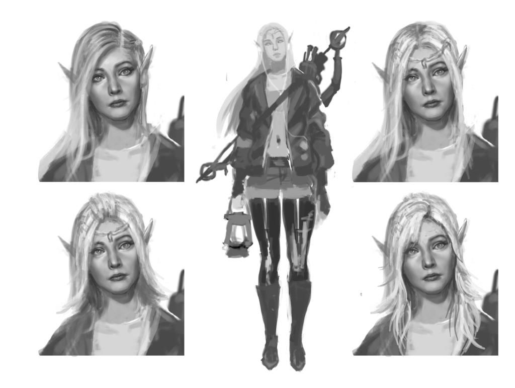
I end up picking the hairstyle from top left.
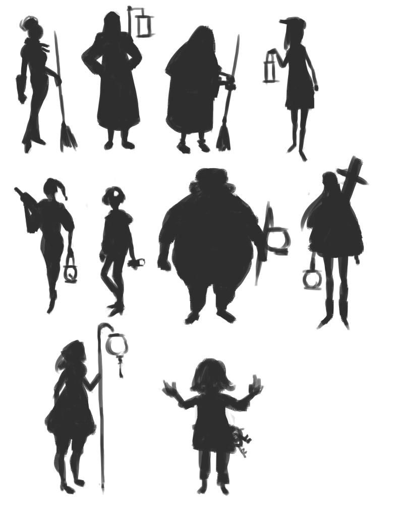
Silhouettes, picked the one from the middle right~
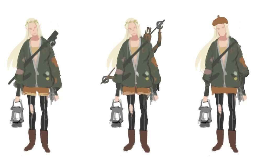
Some Color study:
Her name is Vashti, she lives in a future not too far from ours where the third world war started. I wanted to imagine a universe where elf continued to exist among humans while technology continues to flourish but magic has dissapeared. The elf are minority now, they are trying to adapt into the human society and culture by wearing their makeup, clothing using their weapon and etc. However, they sort of stand out.
Ps. If you are interested you can check out my almost done Victorian Doctor sculpt here: http://www.polycount.com/forum/showthread.php?p=2252390
Current Progress:
I end up picking the hairstyle from top left.

Silhouettes, picked the one from the middle right~

Some Color study:


Replies
Thanks man!
I am back with some head sculpt and clothing base mesh stuff
Hi Theodor, you have sharp eyes! Yes you are absolutely right about the proportions. The thing is I don't really mind the sculpt being sort of different than my concept because my sculpts are usually more anatomically correct than my drawing haha T-T However I do appreciate your critics please do keep them coming if u want.
Thanks man, please continue to look forward
UPDATE~:
Gathering all the shiznits together.
Rounded the face up a little bit more since it was too thin from the front.
Started the clothing sculpt
I'm being ultra slow btu here's some progress! Her shoes
Thank you. Yes, i made a base mesh on maya and then i sculpt it in mudbox/zbrush.
But i take a bunch of reference photos as well, it helps alot!
I know i haven't updated in a while but i am still working days and night on this. Had problems with normal map and i went to learn a bit of marmoset toolbag.
Anyway, here's some result of my test.
Don't giveup on me yet q.q
One thing I hope you plan to do is render out hairs for the brows and lashes
I am back with more picture after fiddling around in marmoset abit more.
Here's two lighting that i came up with.
Personally i liked the flat one better but quite a few friends says they like the dramatic lighting more. I am not sure which one to pick, what do you guys think is better?
I think the first picture has better composition, and is probably why I'm drawn to it. Though I do like the contrast on the second picture. Maybe do a comparison where the composition is the same?
Personally I'd go with a dramatic light setup like the second picture, though for your character I would tone down the red rim light, since that combined with the blue adds strong colors to your pallette. Maybe a subtle yellow/orange street lamp-like light, on a blue night lighting would work instead? I imagined this character strolling in the streets at night when I saw her concept.
Keep up the great work!
Meanwhile here's some highpoly render im trying to make xP
The only critique I would have is that the expression on the face looks a little too blank for the final pose.
Do you have any plans to change up the facial pose?
Look her up if you haven't (I'd be really surprised). You might also want to check out images of her in Wrath of the Titans, since I think she used a bow there. Might just inspire you in terms of facial expressions, especially if you haven't used her in your references.
I'm quite excited to see the final outcome.
Hey Anthricus, The clothing is just the mudbox default sculpt brush+the 8th threshold. I make low poly and sculpt on top of it. I tried to move the face a lil bit inside photoshop hopefully its less blank xD
She definitly need those leggings, but presently i don't have time to make it because it need to show to public on wedsday Q-Q.
Hi Tom. I checked the actress out and theres really resemblance! But the person i used was liv tyler. And I tried out the street lighting u talked about earlier in the reply. Check it out
Where here is update on the background. I need to choose 1 between these 2 ToT What do u guys prefer?
She looks cross eyed though.
Nice rim light, really liking these renders. I'd go with the first one because it has less big shapes in the background, and the subtle yellow light is just right. I can go with either one though. Great work.
Good luck with the presentation on Wednesday.