Medieval Batman
I decided to try my hand at creating a new version of Batman for a university project. I wanted to redesign the character as if he had existed in medieval times as a European knight. While I want to aim for a certain level of authenticity, I also want to include some fantasy elements to make the project fun and interesting. The final product will be a current generation game character intended for use with the Unreal 4 engine.
Here's what I have so far, it's all a WIP at the moment and this is only the third character I've ever created, so please excuse any mistakes and errors. All criticisms and comments are welcome")
I started by researching a load of armour, both real and fantasy, to create a few basic sketches of how I would like the character to look:
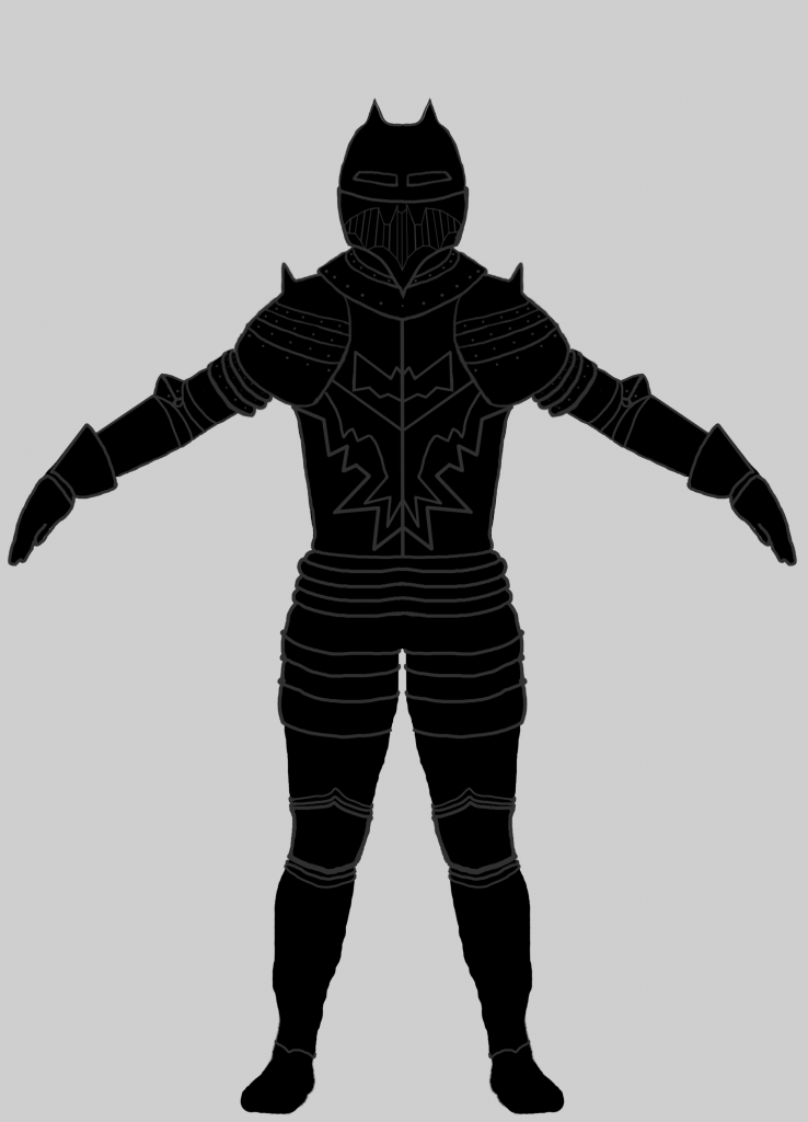
First design didn't come out too well, mostly as I had try to keep things a little too traditional in my opinion.
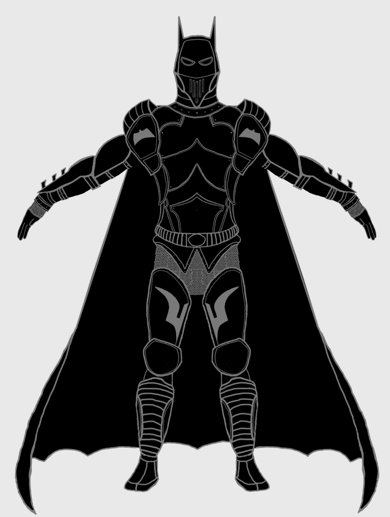
Second design was a little better than the first, I really tried to make it look more like Batman here, rather than a generic knight with pointy ears.
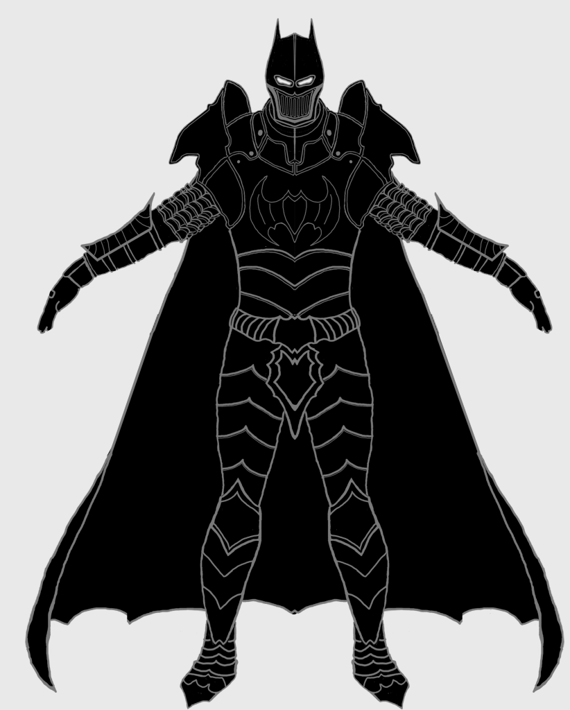
Third design was the one I think worked best. I think (while rough) it is good enough to use a basis for what I'd like to create in 3-D. After this design was chosen I went to work creating a base mesh to build all of the armour pieces from. I wanted to create something fairly realistic, but (as his body will be covered in armour) not go too crazy with the detailing.
After quite a few hours of work, this is what I came up with in Zbrush:
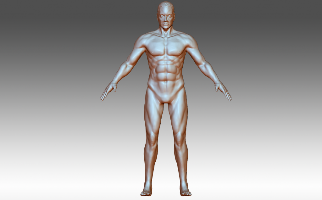
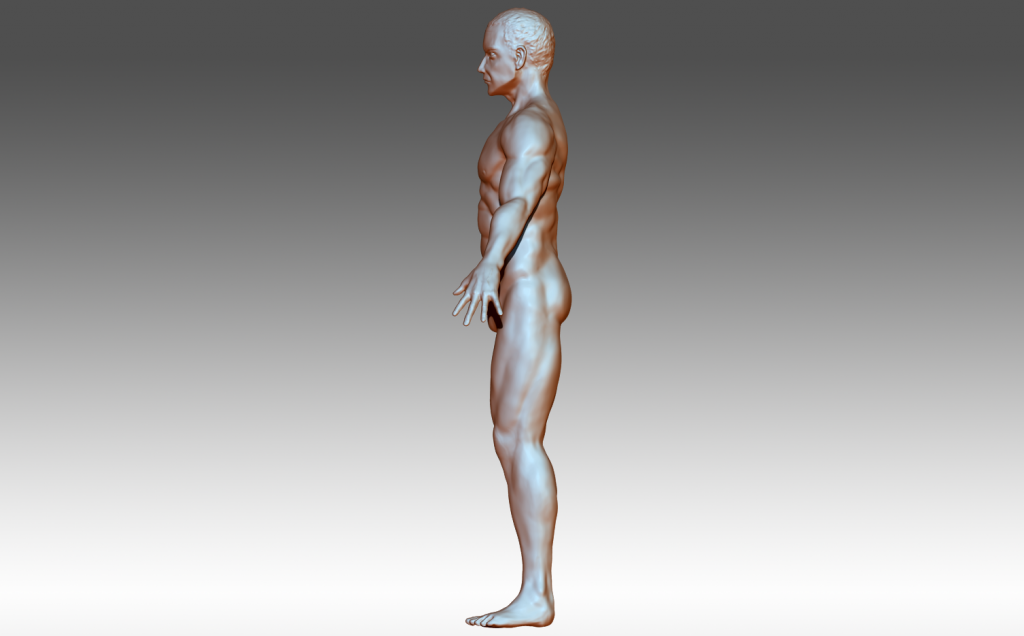
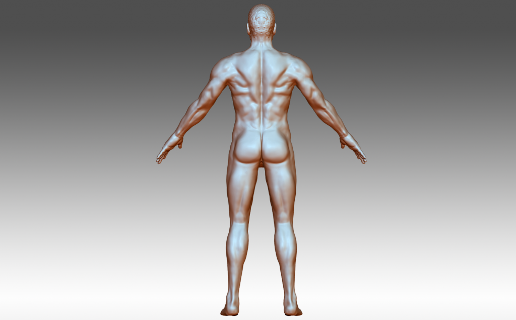
Some of the muscles (especially the back) are still off, but as time is a factor, I decided to carry on with the armour creation and then revisit the anatomy if time allows.
After some concept sculpting and lots of revisions, I ended up with this as a basis for the character. Some pieces are still in the concept sculpt stage, and some have been taken to high poly using the Zbrush hard surface workflow (retop, sub divs etc.):
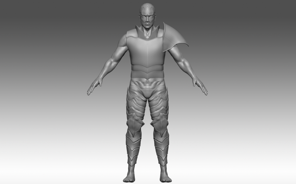
Some elements didn't appeal (shoulders in particular), so after some reflection and more high poly work, I've ended up with the character looking like this:
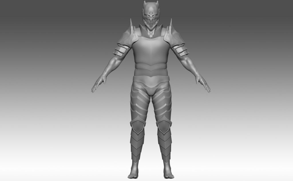
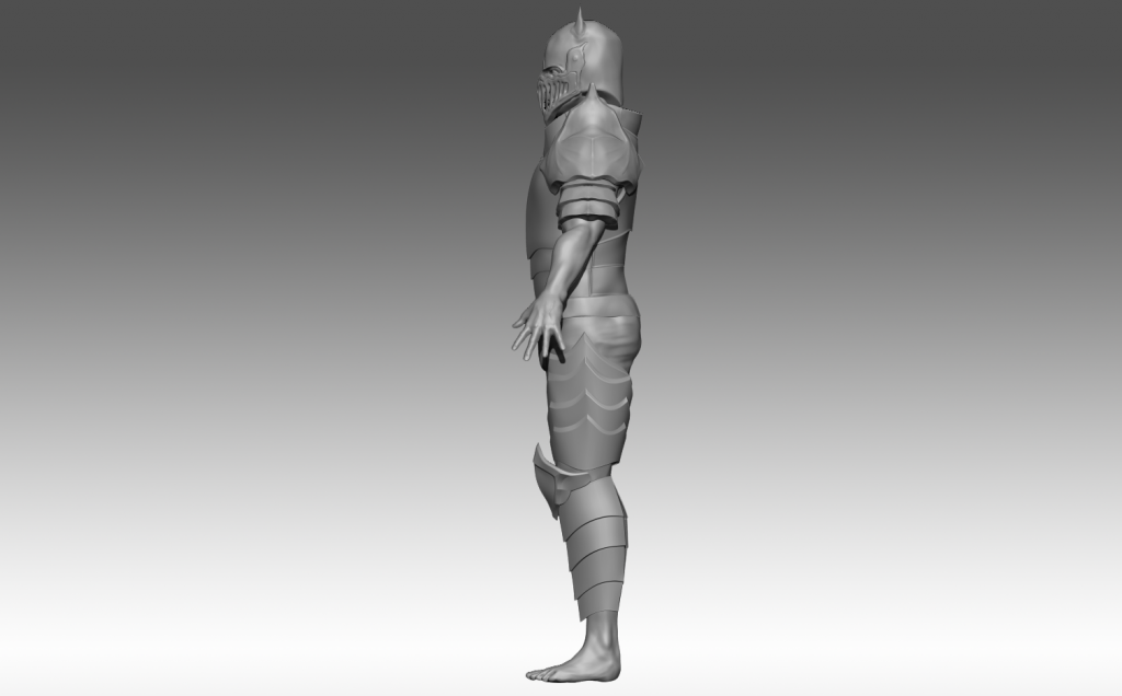
There is still plenty to do, but he's starting to come together. The new shoulder design is more appealing (but still in the concept stage), the leg armour came out o.k, and the helmet is looking o.k too (although I'm dreading making the front portion in high poly).
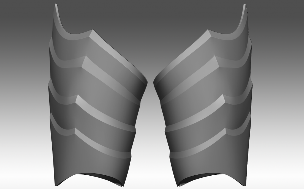
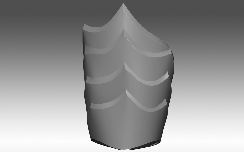
Here are a few close ups of the armour elements with more to come soon:
Here's what I have so far, it's all a WIP at the moment and this is only the third character I've ever created, so please excuse any mistakes and errors. All criticisms and comments are welcome
I started by researching a load of armour, both real and fantasy, to create a few basic sketches of how I would like the character to look:
First design didn't come out too well, mostly as I had try to keep things a little too traditional in my opinion.
Second design was a little better than the first, I really tried to make it look more like Batman here, rather than a generic knight with pointy ears.
Third design was the one I think worked best. I think (while rough) it is good enough to use a basis for what I'd like to create in 3-D. After this design was chosen I went to work creating a base mesh to build all of the armour pieces from. I wanted to create something fairly realistic, but (as his body will be covered in armour) not go too crazy with the detailing.
After quite a few hours of work, this is what I came up with in Zbrush:
Some of the muscles (especially the back) are still off, but as time is a factor, I decided to carry on with the armour creation and then revisit the anatomy if time allows.
After some concept sculpting and lots of revisions, I ended up with this as a basis for the character. Some pieces are still in the concept sculpt stage, and some have been taken to high poly using the Zbrush hard surface workflow (retop, sub divs etc.):
Some elements didn't appeal (shoulders in particular), so after some reflection and more high poly work, I've ended up with the character looking like this:
There is still plenty to do, but he's starting to come together. The new shoulder design is more appealing (but still in the concept stage), the leg armour came out o.k, and the helmet is looking o.k too (although I'm dreading making the front portion in high poly).
Here are a few close ups of the armour elements with more to come soon:
Replies
and i would almost say the armor is too boring,
for example look at all the ornate sketching....i feel that something like that on this would be really cool
wheres the cool teeth from the concept! lol i think that would be baller....almost make the helm like a demon bat head or something
but i love this concept and idea i cant wait to see it finished
Regarding functionality, will you give him any weapons? A shield? I don't think it would make much sense to fight unarmed under all that heavy armor.
@apllana Yeah the clipped pieces of chainmaille were a real issue for me. I tried to figure out a way to eliminate them, but as I was using micromesh with a tileable pattern, they became an unavoidable evil lol If you have any tips for getting rid of them I'd be eternally grateful
@jhoythottle I agree completely about the belt, I really wanted to add some extra gadgets and batarangs etc. to flesh out the character and make him a little more functional overall. Sadly though, as I'm quickly running out of time to submit this piece, the plain belt will have to do for now. Once it's submitted though I will be returning to add more details, and the belt is number 1. on that list. His proportions have been an issue from the start. While my base mesh was anatomically correct ( as far as I could tell anyway lol I'm still learning anatomy and I'm sure it could be improved upon ), as soon as the armour started to get placed on the character, things started to shift visually. He looked very dwarfish to begin with, and this caused issues. I tried to move things around a little bit to compensate but he always seemed too bulky and short, so I agree with you that things definitely look off. I'll be looking at his proportions after the submission is done and making some revisions.
@nickcomeau Yeah the proportions have been a pain from start to finish here lol I have tried changing things around to compensate, but like I mentioned earlier, nothing really seemed to help. The armour is the big issue, and whenever it's placed on the body, things suddenly start to look wrong and distorted.
Thanks again for taking the time to look at my work guys, I hope to have some more progress pics to show to you all soon.
I'm working on a Batman myself atm.
Notice the proportional scale of how big Batman's torso is relative to his lower body. And also how relatively larger some of this body parts are in relation to other areas. It communicates heft and power. I'd also paint his eye area black, so it's just pearly whites peeking out through the armor.: