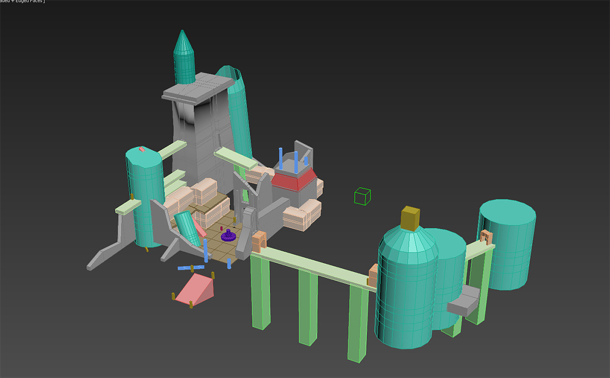
Castle Gryphon
I really wasn't going to start a thread for my first Cryengine project but then thought that well, it couldn't hurt to get some genuine feedback as I go along - so here we are!
So, first time using an engine and we will see where this goes. Creating an environment that is influenced by the like of Gigantic and Overwatch etc, perhaps with more emphasis on normal maps, not sure yet. I am also really new to using 3ds Max - have been using Maya up until recently.
We will start with the basic blockin - isn't it pretty...


Replies
Just checking scale before I start in zbrush properly! Quite a lot more of the scene modelled out now, and I am working on some trees to add a bit more life to the place.
Shiny roof for shiny world
I agree with Tobbo, the gras looks really promising ;-)
You said your stones turn out to look like something else. I also think that something feels a little bit wrong about them. I would say that's because of the parts where you added those deeper parts, like wholes. You did this regularly on every of those 3 stones as if every stone needs to have a whole. I don't know whether stones should have wholes or not, but imagining them without the wholes they look much better to me.
Looking forward to more progress on the castle :-)
Someone needs to do the gardening.
Ugh, I have been quiet recently - a mix of a lot of things happening in the real world (some good!:D) and also feeling very disheartened every time I opened the castle scene. I also blame it on playing Dragonage: Inquisition. They really know their stuff. And makes me feel like I don't know mine - but if I keep at it, one day I will get there!
A key "trick" seems to be filling the environment with lots of tasty little distractions - which covers up seams and directs the eye away to travel around, a busy world is a pretty world! So I am adding "busy" - first up, some smashed rocks. Quite happy with these although the alpha blend is playing up and trying to be shiny. (why, Cryengine, Why?) Then I made some cliffs and all of a sudden I didn't hate the scene as much. Still needs sooo much work, but I don't hate what I see at the moment.