Low-poly handpainted Egyptian cafe interior - C&C request
Hey everyone, I've been working on this Egyptian cafe scene on and off for a few months. Would love some feedback. The modeling is mostly done except for some minor props (such as trashcans, cash register, bus trays which are currently stand-in models). I've got base textures on most but not all of the models.
The lighting is stand-in right now; I'm putting the scene together in Unity but I'm currently using Unity 4 and plan to use the improved lighting and rendering in Unity 5 for the final scene.
I'd like constructive criticism on the textures, as far as keeping the style of the different props consistent, visual appeal, variety, scale, etc. I'm handpainting all the textures going for a a bit of an exaggerated simplified look but not super cartoony. For example for the wood textures I started by painting over photos of wood, then changing and simplifying some of the shapes for aesthetic appeal, and to avoid unique bits that made tiling look obvious.
Also I'd be happy to hear it if anyone has suggestions on minimizing workload while avoiding obvious duplication. For example I have two tables and two chairs that are each duplicated to fill out the scene. I'm considering using the same base texture but creating several versions with different color adjustments and unique wear and tear. For some props I'm also sort of "cheating" to create the handpainted look by using a few base greyscale handpainted textures as an overlay on flat color textures.
Most of the models are albedo only right now, will add other maps eventually.
Other constructive feedback, critique, etc. welcome as well.
These first few images are the scene put together in Unity. I'll post a reply with some of the individual props and textures.
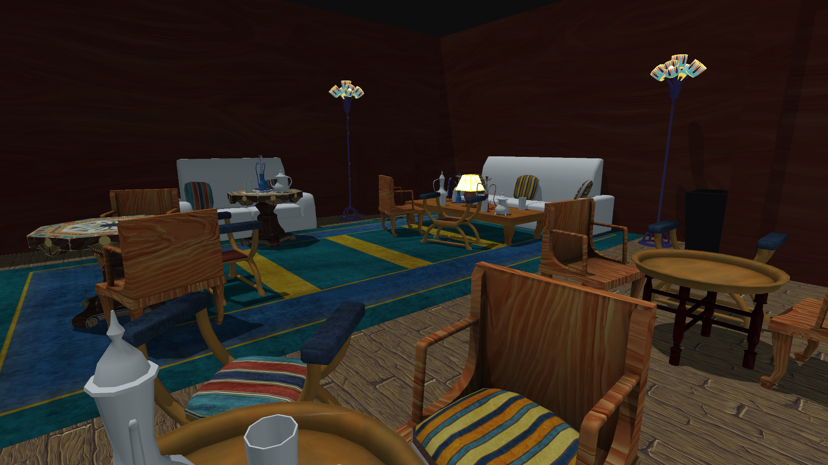
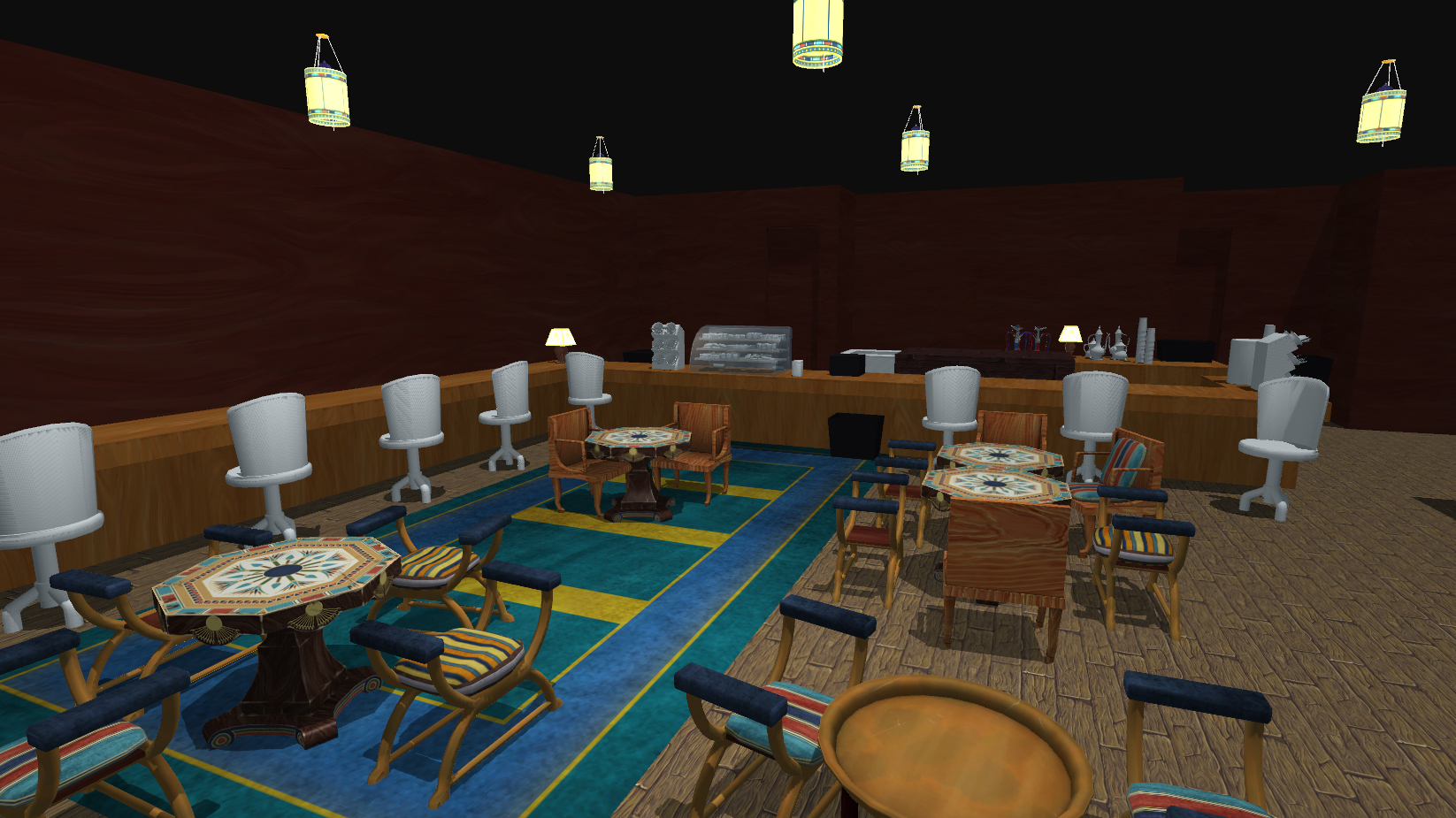
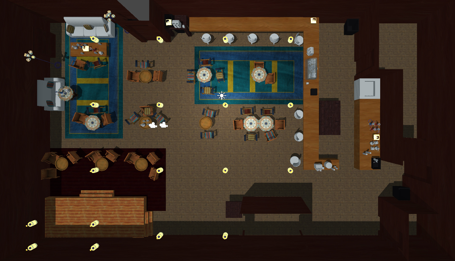
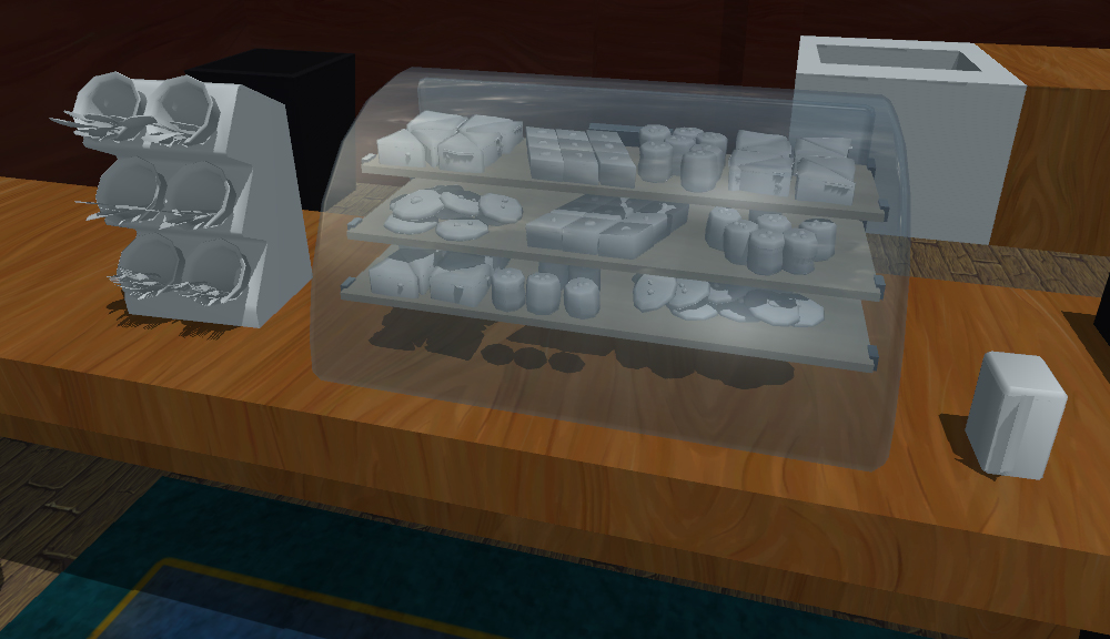


Replies
I think you have to ask yourself, what style do you want? Gather some reference from other games/scenes with a specific style you want to go for and post it here
I am not going for photorealism, I want a handpainted style, but I ended up putting in more detail in the textures than I had intended. The cloth weave on the couch is taken from a photo that I ran filters, effects, etc. on in Photoshop to soften the noise and eliminate detail. But based on your comments obviously it still stands out compared with the painterly style of the wood for example. I'm having difficulty determining how to imply cloth in a simplified painterly style. Perhaps I will try completely eliminating the noise and seeing if using flatcolor low-gloss is enough.
A few months ago I listened to a PBR podcast with guys from Marmoset and a few other companies (maybe Quixel or Allegorithmic?) in which they said (I'm paraphrasing) that PBR is useful and valid even for stylized textures. That stuck with me, and I got the idea that I wanted to do a scene with handpainted textures but realistic material separation - highly reflective metal, matte cloth, etc.
As far as realistically proportioned models - I am going to exaggerate shapes. I started with what was easy and quick, thus creating symmetrical rectangular table, chairs, etc. I am going to skew the shapes but that's icing on the cake I haven't gotten to yet. I hope it helps sell the look.
I can't think of a game offhand that I know for sure uses handpainted textures and PBR but I will look around for and post some style references even if the technical method is different than what I'm doing.
As far as frequenting Egyptian cafes......I go to Middle Eastern-owned cafes in the US moreso than probably the average US citizen, because I know people who enjoy hanging out in them. I am by no means an expert but I am doing a lot of image searching, and I just figured this would be unique compared to a lot of game art settings. Also I like the idea of game art representing the Middle East as something other than a warzone.
Two of my big inspirations for the look are Dishonored and Life is Strange. A strange pair, but I like aspects about both of them! There's a big thread by someone who worked on Dishonored here. I really like how stylized yet readable this game is. It obviously doesn't use PBR but its graphics are very distinctive.
I think that it'll be pretty illuminating once you get other maps on there besides albedo. Right now, everything is reading as very flat and it's hard to get a grasp of the style you're going for. One thing that helped me when I was feeling kind of lost with my piece, was I went in and did one prop up to the art direction level that I wanted - in my case, it was the chair in my scene. Then I used that as a basis for the rest of the pieces. Maybe that would help in your case!
Edit: I forgot, here are some specific references. I'm not sure if these are too cartoony but they could be a good place to start. Here's a few: 1, 2. I'm also using Dishonored/Life is Strange as style references, as I said above.
I had done one prop to finish (the octagonal table with the detailed pattern painted on the surface) but that was before the switch to PBR/Unity 5 so the spec and gloss maps no longer look right. I think you have a good suggestion though and I will keep that in mind. One issue I may be facing is that the props that have more detail make the rest look unfinished. I need to standardize the level of high/mid/low-frequency noise
This guy's stuff is great and inspirational. I'm going for a bit more detail/realism though:
https://www.artstation.com/artist/tobiaskoepp
Also looked at some video/images from Sly Cooper Thieves in time but again I'm going for a bit more realism, not quite as saturated colors:
[ame]
http://blazekick.com/wp-content/uploads/2014/11/sly-cooper-thieves-in-time-2.jpg
http://www.jeuxcapt.com/upload/module_images/1345035732_sly-cooper-thieves-in-time-playstation-3-ps3-1345015268-067.jpg
More along the lines of what I'm going for. Obviously handpainted and stylized but not *super* simplified:
https://s-media-cache-ak0.pinimg.com/originals/4b/8b/42/4b8b4206c5b3b59f7a5484f0bbbc4d11.jpg
Also this:
http://www.polycount.com/forum/showthread.php?t=132866
So I re-did the wooden chair as a style proof of concept. Made the shape more exaggerated and actually painted in planks. Very basic 3-point light setup in Unity 5, only keylight is shadowcasting, ambient at default setting, albedo, spec, glos, and AO. C&C welcome.