Brick Block - a Unity demo for your browser.
Hey y'all. I thought I'd show what I've been up to lately:
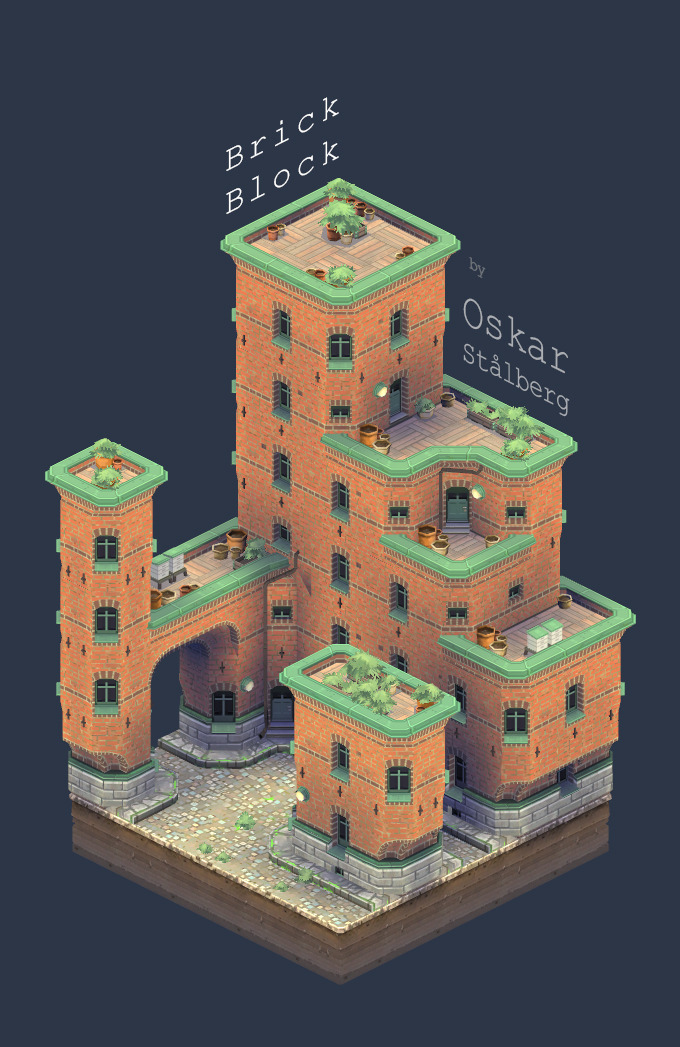
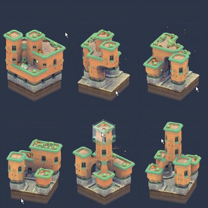
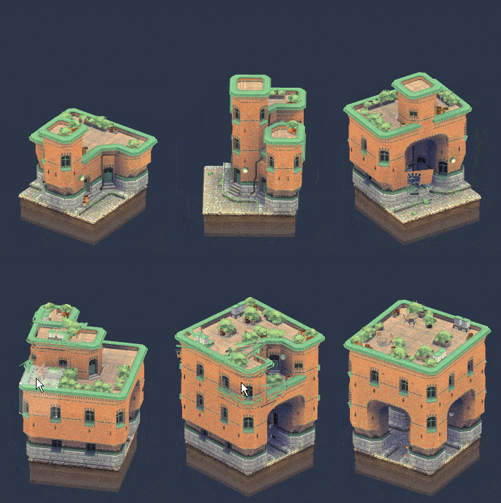
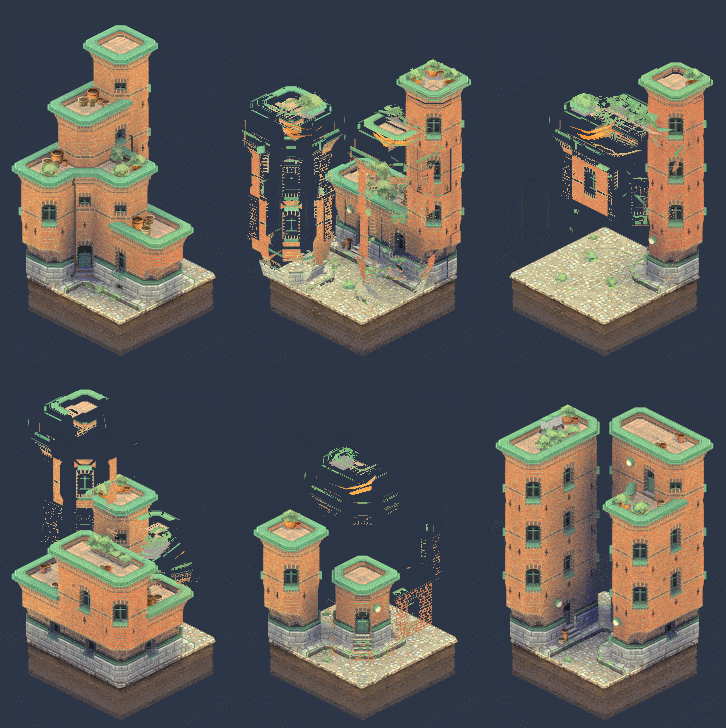
Basically, it's like a mini level editor that runs in your browser. Made in Unity.
Give it a go, and let me know what you think!


Basically, it's like a mini level editor that runs in your browser. Made in Unity.
Give it a go, and let me know what you think!
Replies
and not just the functionality, but the subtle floating when there's nothing under it, the way things break apart, even the popping sounds. it's super fun to use.
I love how pots will only grow plants in the open and not in the shade.
So much cool stuff here.
When's the full game coming out? Y'know, the one where we can pick different styles of architecture and see little people run around the buildings 'n stuff?
I really want to see some of your inside job. How you did the animations and what kind of object you created to achieve such results
How does it feel to have created the most insanely amazingly awesome thing to ever exist in the entire history of human kind???
Seriously, this is so freaking beyond words amazing, me love you long time.
Just noticed floating items float and hover a little. great touch!
Let me address what I deem to be the 2 main questions:
Q : Is this part of something bigger?
A : Probably not. My projects are usually just a proof of concept of some particular idea I've had. In this case, that idea is a specific approach to modularity. I like to keep my projects small, yet presentable, so that I can post them and move on when I'm bored and want to explore something else.
That being said, I think this project did prove it's concept, and I won't be surprised if I end up applying this professionally somewhere in the future.
Q : How is it done?
A : I'm not going to be too exhaustive here. I'm writing an article about this project for a certain magazine dear to many people on this forum. If that for some reason does not get published, I'll post my breakdown here.
I can share some brief basics though:
The disintegration is a pretty basic vertex shader accompanied by some texture driven pixel eating in the surface shader. The fade-in is just the disintegration in reverse. The two running simultaneously gives the seamless appearance. As is often the case, I think the timing is the most important part of the effect.
All the lighting is completely custom written. I don't have Unity Pro, so I can't use realtime shadows, SSAO, or any of those goodies. My lighting solution is basically voxel based, probably not that different from that of Minecraft, and whould not work that well were it not for the very blocky nature of the project.
I'll share the main texture. It's poorly optimized and leaves a large part of the UV unused, it's probably not a good example to put in the article. It's 256x256
Well done!
I love the visual style, the attention to detail, and I'm burning to know how you did all this! Can't wait for the article
I think I'll stop now.
Can... can we get a bigger area to play in? You've really got something here.
You can use Unity5 for free. GI + other goodies.
Yeah, well, that was released a few weeks after I finished this one. That will be for the next project.
everything fits so nicely and it plays really well
good job
To make a modular building like that is one thing, but to make such a sweet, smooth demo is another thing.
I love how it works, just perfect.
This is really cool!
Unfortunately, Chrome recently stopped supporting the Unity Web Plugin. It still works in Firefox though. If I have time after my current project, I'll port it to WebGL