The BRAWL² Tournament Challenge has been announced!
It starts May 12, and ends Oct 17. Let's see what you got!
https://polycount.com/discussion/237047/the-brawl²-tournament
It starts May 12, and ends Oct 17. Let's see what you got!
https://polycount.com/discussion/237047/the-brawl²-tournament
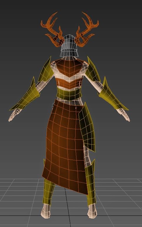
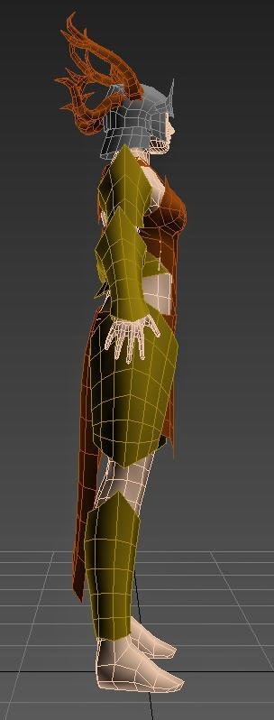
ArenaNet Character Art Test - proxy/blockout
Working on the character art test for ArenaNet - provided concept shown in the screenshots. Just getting everything blocked for reference and a start to the low poly armor pieces. Would love feedback at this point especially on proportions, edge flow issues I may have missed, anything. Thanks in advance!
I am also just curious, for art tests in general - here the provided concept does not show the back of the armor, but I know this particular armor does exist in GW2. Is it better to take reference from what the ArenaNet artists did in their interpretation for the in-game version, or do my own? Or a combination of both?


I am also just curious, for art tests in general - here the provided concept does not show the back of the armor, but I know this particular armor does exist in GW2. Is it better to take reference from what the ArenaNet artists did in their interpretation for the in-game version, or do my own? Or a combination of both?


Replies
As far as weather or not you should use the armor that is in game for reference, I would say dont. The challenge is to gauge weather or not you as an artist can deliver a good 3D model, and a part of that is being able to translate a 2D concept into 3D. They already know how their modelers translated the concept, now they want to know how you can translate it.
I hope that helps and good luck on the challenge.
Model out the strips for the armor, it will be less of a pain to create than trying to sculpt them out.
The polyflow on the chest armor in the front is a little weird and I fear that the part below the breasts might give you some trouble since there is not enough geometry.
I would look at how it was done in game and then use it to give you an idea how you should execute it, but don't copy it directly. My advice would be to go with something symmetrical on the back, as it can help speed things up and be a better utilization of UV space.
Keep on going!
oh and you might want to flip the character horizontally, on the original concept art its flipped horizontal of what you have
@pyrzern i know right... im doing the contest as well and i was a bit bummed out to see the exact same concept, but hey... i guess u get to see progress from last year? haha