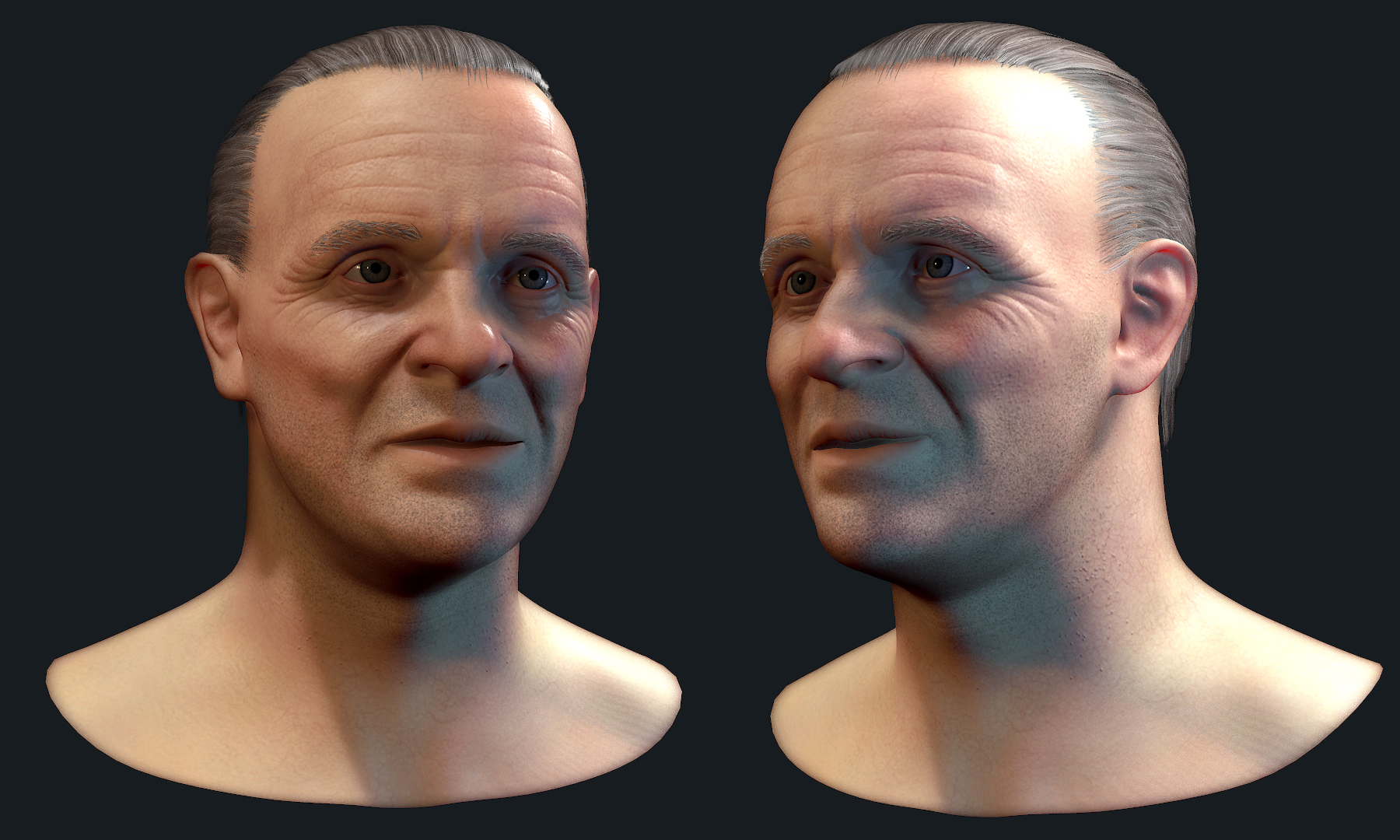
Looking good so far, right now the lips feel off to me. Maybe just the bottom lip, it looks a bit full. Also maybe a bit more volume in the cheeks. What age range are you using as your reference?
thanks for the comment iflingpoo (nice name btw lol). I'm working on the hair and also aging his skin. He currently doesn't have all his maps applied (right now using the gloss and spec value sliders in marmoset with no maps)
Once i get his hair completed i'll think about making his mask. I don't want to cover up too much of his face. I'd like for it to be recognizable as hannibal lecter without the iconic cannibal mask.
I'm looking at silence of the lambs. Images like this for his skin.
Right now it's just first pass, but i'll be hopping into substance painter to age him a bit
Hey, I like where this is going. However, I think you should turn down the subdermis scatter and normal smoothing/shadoow blur a bit as you're losing quite a bit of detail from your sculpt in the render.
It's a minor thing but, if you haven't done so, also consider adding a bit of scattering to the eyes. The sclera is what needs it specifically.
I don't really know if you are going for a younger look than what i think of when i think of Antony Hopkins, but i really feel that the skin is too perfect, if you take a look at the picture i added, he has quite a lot of brown spots and imperfections, especially on the higher forehead. I also noticed that his jawline is too straight, as you can see he almost has like the second chin coming up around the jaw and connecting to his cheek (i don't know a better way to describe this). Otherwise, good sculpt.
Thanks for the feedback guys. His hair placement does need work for sure.
I guess I should've named this thread Hannibal lecter from silence of the lambs. That's the reference I'm using for his face.
I checked the subsurface scattering settings and the normal smoothing was at 0. I changed the lighting a bit. Hopefully this will show a bit more detail that was missing from before.
Nice progress, the hair is looking better. It seems like the top of his skull could be inflated a bit more. The image above looks rounder and slightly larger at the crown. Its a tough project keep up the good work.
Thanks for the feedback Sleepygiraffe. These will probably be my final renders. Learned a lot from this study and will help with future like-ness studies.
Replies
Keep up the good work.
Once i get his hair completed i'll think about making his mask. I don't want to cover up too much of his face. I'd like for it to be recognizable as hannibal lecter without the iconic cannibal mask.
I'm looking at silence of the lambs. Images like this for his skin.
Right now it's just first pass, but i'll be hopping into substance painter to age him a bit
I feel like the nose is a bit thick, and they jaw could be a bit stronger. I know you're going for an older hopkins but check out some 70's Hop.
Edit: Still a ways to go with the haircards but starting to get it.
Yes, I'm using Marmoset for these renders.
It's a minor thing but, if you haven't done so, also consider adding a bit of scattering to the eyes. The sclera is what needs it specifically.
a bit more randomness would add liveliness i think
I guess I should've named this thread Hannibal lecter from silence of the lambs. That's the reference I'm using for his face.