Weekend speed environment.
During my job hunt I got the feedback that I should have more environment art in my portfolio, so I put this together quickly over the weekend. It served not only as a quick lil portfolio piece but also as a good practice for modular design and speed modeling.
Everything was done with 19 modular pieces, using a single set of textures (albedo, normal, spec/gloss).
Built and rendered in Unity 4.
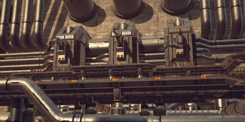
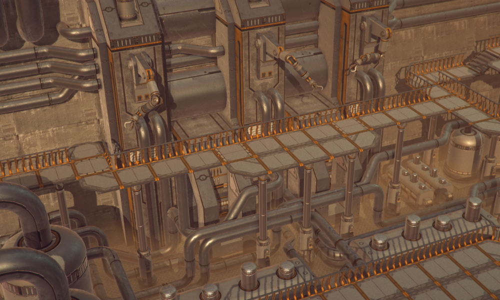
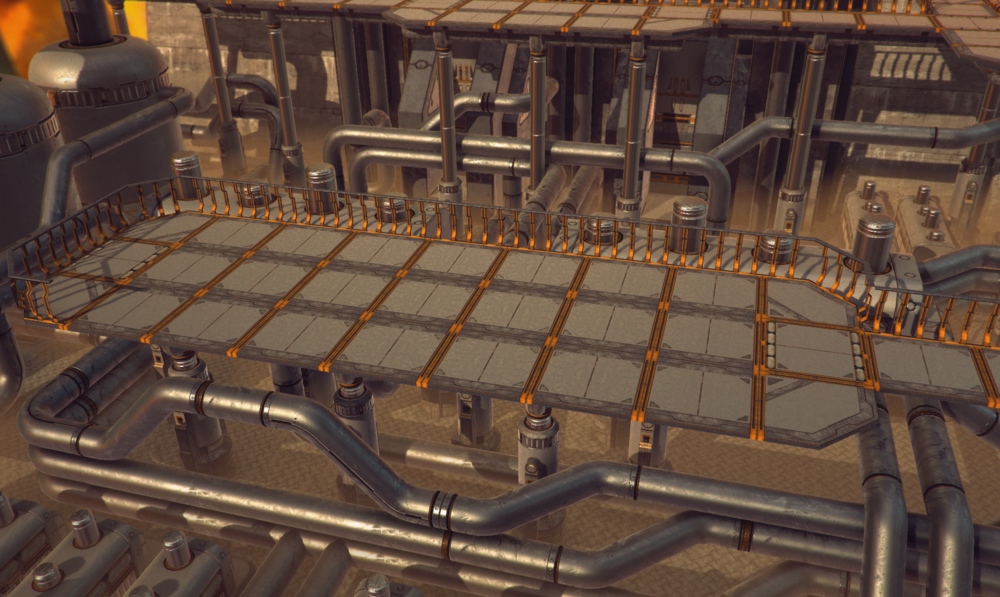
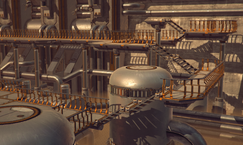
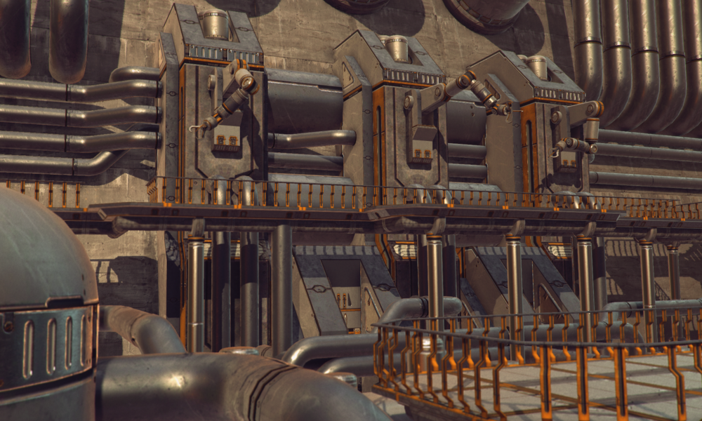
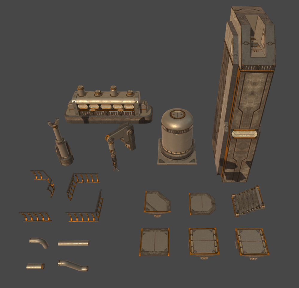
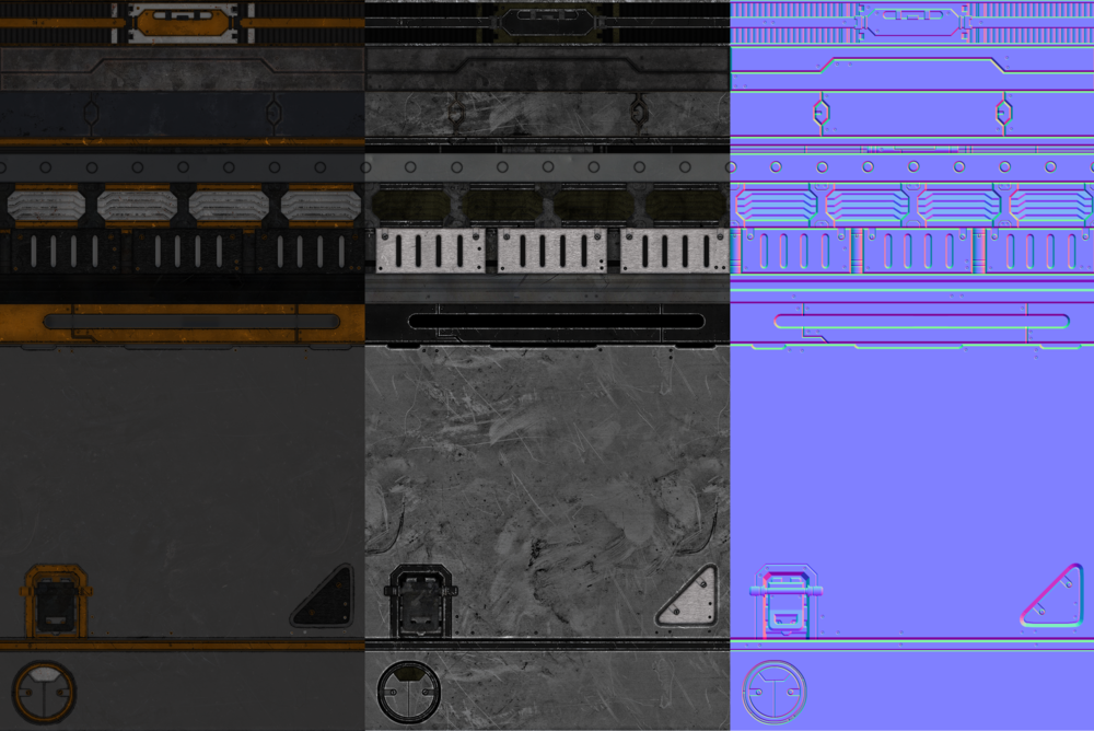
Everything was done with 19 modular pieces, using a single set of textures (albedo, normal, spec/gloss).
Built and rendered in Unity 4.


Replies
Thank you! Pretty pleased with how it turned out considering the short amount of time spent on it. It's got some issues I'm considering going back and changing. The nice thing about something modular like this is that it's very easy to alter and expand.
I lit it using Marmoset Skyshop, and their shaders are PBR-esque. No metalness or anything, but it still employs things like energy conserving specular and reflection fresnel.
If you're going to take it further I'd recommend creating some sort of focal point by either lighting, a specific repetition in a key area, or maybe a little unique set piece model that fits into the current style.
I dunno if it's just me but I feel like it might be a little bit too uniformly busy, maybe you can think about using some decals/opacity masked textures that can help combat the repetitive nature of modular parts.
Lighting wise everything seems currently around the same value minus a few shadows from your directional light, so maybe you can fiddle around with creating a difference in values depending on the section. I'm currently guessing it's supposed to be outdoors judging from the directions of the shadows, in that case maybe some outside light models such as emergency lights/hanging worker lights/lamp posts/etc. might help. Not necessarily lit in the areas where the sun is bright, but maybe in one of the darker areas underneath a platform or an area that's a bit more enclosed which wouldn't receive as much light. If it's indoors you could probably go even crazier with how it's lit since you won't have the sun to deal with.
But yeah all those are pretty subject to whatever you're going for, just my 2 cents!
Keep it up