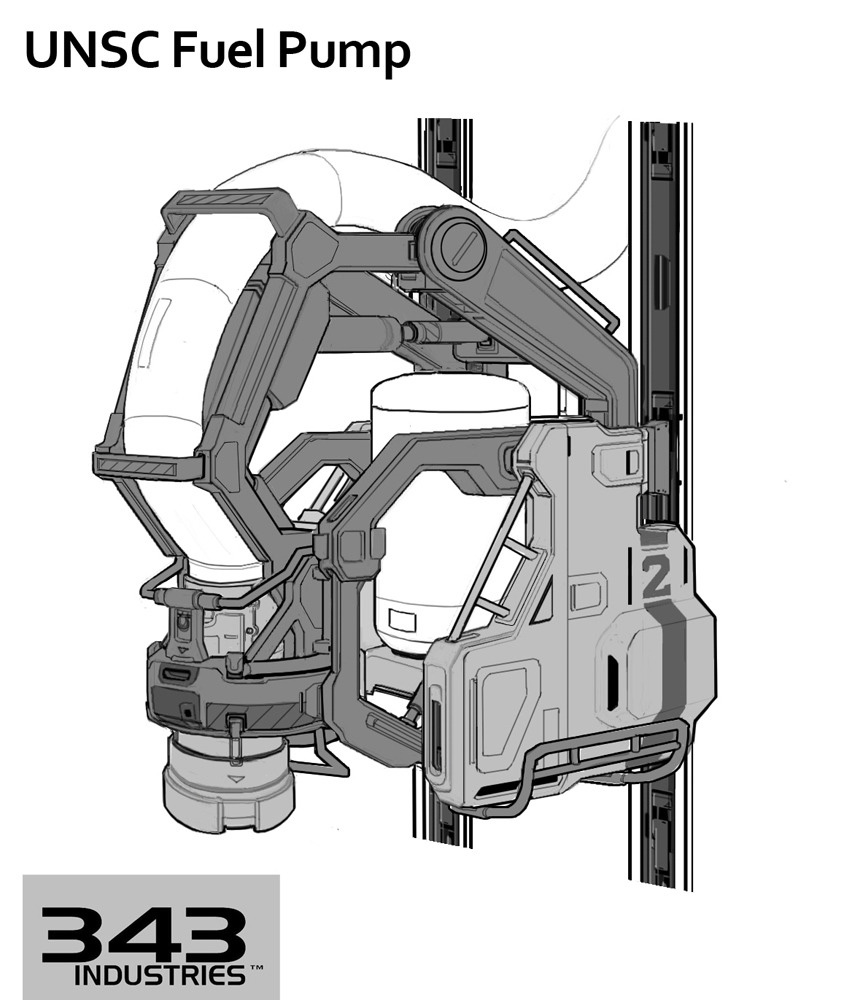
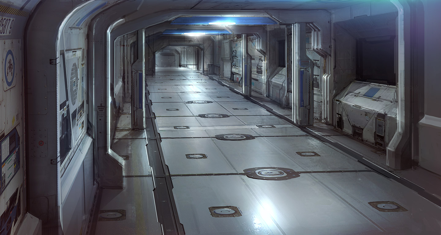
I Currently live and San Francisco and managed to get me tickets to this years GDC. GDC is in 2 weeks and I have the next 2 weeks so I'm going to try my best to crank out an environment or prop before the event. Here are my ideas, you may have seen these concepts before.
I 'm not trying to get all this done in 2 weeks, but I'm hoping to at least get 1 or done and contiue to work on some of these things later on in the near futture.
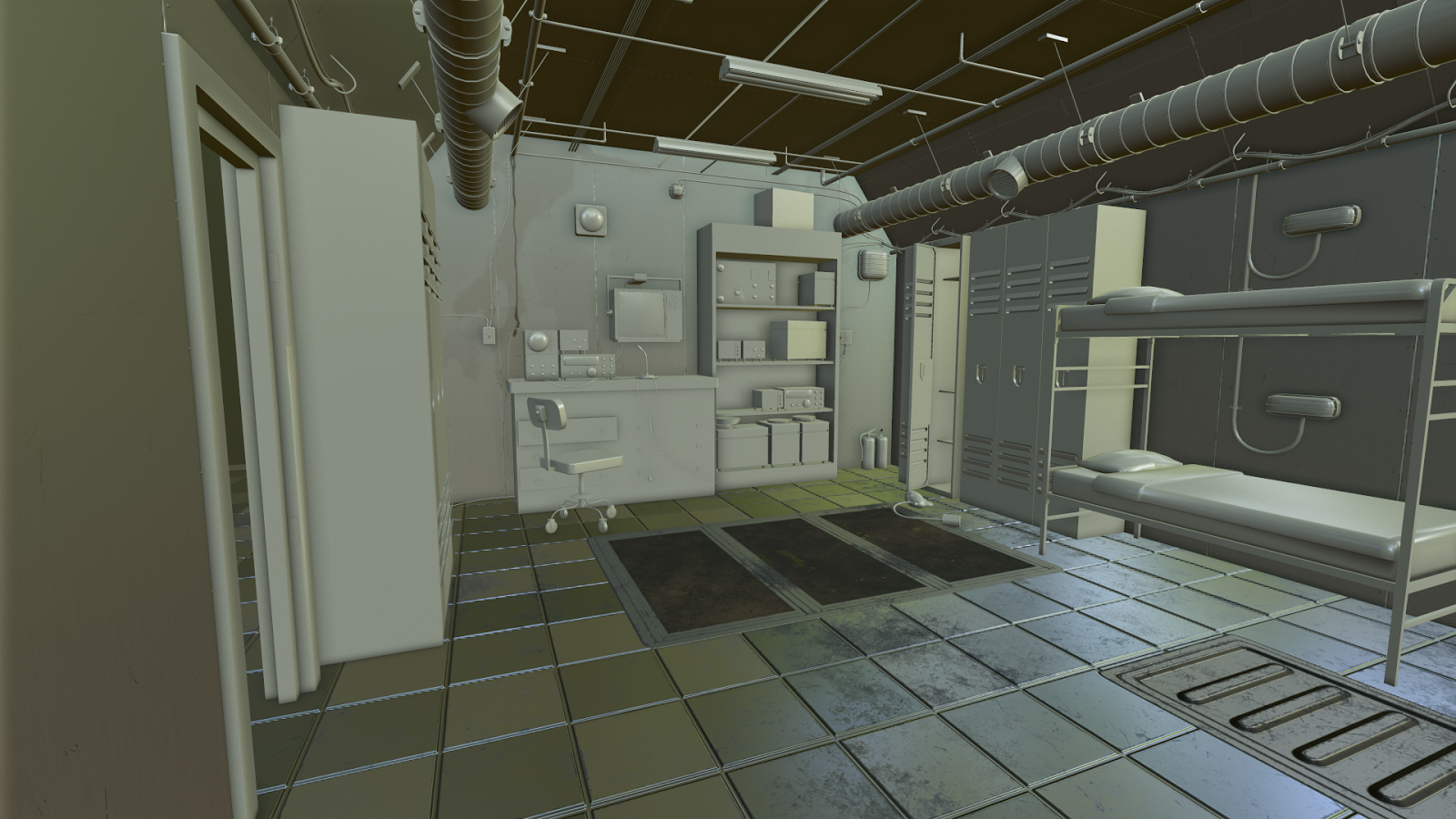
Day 1 progress so far. I got most of the obejcts done for the bunker, going to take a break get some tea, play some titanfall or league, and finsh up the assets so i can unwrap and texture in tomorrow.
I went back in to fix some of the models, unwrap, and layout each one correctly, I wanted to do this environment in marmoset because I never made an environment specifically for marmoset presentation. I will be posting the textures and high poly models that I'm able to finish today. And I will do the same for the next couple of days.
Well, guys, sorry to say but I 'm not going to get this done by GDC, I will be there though if anyone wants to just hangout with a fellow artist ping me. But, I do really want to get this done, I'm in need of opinions/critique, I decided to go with a cement/concrete wall texture. I thought the time period the bunker would possibly be made in, based on the radios, something between 1940s to 1960s. But, I could completely be wrong, what do you guys think?
As I stated in my last post, I'm continuing the progress on the bunker. However, I want to say that GDC was great, I went to a bunch of sessions, some parties (polycount meetup was the first on my list), and met some great people. Definitely something I will thing about saving up for in the future. I didn't do much work that week, right after that I had work on some contract work. But now that I have the time I'm back on to the bunker.
Here are the tile-able materials I work on so far. Critique definitely wanted.
So, I've had a couple of art test's and some contract. I had to put this piece on hold but I'm back. I decided to redo the metal texture, it was to shiny and the roughness map had low contrast.
Hey dude it's Morrissey from the Taskforce internship! great work man I think the metal could improve with the help of some scratches, nothing too over the top. And the tiles might feel nicer with a slightly lower gloss so the reflections were a little less in your face. Just some ideas for the texturing,keep up the work.
I feel like the metal feels a bit plain right now. Also it's very evident the photoshop brushes you used so I would try to vary the consistency of the ware that you have on it if that makes sense? I wasn't 100% of what kind of metal I was looking at at first so try and really push some characteristics of the type of metal you're working on. Best of luck! I hope that helps I can try to explain more if it doesn't make sense to you.
@reckzilla Hey Morrissey great to see you on here. There are little scratches on the metal but nothing crazy. I didn't add scratches to the normal map because I felt it was unnecessary. This texture will be place on the walls, not that noticeable so I feel it would be a waste to add so much detail on something that will not be seen that clearly. The floor is suppose to be super reflective, if you look at the concept art the floor is reflecting the objects clear as crystal. However, I'm not happy with material. Now that I have sometime I'm going to adjust a couple of things.
@nickcomeau I didn't use any Photoshop brushes for the ware (grudge mask). It's an alpha compiled together with many other images found on the internet. Maybe it seems familiar because I grabbed the first couple of images I found in my search. However, I do think I need to make the mask less noisy and more specific to the normal map. the metal I'm going with is steel, when I went to work today I noticed what i was missing. I'll be fixing that tomorrow.
Replies
Now on to High poly and textures
I went back in to fix some of the models, unwrap, and layout each one correctly, I wanted to do this environment in marmoset because I never made an environment specifically for marmoset presentation. I will be posting the textures and high poly models that I'm able to finish today. And I will do the same for the next couple of days.
Here are the tile-able materials I work on so far. Critique definitely wanted.
Here is the new one:
Share your opinions please..
@reckzilla Hey Morrissey great to see you on here. There are little scratches on the metal but nothing crazy. I didn't add scratches to the normal map because I felt it was unnecessary. This texture will be place on the walls, not that noticeable so I feel it would be a waste to add so much detail on something that will not be seen that clearly. The floor is suppose to be super reflective, if you look at the concept art the floor is reflecting the objects clear as crystal. However, I'm not happy with material. Now that I have sometime I'm going to adjust a couple of things.
@nickcomeau I didn't use any Photoshop brushes for the ware (grudge mask). It's an alpha compiled together with many other images found on the internet. Maybe it seems familiar because I grabbed the first couple of images I found in my search. However, I do think I need to make the mask less noisy and more specific to the normal map. the metal I'm going with is steel, when I went to work today I noticed what i was missing. I'll be fixing that tomorrow.
Thanks for the feedback guys it was very helpful.