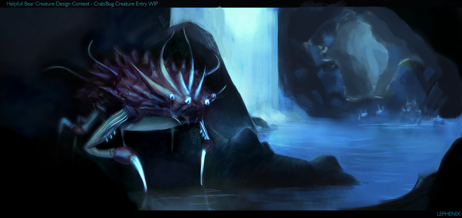
Hello fellow polycounters

.
I am participating in a contest, a creature design one. I am about to finish it.
The contest ends friday 20 of februrary and I need fresh eyes, comments and critics from you guys to help me push it further

. Thanks!
Here it is:

Replies
I might try to explain that more in-depth tomorrow, I apologize for just pointing out a problem then leaving but I'm right about to go to bed (sorry)!
Another point is the underbelly seems under-rendered-- I don't know what kind of texture that would be, and it just seems sort of plain, too. Ever looked at the underbelly of a crab? There's some interesting stuff going on down there.
Speaking of crab-bits-- the way the shoulders are jointed seems either like they might be either inflexible or a soft spot that would be a GREAT place for foes to latch onto. Again, have a close look at the way crab's legs are jointed into their body. I think you could easily make that more believable in the time you have.
That said, I do really love the top half of them, and the overall idea is cool. Would love to see some other (possibly bioluminescent) flora/fauna in the cave, maybe that's their natural food source or something. Would give more context to the background, too, and maybe introduce a focal point that would bring more attention to the creature itself.
Looking forward to seeing more, I'll drop back in ASAP and try to explain some stuff better if I can.
I'll definetly remvove the pure blacks. They look really bad.
Also a really good idea for the underbelly, I'll take a look at crabs. Same for th shoulders.
And I also thought about making special flora/fauna for this piece.
Thanks again
Thanks to everyone who helped me and supported me, espcially Polycount, Mike Azevedo, Jonathan Kuo, Simon Kopp and of course with the support of my class and my girlfriend Marine's Art Progress
Good luck!