The BRAWL² Tournament Challenge has been announced!
It starts May 12, and ends Oct 17. Let's see what you got!
https://polycount.com/discussion/237047/the-brawl²-tournament
It starts May 12, and ends Oct 17. Let's see what you got!
https://polycount.com/discussion/237047/the-brawl²-tournament


Replies
Nice design. I could see this as an enemy in a Final Fantasy game.
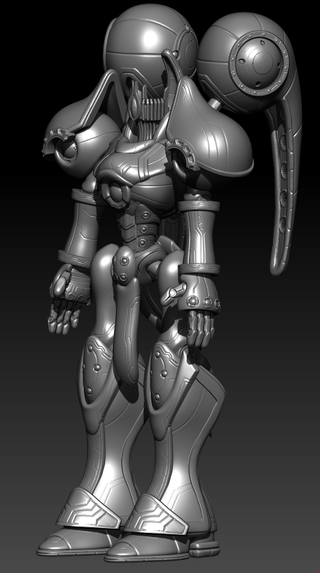
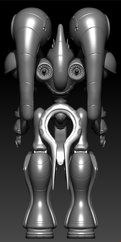
1 ) The jets would only let it go backwards, incinerating its arms as it does so
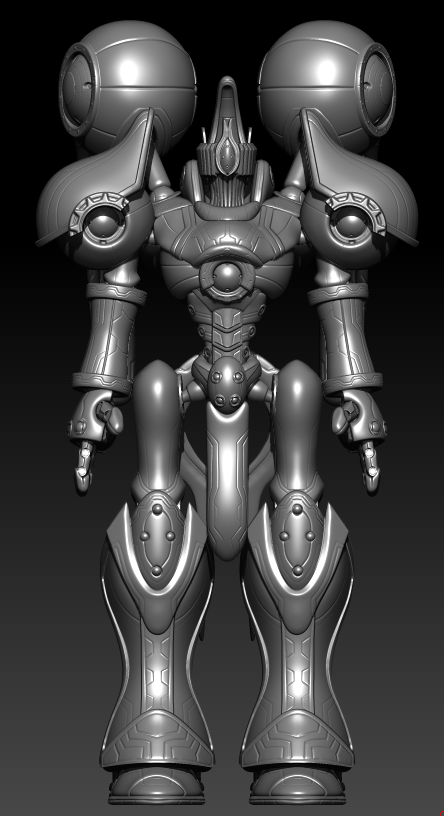
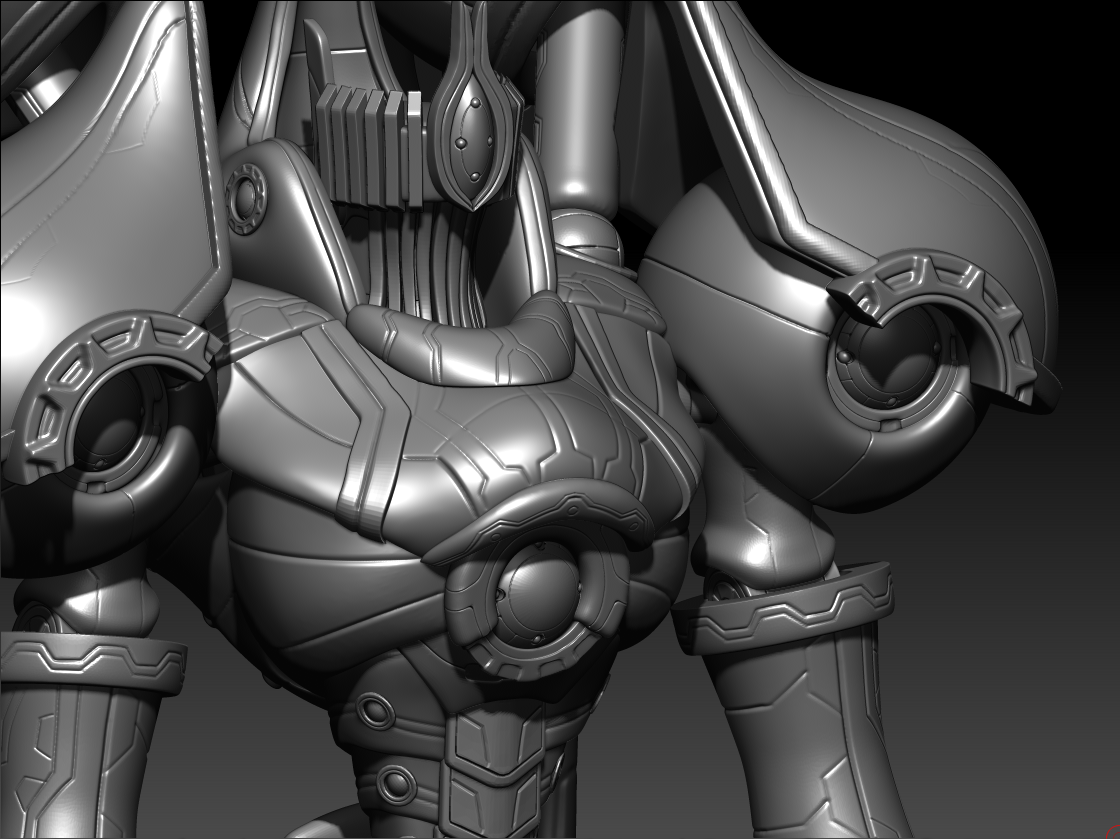
2 ) The head is a totally different style than the rest of the bot, and really doesn't look like it's even from the same culture or tech base.
3 ) The proportions look a mite awkward. Maybe making the legs and arms (especially the arms) a bit longer would give it a more graceful feel.
Tell me what you guys think!