Sketchbook: Learning Male Anatomy
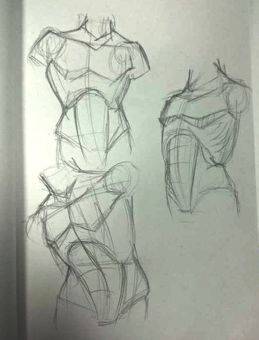
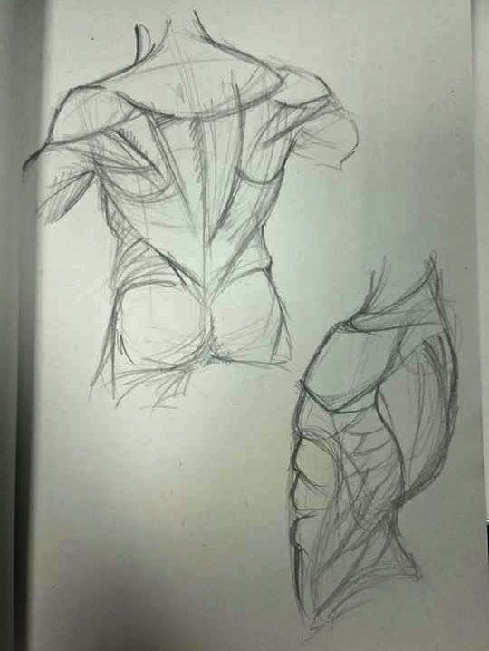
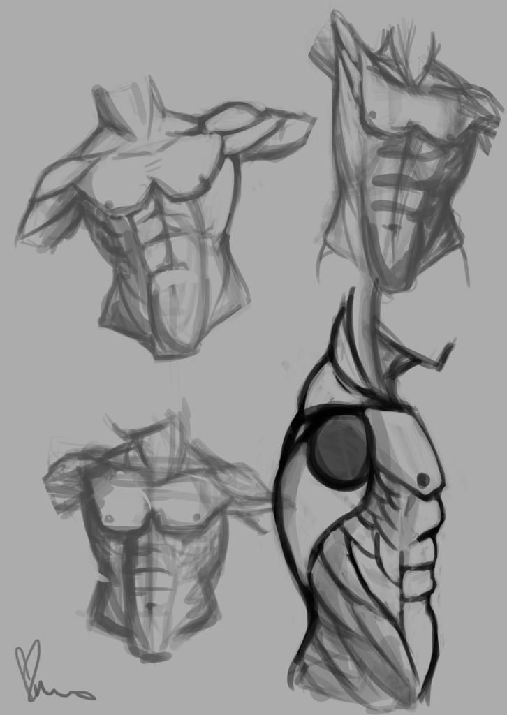
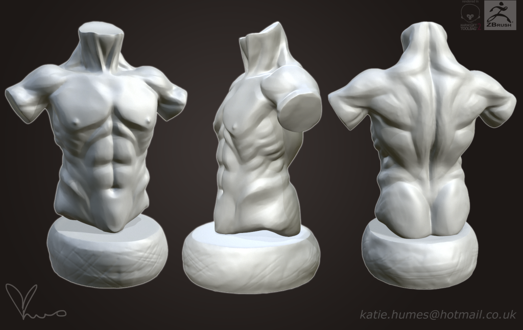
Really trying to push myself to be fluent with human anatomy, know where the muscles go, how the body is put together etc. Focusing first on the male torso. Some rough pencil sketches first, studying basic shapes and muscles, then a few quick photoshop renders, trying to think more digitally and work on my line art. Then finally into zbrush. Followed a tutorial for the initial steps http://alexs3d-blog.blogspot.co.uk/2012/10/lunch-crunch-17-male-torso.html and referred back to sketches. I'd really appreciate feedback on all fronts 


Replies
arms are harder than I thought :c
decided on a more dynamic pose
rough sculpt from research and sketches!
Now on to the legs
Started working on my own pose ideas rather from reference
Final rough sculpt (with bonus fig leaf for dignity
Is it just me, or is there something off with the lighting where his legs meet the plinth? to me it looks like he's floating, though colleagues say different...I tried everything in marmoset and photoshop's 3d viewer but it didn't come out any different. Hmmm
after a lot of adjusting and tweaking this is how he looks so far
especially pleased with this bad boy. Yey for reference!!
FACE TIME
The face ended up super boring and plain. So out came the move tool and gave him a douchebag expression to go with his douchebag hair.