BrickSpace - Homeworld mod
Hi all,
I mentioned my mod in the Homeworld Remastered thread and had a request for screenshots. I didn't want to derail that thread so figured I'd start one over here.
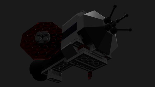
Each model starts out in MLCAD (community made LEGO editor), is imported into Blender where I trace a low poly version and build custom pieces to generate bakeable geometry (for AO, normals, and colors), and then is sent on to the game engine after being textured and rigged.
Finished lo-poly models.
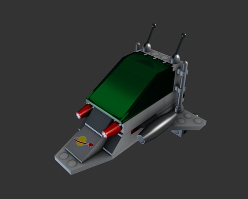
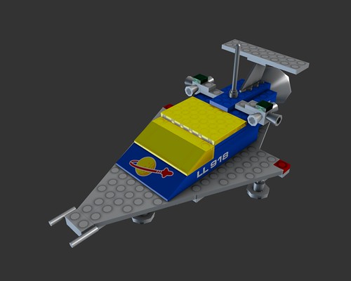
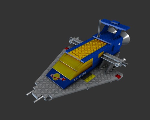
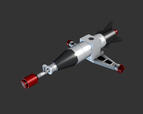
And a hi-res version in Blender.
I'm interested to hear y'all's critiques and feedback! I'm always looking for ways to speed up the content creation process as well as improve the overall look.
-Stefan-
I mentioned my mod in the Homeworld Remastered thread and had a request for screenshots. I didn't want to derail that thread so figured I'd start one over here.
Each model starts out in MLCAD (community made LEGO editor), is imported into Blender where I trace a low poly version and build custom pieces to generate bakeable geometry (for AO, normals, and colors), and then is sent on to the game engine after being textured and rigged.
Finished lo-poly models.


And a hi-res version in Blender.

I'm interested to hear y'all's critiques and feedback! I'm always looking for ways to speed up the content creation process as well as improve the overall look.
-Stefan-
Replies
Are you going to keep a consistent scale between the pieces?
The mother ship will be a crazy undertaking if you are!!!!
One thing I've been fiddling with since day 1 is that the ships I'm using for source material don't get very big. This is the flagship: http://brickset.com/sets/497-1/Galaxy-Explorer
As a result, it's been "warp-in" building so far. And any dock functions tend to be the ships flying in close formation for a few seconds while whatever action is performed.
It'd be a lot cooler if you could post some larger images. It's hard to really appreciate your work on such a tiny image. The lighting on the last image in particular makes it really hard to read.
I also think it's kind of weird how you have the studs baked down on some assets, but modeled out in others. Of course, it looks WAY better to have those modeled in, so I'd definitely go that way every time. If you're really tight on your budget, you could even get rid of the normal map, because the pieces don't really need it that much.
I've updated the first post with larger vesions. They also link to my Flickr stream for larger sizes still. Regarding studs, as a general rule I have not been including them on finished in-game models. If you see studs, it's probably the high res version that I pull the textures, AO, and normal maps from. The general reasoning is poly budget, though I suppose these days that's becoming less of an issue.
It definitely gets confusing for situations like this:
Here's another high poly model in Blender, with better lighting.
Those of you that work with game assets, do you end up using "mis-shapen" or odd geometry in your high resolution work? For example, I found that making the hi-res geometry match the lo-poly external silhouette resolves a lot of the issues I was having way back in this thread - http://www.polycount.com/forum/showthread.php?t=52886 - while still allowing me to catch all the edge highlights and other AO information that I want to include.
Also, I'd enjoy hearing y'all's opinion on whether this is an underutilized normal map, and what perhaps could be done to improve it, or what sort of additional information could be captured in the normal map.
Thanks!
-Stefan-
So down to business, right now its hard to tell what model your texture sheet is referencing to. I think 3 texture sheet might be too big for something of this size. i see alot of repeated objects that can easily overlap and give you more texture space. i would also give more texture space to the parts that are seen more and less to pieces that are less noticeable.
i hope you model the bumps that connect the legos together, because i noticed in your other lowpolys, they were normal mapped. what makes legos special is there ability to connect and break off. i think keeping them will really make your models stand out more.
Thanks for reading and good luck.
Do you live in a cave.......?
Thanks!
Definitely had your words ringing in my ears when I was finalizing the textures. I found a lot of things that I thought would end up with different lighting (the reason some pieces that should be duplicated sometimes aren't) that ended up looking completely identical. And I'm always looking for ways to reduce the number of UV islands, so the next ship I intend to take these lessons into account!
Edit: Oh, as for size, you are probably right, however this will be among the largest ships in the final mod, and the player will be limited in how many of these they can field. I definitely intend to have the majority of ships be limited to a single 1024, or at the most 2048 texture. Also they're DDS textures, so they will mip automatically.
Those studs add A LOT to the polycount, but I have designed these ships and textures to be compatible with an optional seperate layer of studs. That way the studs can be treated as a LOD layer.
The ship that the above textures belong to is now in game!
Remembering how to do weapons and muzzle effects, making more progress.
Note: All, if the pics are too big, just lmk and I'll shrink 'em.
I hit upon this idea to assist me in uvmapping this weekend. I gather it's fairly common, but it seemed worth sharing.
Green is unique UV maps, white/blue is stuff I haven't mapped yet, and red will be junk/duplicated UV maps.
I've taken Light On Switch's advice to heart and aggresively mirror/duplicate elements where I can to minimize their footprint on the texture sheet. Here's my two latest texture sheets (1024x1024 and 2048x1024 respectively):
Taiidan Attack Bomber - 1,070 triangles
6890 Cosmic Cruiser - 2,692 triangles
6780 XT Starship - 10,691 triangles
model