Home Contests & Challenges Archives Allegorithmic's 'the THRONE ROOM'

THRONE ROOM - Galactic Triumvirate - wvaughn409

First time doing one of these contests. I'm very excited to be part of this. I am going to do a sci-fi theme with a blend between ultra-futuristic alien-looking stuff but with an ornate religious visual accent. The throne room will have a glass dome thing that looks out into space as the room itself will be on a space-station. The throne itself will actually seat three individuals as the galactic governing body is a triumvirate.

For this project, I will be using...

Maya,
3DS (for some tricks I can't do in Maya),
Mudbox,
Photoshop,
Quixel Suite,
Substance Designer,
Substance Painter,
and will be delivering my final scene in either
UE4 or rendered using
Vray for Maya (depending on time constraints).

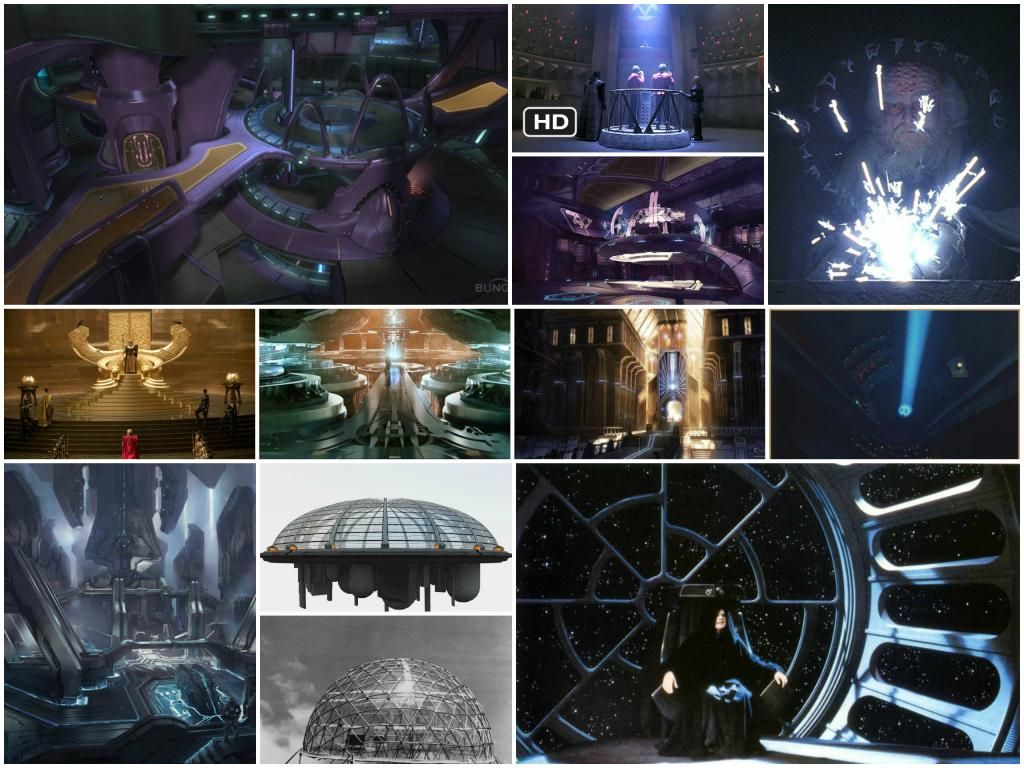
Here are a bunch of images I grabbed from Google to give me ideas: concept_collage_zps904dd30a.jpg
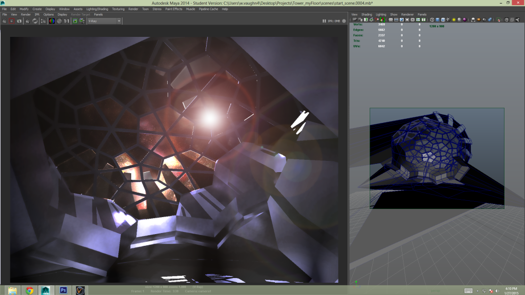
Here is what I have so far in Maya. I used some materials from http://vray-maya-materials.com/ to get an idea of what I want things to look like but nothing is unwrapped or permanent geo yet:first_go2_zpsc6585575.png
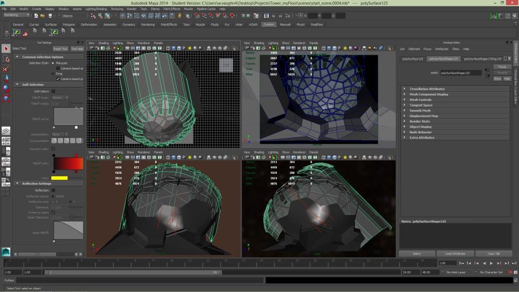
first_go1_zpsaf169790.png
...and then the same thing with a concept overlay of the 3-person throne equipped with holographic projector on armrest...
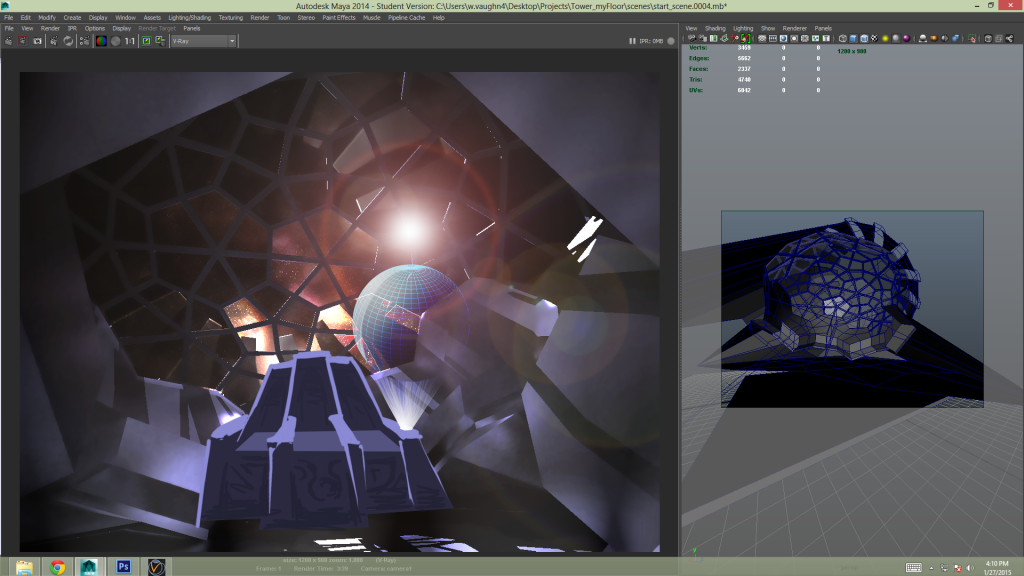
first_go1_throne_concept_overlay_zpsd7561005.png

more to come :)

Replies

  • wvaughn409
    An updated lighting scheme with some texture...
    0OYkjqF.png
    ...and the texture/material stuff...
    eycFrCw.png
    2jRt8oJ.png
    TfA7sQZ.jpg
    wrGTEJk.jpg
    JZvh3ke.png
  • wvaughn409
    Here is a sketch of my idea for the throne(s):
    yaWKyIu.jpg
  • wvaughn409
    Here is the throne at an early block-out stage with the stock UT3 male that comes with UDK (UE3). I'm using the sketches in the orthographic view-ports, but I had to modify some dimensions because i did not create the concept to accommodate a realistic humanoid sitting in it. So the seat had to raise and a couple other things. Also I added some divisions and threw a smooth on it for the render. Using vray subsurface scatter ketchup :)
    kupUCR4.png
  • wvaughn409
    here is an animation of the throne's movable parts...

    [ame]http://www.youtube.com/watch?v=F0Z3DOzSGcI[/ame]
  • wvaughn409
    So i finally got UE4 up and running again. Slapped some stock materials on stuff to get an idea of the direction i'm heading in. (not original textures)
    wIPtpAT.png
  • wvaughn409
    been working on putting in some more intentional metal scratches on the panel...
    w4xTj4u.png
  • wvaughn409
    i read the rules more carefully and discovered that i needed to declare that the terrain i put in the background of the removed image was a preexisting terrain that i had created in UDK, then ported over to UE4 last year, but it is no longer relevant as I have decided it was hideous, made the image too busy and confused the lighting scheme i was aiming for, and need to be altogether scrapped :poly136:

    ***THIS POST IS NO LONGER VALID***put a landscape in the background and am trying out the panel material. looks like i will need to do some major UV aligning/unwrapping, possibly have to redo the geometry of the walls too.***THIS POST IS NO LONGER VALID***
  • wvaughn409
    more geo for the blockout...
    XNIvDhc.jpg
  • wvaughn409
    Here is the new setup (3 thrones w/ clamshell & raised platform/red carpet walkway) in unreal w some DOF and stuff. post work in photoshop for fun. but i won't photoshop my final showcase shots or video flythru.

    First, a detail lighting shot...
    1IlZnBJ.jpg

    then with all the fancy stuff...
    TktHvnK.jpg
    ...also the material on the trim and the vertical shafts beyond the windows are stock materials that come with UE4. also the lens dirt is stock. Will replace all this w/ original textures and mats eventually
  • wvaughn409
    warm lighting. different angle.
    7Xxwdlb.jpg
  • wvaughn409
    and now i'm just getting carried away with all the little settings one can tweak :)
    LBVAAMd.jpg
  • wvaughn409
    so my better half informed me that i am getting way too obsessed with lens effects and lighting tricks and things and that it is probably hurting me at this point. so I'm going to stop polishing a turd and go back to making the models and sculpt bettter :)
  • wvaughn409
    sculpted out the side section of the throne in 3d Coat. Baked to mid range LOD (1600 faces) w xnormals. used ddo to add scratches and weathering
    IlwA41e.jpg
  • wvaughn409
    got the side panel in engine...
    ycnQFF6.jpg
    zeVB3EI.jpg
    KWo8zV8.jpg
  • wvaughn409
    worked on sculpting the seat...
    YUaGBCw.png
    BjWemL2.png
    LAtkqZD.png
  • wvaughn409
    changed some stuff. scaled room up. changed mats. other tweaks
    2unnawA.png
  • wvaughn409
    from left to right: lo-poly modeled in Maya, sent to 3d Coat for sculpt, export as obj, bake AO and normal in xNormals, subdivide lowest LOD 1x for better silhouette, generated object space normals from xnormal utility, gradient map from maya ramp shader & transfer maps, quixel ddo to add wear and material properties. rendered LOD2 with vray for maya (diffuse, spec, gloss, normal)
    URUExjY.png
  • wvaughn409
    hey everyone, i would like to humbly request some feedback on my stuff so far. I'm not looking for feel-good pats on the back mind you, only real constructive criticism. Apart from looking at what everyone else is doing, I think it would be refreshing to hear from you all because fresh eyes can provide insight on things that I don't see because I've been staring at this for weeks and lost objectivity. thanks in advance!
  • CrunchieNut
    Hi Vaughn,
    I would agree with your better half. Its very easy to get stuck into the fun stuff of lens flares, depth of field, epic lightshafts and trying bells and whistles like depth of field. I find myself falling into that sometimes, where I've spent 2 hours in the editor just messing with values and post process. The problem is that you need to do the hard work of making some solid assets before allowing yourself into that part. Its a layering process and if you dont lay the foundation you can end up obscuring everything with lighting/effects and the like. You end up not able to see what you've made and if the basics are working.

    I would advise doing more work like you've done on the throne. Its a nice asset where you've taken the time to sculpt it, bake it and think about how it works. Just force yourself to take that process and apply it to the next piece in baby steps. Say, ok I need that round pedestal/dais that these thrones sit on. Dont skip ahead an just put a tilable material on it. Although that might not be bad to get a general idea of where you're going for the scene, you can end up running ahead and leaving lots of assets unfinished. Before you know it you're trying to tackle the whole thing at once and you feel a bit scatterbrained.

    Anyway, I always find it helpful to tell myself to shut up when I'm getting overwhelmed like that. Stop, pick an asset and finish it. Move on to the next. Before you know it you've got lots of cool bits you can make your scene with. You've laid the foundation that you can then get stuck into the post stuff! Keep it going, hope this is helpful in some obscure way!!!
  • wvaughn409
    Thanks CrunchieNut! I really appreciate the time you took to look through my stuff and provide feedback. And i totally hear you. I found myself nodding emphatically and saying "Yeah! I do do that!" while reading through your post. I will take your advice to heart and focus on laying that foundation one baby step at a time. Thanks again!
  • wvaughn409
    k so before i read CrunchieNut's advice and was still spending too much time playing with settings in engine, i landed here...
    xAYZeUU.png
    But now I decided that the thrones looked more like captain's chairs on a space-ship than a more regal architectural structure that one would envision for a throne. so before I got too far in the sculpting, I am running with this new blockout...
    J0cKyjf.png
    and here is a close-up of the arm rest so far...
    FwxTLqq.png
    Thanks again CrunchieNut for helping me to re-focus and build some momentum!
  • Minos
    Offline / Send Message
    Minos polycounter lvl 16
  • wvaughn409
    Thanks Minos! Your team's recent shots for The Temple of Utu are very impressive. The eight pointed star on the floor is amazing, as well as the overall architectural detail and fidelity.

    Here is the most recent throne component work (sculpted & baked AO & normals)
    6yMAm05.png

    and i'm having trouble deciding which lighting/environment scheme I like best out of these four. any thoughts?
    MkEBWLk.jpg
  • wvaughn409
    worked on the seat back.
    exH71vq.jpg
  • wvaughn409
    here is my first attempt at a fly-thru video. not by any means a finished scene...

    [ame]http://www.youtube.com/watch?v=T8tOS4UNg5Y[/ame]
  • wvaughn409
    Better late than never right?.... well i hope so. Here is where i was at some point during crunch time when all the coffee and hot pockets in the world couldn't save me from having a project with way too large a scope and not enough time to do what i set out to:
    TspYUUl.jpg
    CfXw8VW.jpg
  • wvaughn409
    ...and then my better half informed me quite frankly that my arch/clam-shell thingy was lame and suggested that i spice it up a bit. So after doing that, and then playing around in unreal importing re-importing and messing with settings for shamefully long time, here are the final shots I pumped out and ended up using a monochrome version of the far back shot and the close up for shots on my portfolio website
    XLGeAEP.jpg
    XZV0COX.jpg
    Sd14nxO.jpg
    Qx5rcqq.jpg
  • wvaughn409
    I was going to do an updated fly-thru video but since changing certain settings, I am having some situations where things get really dark during parts of the fly-thru and u can't see what i'm trying to show. it's the exposure settings and i'm sure you can control that stuff in matinee but i do not have the opportunity to fuss with it ATM. Seeing as how the top ten are all but announced and they all look absolutely incredible, I may just set this whole thing aside and revisit the project later this year. This has definitely been one of the most challenging and rewarding experiences of my career and a whole lot of fun. I think I'm hooked.
  • Minos
    Offline / Send Message
    Minos polycounter lvl 16
    Very cool entry man, the throne looks dope!

    btw you can easily disable eye adaptation with a global post process volume :)
  • Spoon
    Offline / Send Message
    Spoon polycounter lvl 11
    Yeah, wild throne :)

    Minos is right, I think you have to actually ENABLE it in the post process, and then just clamp the min and max to the same value :) You can also change the speed at which the eye adapts, to something near instant. I thought that was a nice way to work, actually :)
  • wvaughn409
    Thank you both for the compliments and advice! Temple of Utu and Halls of the Divine are looking fantastic! Congratulations to both of you on excellent work!
Sign In or Register to comment.