Home 3D Art Showcase & Critiques

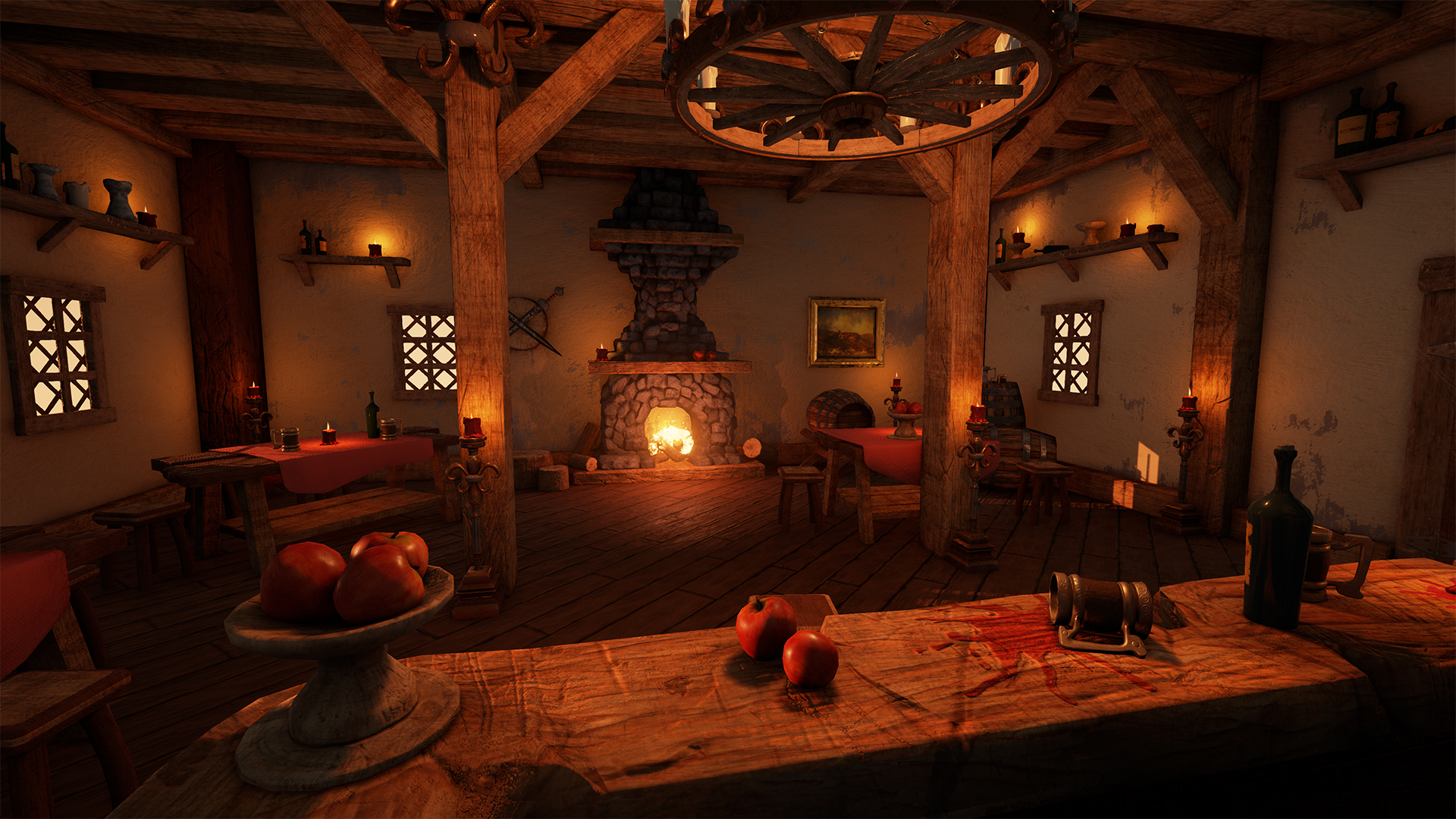
Tavern Environment Unreal 4

polycounter lvl 5
Offline / Send Message
DIABL0X polycounter lvl 5
Hey guys!

I´m working on my Portfolio and finished my first little Scene. It´s inspired by this concept here ( not from me) :

My intention was to get used to Unreal 4 and the PBR Workflow ( i used Substance Designer & Painter ).

Really would love to get some feedback and crits,

greetz Diablo

concept_taverne_by_diabl0x-d8fbqk5.jpg

4_by_diabl0x-d8fbqlz.jpg

1_by_diabl0x-d8fbqmq.jpg
7_by_diabl0x-d8fbqlm.jpg
9_by_diabl0x-d8fbqkq.jpg
8_by_diabl0x-d8fbql6.jpg
3_by_diabl0x-d8fbqmb.jpg

Replies

  • Texelion
    Offline / Send Message
    Texelion polycounter lvl 8
    I think your lighting is a bit too much monochromatic, everything is orange. I had the same problem in UE4 until I discovered the ambiant cubemap. Basically, you can create a texture in photoshop ( plain color of the ambiant color you want, OR you can just have it grey and then change it with the sliders in UE ), a small one is enough, save it in HDR or HDRI and import it in UE4, then plug that texture in the Ambiant cubemap slot of your post process. Everything that is not directly touched by a light will take the tint of the ambiant cubemap, so you can create color contrast like hot/cold ( a blue ambiant generally works well with orange lights ).
  • Joltya
    Offline / Send Message
    Joltya polycounter lvl 10
    FOR THE LOVE OF GOD USE SMALLER IMAGES! It took 10 minutes for this page to fully load for me (no joke).

    Other than that, it looks pretty cool. I agree with the above poster about the lighting as well.
  • DIABL0X
    Offline / Send Message
    DIABL0X polycounter lvl 5
    Sorry for that, i reuploaded the pics. Thank you for the feedback, i took a look into the ambiant cubemap, have to experiment a little bit more with it, but i see the point :)
    I had to struggle with the Lightning quite a bit... Thank you for the good advice !
  • Carabiner
    Offline / Send Message
    Carabiner greentooth
    This is looking really good! Personally, I'd tone down the scratches on the bar a bit. I feel like they would be less prominent overall, and instead I'd concentrate scratches in specific areas/around the edges, where it'd naturally get more wear and tear.
Sign In or Register to comment.