Fighting Stage redesign (UNI module)
Hi here is my first semesters progress of my UE4 scene of a fighting stage redesign that was created for a university module.
I decided to choose the extravagant underground scene from Tekken and my idea was to create a destroyed version of the environment for my redesign.
I will be updating this forum post with my second semester's improvements for the environment. Any feedback or suggestions will be greatly appreciated.
Scene
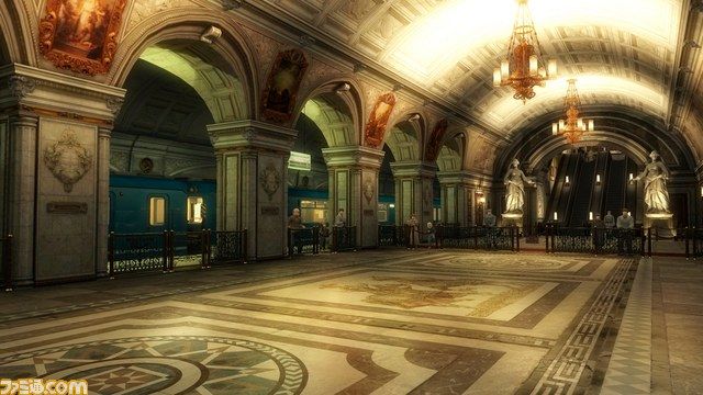
Composition (rule of thirds)
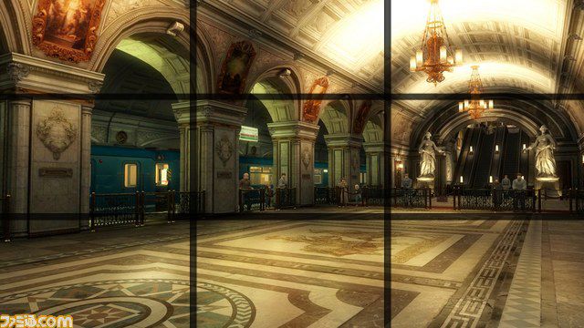
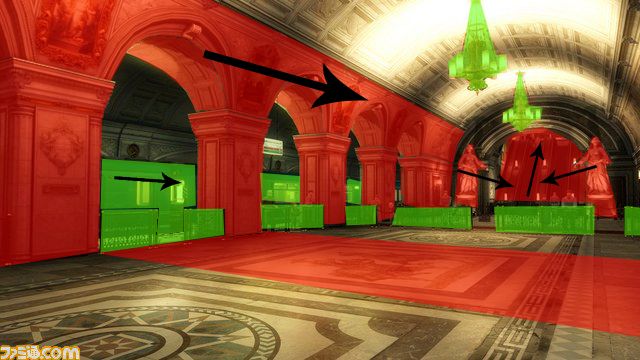
Features and Flow
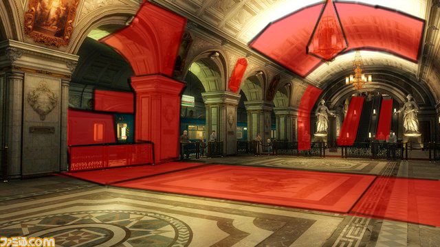
Main Modular Pieces
Colour Palette
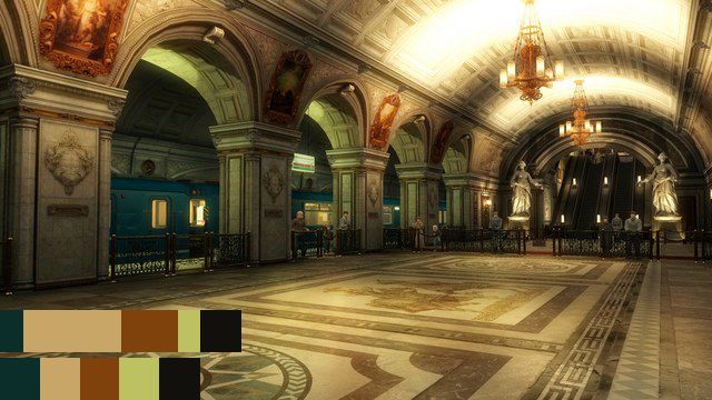
Mood boards
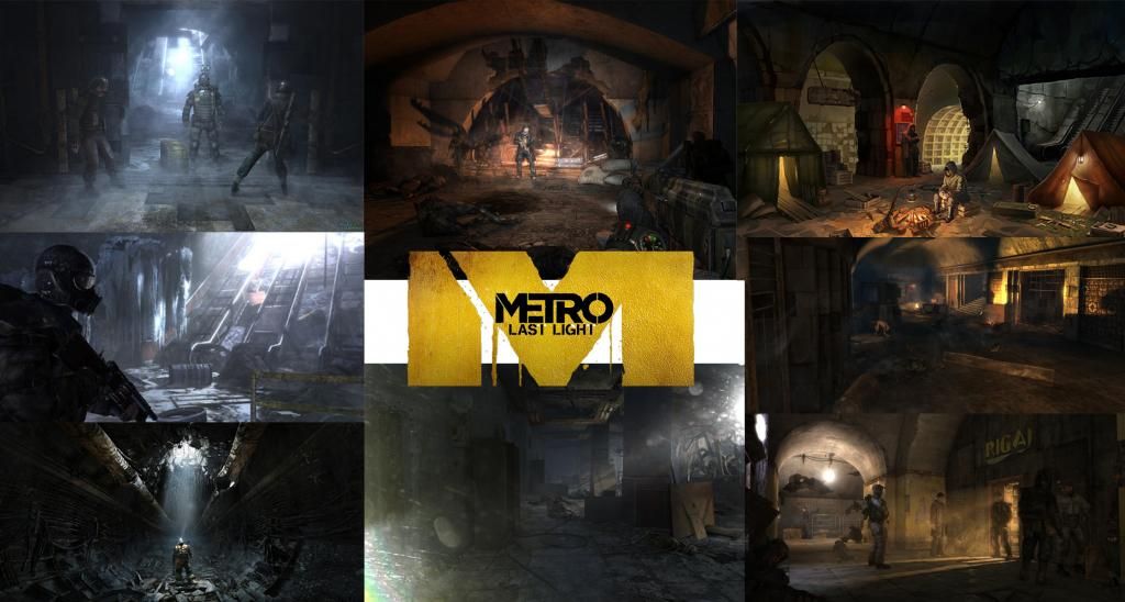
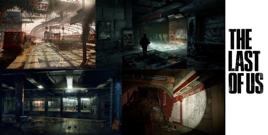
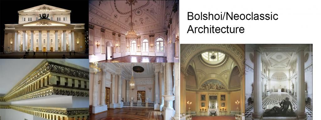
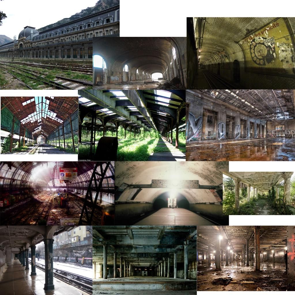
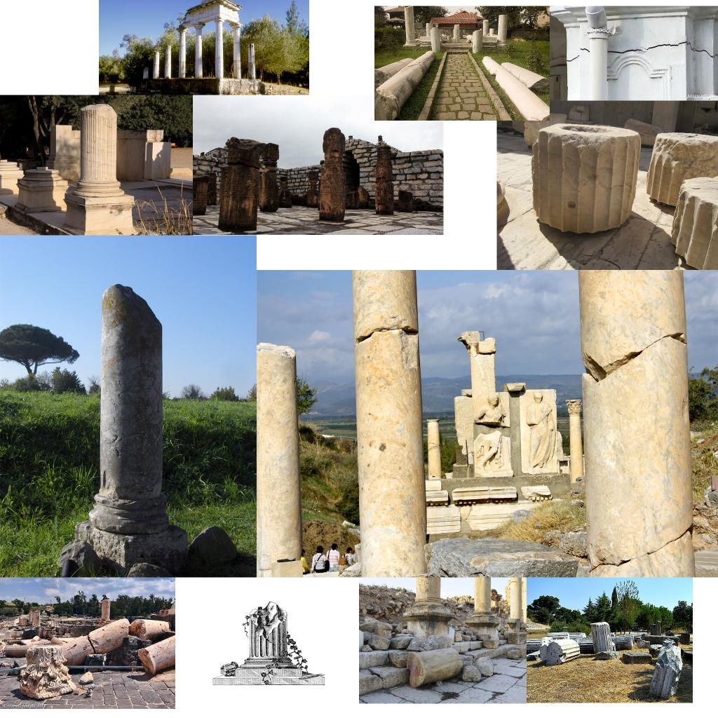
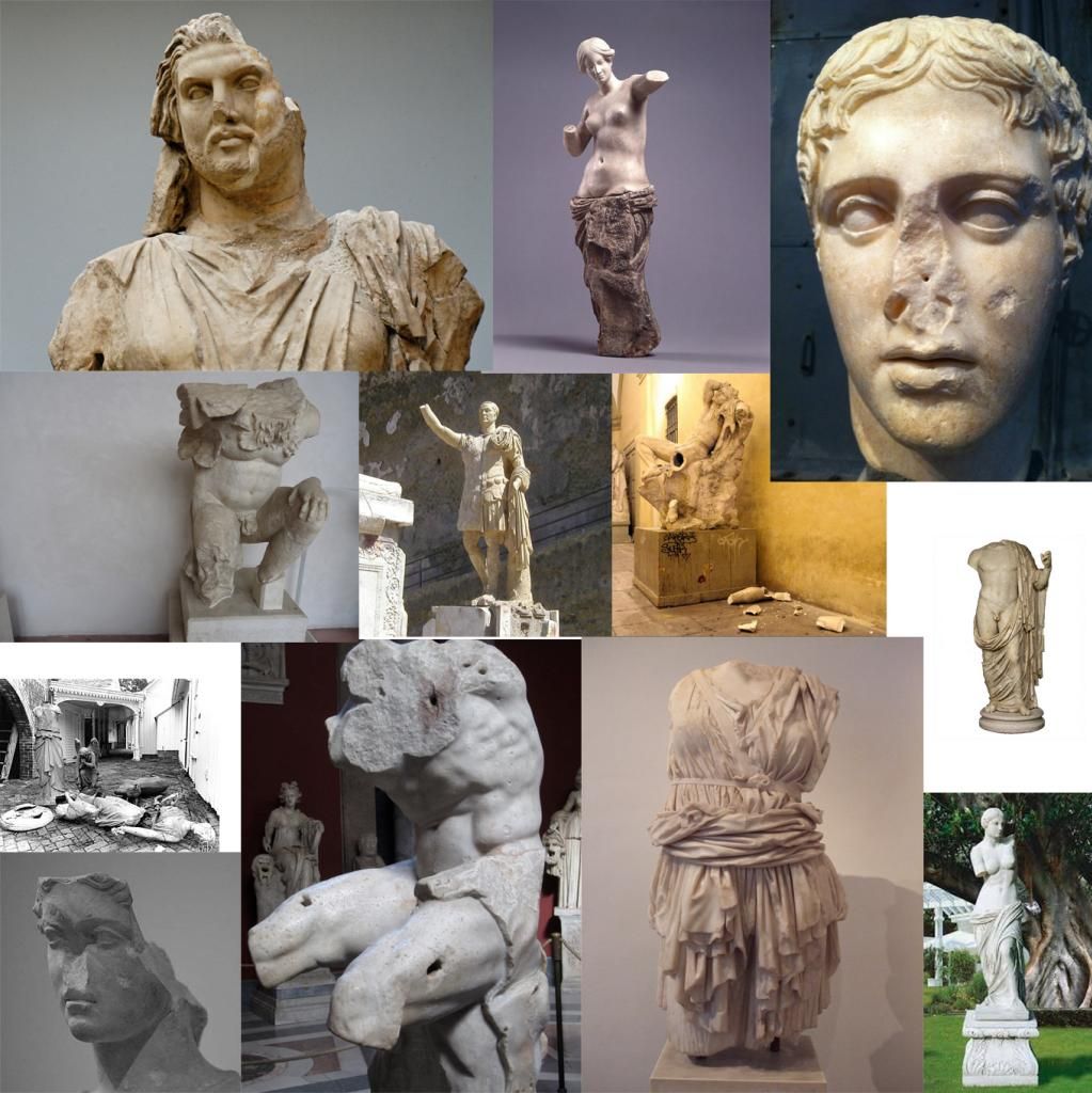

Redesign idea
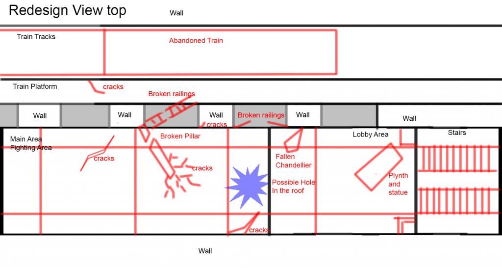
Rough colour and silhouette layout
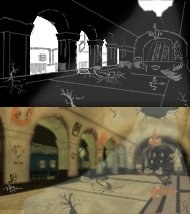
I decided to choose the extravagant underground scene from Tekken and my idea was to create a destroyed version of the environment for my redesign.
I will be updating this forum post with my second semester's improvements for the environment. Any feedback or suggestions will be greatly appreciated.
Scene

Composition (rule of thirds)

Features and Flow

Main Modular Pieces

Colour Palette

Mood boards


Redesign idea

Rough colour and silhouette layout

Replies
Progression paintover
Minor details
Lightmapped scene
Master material for flooring
Final renders for semester one
Detail lighting
Textured renders
Overall my outcome above fell short of my destroyed redesign aim and still looks too neat and tidy. Here and my main points for this semesters improvements.
More detail on the roof as at the moment it looks boring and repetitive. I will most likely sculpt ornate details in Zbrush to remedy this problem.
The debris looks out of place and the harsh falloff fails to make them blend into the scene, so greater consideration for where the debris has come from needs to take place and will possibly have to be redone.
Vertex painting needs to be used to paint dirt, dust etc over models.
More complex shaders within engine, using textures rather than values.
The flooring seems a bit too flat and could do with breaking up into multiple broken pieces. (could also potentially benefit from a bump offset.)
Here is a rough paintover of my suggested improvements
Any additional suggestions and feedback would be greatly appreciated
There's a lot more interesting texture detail in the Tekken reference than in your recreation.
Also your arches don't reach up as high, which means they don't expand out with the central tunnel the way the originals do. This makes the composition a lot flatter.
Currently you have the broad structural/lighting information in place, but your only high-frequency detail is noise & you have barely any medium-scaled detail (colour blocking, generally) in place at all.
I've directed the destruction towards an earthquake that has struck the station.
Any feedback and suggestions will be greatly appreciated
Since my last post I re jigged the lighting so that the viewers eyes were drew down the corridor, added more particle effects, add physics too the scene as well as additional meshes.
Here is a brief fly through too, sorry about the lack of audio.
[ame]
looking good. I really like the improvement you've made, especially color-wise. Are those dust particles unlit? Because lit particles work quite well for dust and currenty I think the particles look too big/opaque/bright.
You could perhaps also add some DOF, if only just near focus blur (to blur the particles close to the screen) if you don't want to blur any of your scene.
@ nickcomeau Thank you for the feedback it's greatly appreciated. The stone material is mostly a tiling texture so i'll go back into the shaders and make it more uniform over the meshes.