Home Contests & Challenges Archives Allegorithmic's 'the THRONE ROOM'

THRONE ROOM - King Of Graveyards - MDStranger

I thought up this idea after several long sessions of playing New Vegas, and liking the idea of creating an environment in total ruins, combined with looking through several screenshots of games like Dark Souls, and I came up with the concept of making a sort of throne room for a Death type character, where the whole level is in shambles and basically "Dead"

My reference shots for locations, atmosphere and style of lighting are as such below:
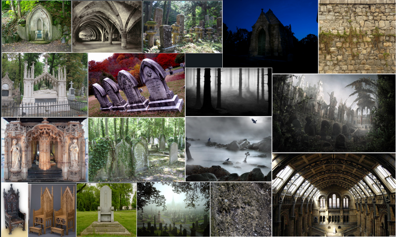
ThroneRoomReference_zps235cc540.png

Replies

  • MDStranger
    Got a super rough layout here, cones are meant to represent general debris in the area, planning to rip parts of the roof off as well, allowing a nice look at the night outside.

    2_zps0a240479.png

    1_zps1371cc45.png

    I've collected more reference art to use, such as that for Tzompantli, a skull wall which will be pasted in various parts of the environment.
  • MDStranger
    Some update pics that nobody will care about

    tsgxs_zpszxthqr39.png

    gvyhfgh_zpsxsav8vzq.png
  • polytom
    Offline / Send Message
    polytom polycounter lvl 4
    Hey man, I care! :)

    Nice progress. What engine do you plan on using?..
  • WarrenM
    Some update pics that nobody will care about
    The judges care.
  • MDStranger
    polytom wrote: »
    Hey man, I care! :)

    Nice progress. What engine do you plan on using?..

    UDK4 most likely, need to get used to using it more since moving up from UDK3

    In addition, also considering making the stairs steeper so that the throne is higher and more visually impressive, did also considering whether or not to add more graves, since it is meant to a be throne room for the King of Death, but also fear that could make the scene too cluttered.
  • MDStranger
    Updated pic of the throne.

    vhfcyh_zpsmh6et6wp.png
  • MDStranger
    Quick update, works slowed down abit due to personal issues, hoping to pick up pace again soon

    ih_zpsdvtjyje4.png
  • jsargent
    Offline / Send Message
    jsargent polycounter lvl 5
    I did the natural history museum for my last pc contest entry! Its some amazing architecture! Nice start, good luck!:)
  • MDStranger
    Another update pic, the debris has been done in separate files since I didn't see the point of importing them in 3DSMax only to have to do it again when loading the level in UDK 4, the only reason the graves are there are for the sake of presentation atm.

    2_zps3lzz7mrw.jpg
  • MDStranger
    Small update to let all 2 people interested in this that I am not dead, and have been alternating between creating UV unwraps in addition to re-doing certain parts of the level to add more detail, I hope to spend this final month of the contest focusing on lighting and texturing if all goes smoothly.
  • MDStranger
    Quick sneak peek at my progress, been updating some details of the level I initially got wrong and adding the debris to the environment.
    D4w6kRA.jpg
  • MDStranger
    I have a first pass of the level finally complete, I aim to mostly focus on lighting, mainly to put more attention on the throne itself, as well as to add atmosphere.

    HighresScreenshot00007_zpsrh2aglrq.png
  • MDStranger
    Because I enjoy talking to myself, here's another pic, I've been busy trying to combine both a dark feel to the level, whilst still having enough light to see what's going on as well as to take advantage of reflections.

    Disconnecting the skybox from the directional light to lower the sun enough to make it night, I used further post-processing using tint, scene color and vignette to aid the dark feel, hopefully making the level appear desolate and lost.

    I am considering adding some torches to the level to further help in player sight, because it takes a while for the viewport to adapt to the darkness as it stands.

    HighresScreenshot00014_zps5lir4dgx.png
  • MDStranger
    Okay, think I've resolved the "Too dark to see anything" issue whilst still retaining a night feel, in addition to toning down the bloom to make it more subtle, I've also changed the scene color to more of a purple one.

    I've made it so that the Bokeh, bloom, atmospheric fog and saturation helps add something of a washed out look to the level, which is a look I'm enjoying atm.

    And finally, I've also been adding foliage to the level to make it look more desolate, as well as to make the environment abit more interesting to look at, as can be seen in the second pic, I plan to make these vines and plants look more withered before submission.

    HighresScreenshot00002_zpsbdtxn6is.png
    HighresScreenshot00001_zps4u9ntxwr.png
  • MDStranger
    Some quick pics of my current scene, redid the throne because I wasn't happy with the original design.

    In addition, using a Lerp as well as a red and blue mask, I was able to mix the original granite flooring with a wrecked concrete texture, allowing it to give the appearance of debris everywhere, in addition to making the floor more interesting to look at.
    1_zpsbjfutxyh.png


    2_zpsfqjtuaby.png
  • MDStranger
    A quick look at my ground texture, which I thought might be important considering it uses the GT Free Textures off of the UDK marketplace, plus I am meant to be showing off how I do things anyway, so here you go:

    1_zpsbo9rgktw.png

    As explained in my last post, I did the floor texture like this to add extra dirt to it, considering the state of the rest of the level, it made no sense for the floor to be pristine, so I used a Lerp to mix in a concrete and mud texture with the granite floor texture.

    In addition, I have also been using the mud texture in combination with my other materials, using overlay to add a slight grime to them, adding to the levels feel of ruin.
  • MDStranger
    Okay, just about ready to upload, got 6 different beauty shots with 2 different lighting patterns, still arguing with myself over which set of pics to upload for the final submission

    Set 1
    111_zpsrmalpmfa.png
    333_zpslix201bc.png

    222_zpsbgonmb8k.png

    Set 2

    a1_zpsaolugasv.png

    a2_zpsn9ttymgr.png

    a3_zpsmb790g0b.png
Sign In or Register to comment.