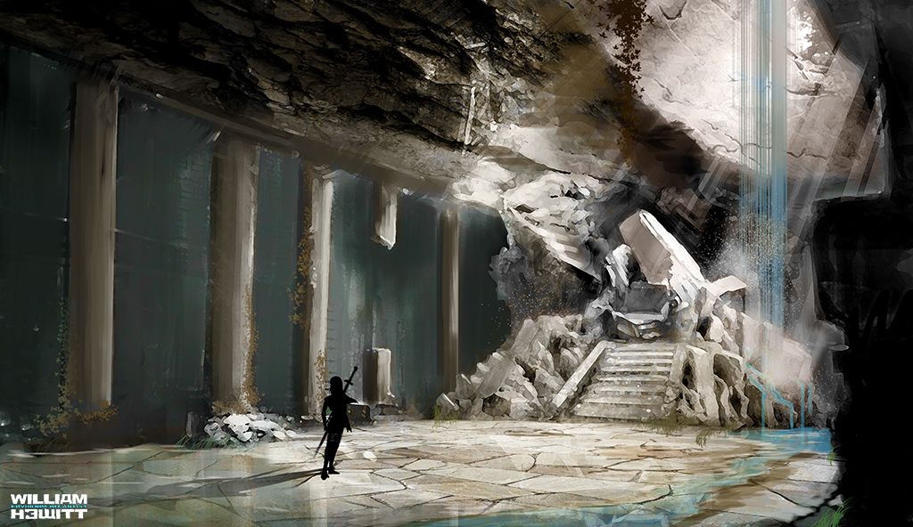
First Attempt at Concept art
Hi peeps. I am an environment artist currently working in the game industry. I primarily work in 3d (I LOVE ZBrush!!) but recently I've been getting bolder with my 2d stuff. This is my fist attempt at a full fledged concept art piece (so be gentle lol). C&C is greatly appreciated and much desired!! Hope you enjoy it. 


Replies
The first iteration has really good composition with the lines on the left leading to the focal point, and the strong contrast between the lit rock and the dark background behind. But in this update the lines are lost a bit, and the contrast has been lost on the focal point as well. The character reference really stood out in the first one too, even if it's not a main foal point, but it too is now lost a bit into the darkness behind it.
Now when I look at your new version, I don't know where to look at first glance, it's all starting to blur together.
I hope this helps!
Also, the water seems too opaque and could probably stand to be more reflective.
Keep it up though, definitely a strong first attempt.