Grassland Environment - Unreal 4 - 1 Week Project
Hi all, it's me again 
For university I got the task to create any project I want, only limitation is that it has to be finished within a week. Started on wednesday, so I have a few more days to go.
I decided to finally start learning Unreal 4 and create a grassland environment, inspired by some kind of autumn alaska tundra grassland whatever. So warm colors, lots of grass and mountains in the background. Here's the current progress:
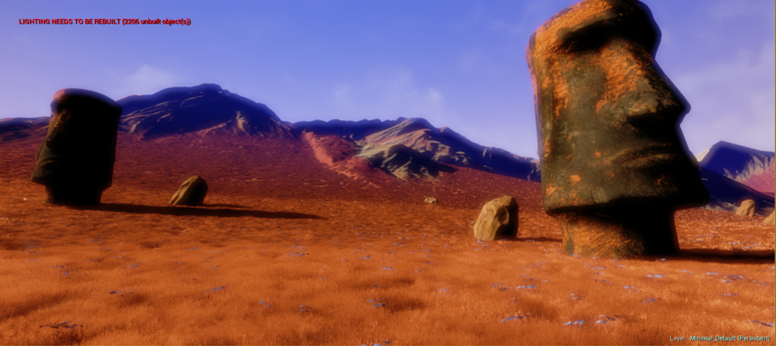
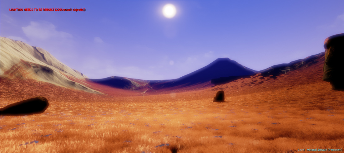
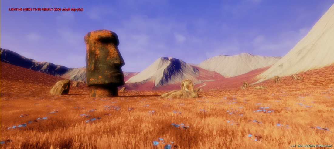
Right now I am having the problem that I don't really now what else to do. Maybe some more vegetation and rocks..
So I am very thankful for every advice (ideas what else to build and technical critiques).
For university I got the task to create any project I want, only limitation is that it has to be finished within a week. Started on wednesday, so I have a few more days to go.
I decided to finally start learning Unreal 4 and create a grassland environment, inspired by some kind of autumn alaska tundra grassland whatever. So warm colors, lots of grass and mountains in the background. Here's the current progress:


Right now I am having the problem that I don't really now what else to do. Maybe some more vegetation and rocks..
So I am very thankful for every advice (ideas what else to build and technical critiques).

Replies
Are you using a post processing effect? The contrast levels seem really crunched. Your shadows are almost pure black and there seems to be a strange color correction or color saturation applied? I would just take out the post processing effect for now. It's distracting from the areas that could be given critique on.
Post processing aside, this looks like a decent start. At this point there's not too much to give feedback on.
Perhaps you could post your reference images?
What I was trying to recreate with the post processing effect are the blueish mountains in the backgrounds and the really saturated grass in the foreground (see reference), but maybe it needs a bit more tweaking.
I already tried to get rid of the harsh black shadows, but had no real succes so far. I think it has something to do with the directional light I use. I tried to use a skylight to counter this problem, but it totally messes up my colors.
(even thoguh I'm not sure if I'll leave it in the final environment.
Also tweaked my landscape material a bit more, it now blends the world color and world normal texture with black and white detail textures and normals (which can have individual scaling factors) based on a splat map.
The hard black shadows are because I haven't build my level yet, but it takes way too long to do so (I have to be finished within a wekk, remember?). So I have to get creative and create a second detailed level with a medieval camp environment (yaaay) and since I am presenting a video I can then edit the footage of the two levels together. Atleast that's the plan.
Some asset tests for the camp:
Thought about using vertex painting for that later, when I finished the modelling. Since I only have time till wednesday morning, I want to finish modelling/texturing tomorrow and do all the level building/tweaking tomorrow evening. Tuesday then is for creating flythroughs, rendering the videos, working on the presentation and all this stuff.
Tomorrow I will be building the final environment, create particle effects for fire and smoke ( which I have never done before, we will se how it turns out..) and vertex paint dirt and wear and stuff onto the meshes. If I have some time left I will do more tweaking and maybe even do a few more assets.
You could turn down the brightness on the wood textures a bit. I have a feeling that they might coincide with the bright values of the ground and get lost when placed inside the level. Also makes it look more used.
Did the final composition today as well as some vertexpainting (mainly dirt).
Depending on my motivation I will maybe do some more assets, but plan for tomorrow are creating the final flythroughs. Also compiled the game for presentation purposes, so you can fly around the level^^
But if I have still time left after setting up the cameras for the flythrough, I will look into that
https://www.youtube.com/watch?v=a25bk0x7S2U
Made a few more little assets like the palisades, bread, plates and bags.
Something appears to be wrong with the youtube sound (my file is okay..) but I'll look into that tomorrow, too tired now.
Let me hear what you think about the result of this 1 week project