Frosty Barbarian - C&C Needed
Frosty Barbarian!
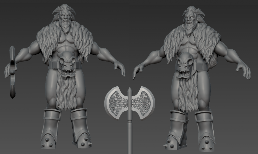
Here is my initial sculpt, all Dynamesh/ zRemesh apart from the axe.
Initial Sculpt:

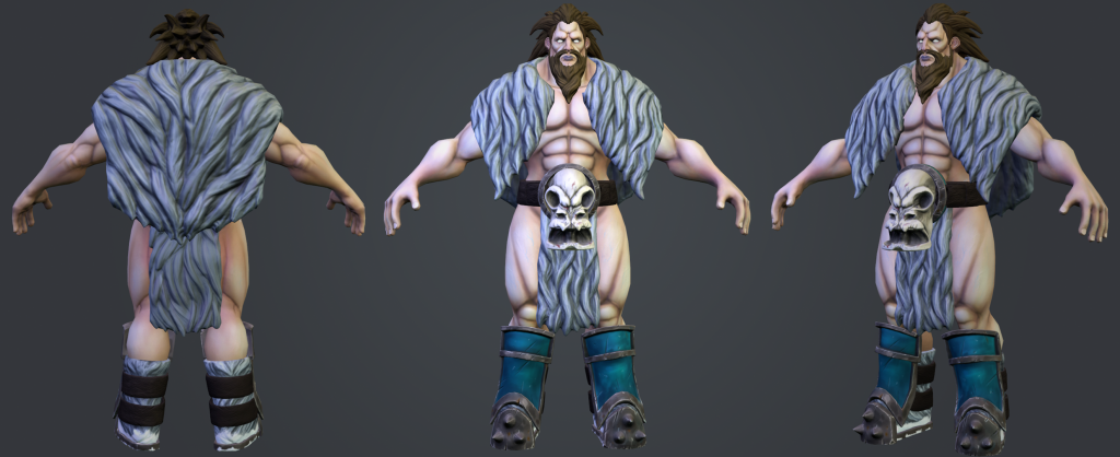
Current Progress:

Full Project Progress:
Detailing: Done
Retopo: Done
UV: Done
Texture: In Progress
Presentation:In Progress
I look to forward to any critique and hope you like what I have got so far
Here is my initial sculpt, all Dynamesh/ zRemesh apart from the axe.
Initial Sculpt:

Current Progress:

Full Project Progress:
Detailing: Done
Retopo: Done
UV: Done
Texture: In Progress
Presentation:In Progress
I look to forward to any critique and hope you like what I have got so far

Replies
Im really excited to test out my hand painting texturing skills again once he is all unwrapped.
Critique welcome as always guys, dont be shy
Quick update, hes retopod and unwrapped and i have started texturing but feel like im getting a bit stuck looking at it with the same eyes.
I have tried to use green and purple tints on the skin to make the barbarian look cold so hopefully that comes across.
Any paintovers or critique would be much appreciated.
Also whats the best method to render hand painted textures? im using mental ray and have tried marmo but cant seem to match the look i have in 3d coat on unlit mode.
Cheers Lads!
If you haven't already given this a look it's definitely worth a read.
http://media.steampowered.com/apps/dota2/workshop/Dota2CharacterTextureGuide.pdf
Rendering wise, again hopefully someone with more hand painted experience has an answer for this, but I do know marmoset has a selection of more ambient IBL maps that you could use for a flat effect and combine it with a couple of strong lights to pick out the details.
Looking forward to seeing the finished model!
I have added in some point light maps from my high poly and mixed up the lighting and i think it is starting to look better
kind of losing the cold skin feeling now but that was always going to be a challenge.
If you have any other examples i would love to see them and try and push my work as far as i can.
Update:
Keep the critique coming and i really appreciate your responses
Tried to finish this up and am gonna try and pose this up soon!
I think the colours are starting to pop a bit more and marmoset is starting to do the model justice
C&C still welcome as always!
http://www.marmoset.co/toolbag/learn/character-lighting
Is a very good tutorial for studio lighting within marmoset. Depending on how much of a 'flat' style you want the final render to be, will determine how far you push things like rim lighting and deep shadows, but even a very subtle back light with specular highlights should make your model pop a bit more.
Lastly I can see you've got AO information within each part of the model, the body, the fur ect, but have you considered getting an AO pass for the whole character? As in, the fur on his back will cast a very subtle shadow onto his arms and so on. This should help the various parts sit better and bring some depth to the render. Be careful not to push it too far though as you don't want to blow out texture information with AO shadows.
Looking forward to seeing it posed!