Teach me 2 art?
Hi, I'm new here. I registered after a friend suggested polycount as a way to learn and grow in both 2D and 3D. I'm currently taking a class to really start doing characters in 3D, so I'm sure I'll be posting a lotta stuff over there too as the semester really gets going.
But today I'd love some feedback on ways to improve- I know I have a long way to go and would greatly appreciate any ideas, suggestions, or criticism, whether that be on general technique, fundamentals, or character design.
Attached are some relatively recent characters I've done.
For more sketchbook stuff (I haven't started a sketchbook thread on polycount yet) my blog is regularly updated: http://zachheckert.blogspot.com/
Thanks for your time, looking forward to getting to know you all (and maybe being in a position to help give critiques too someday!)
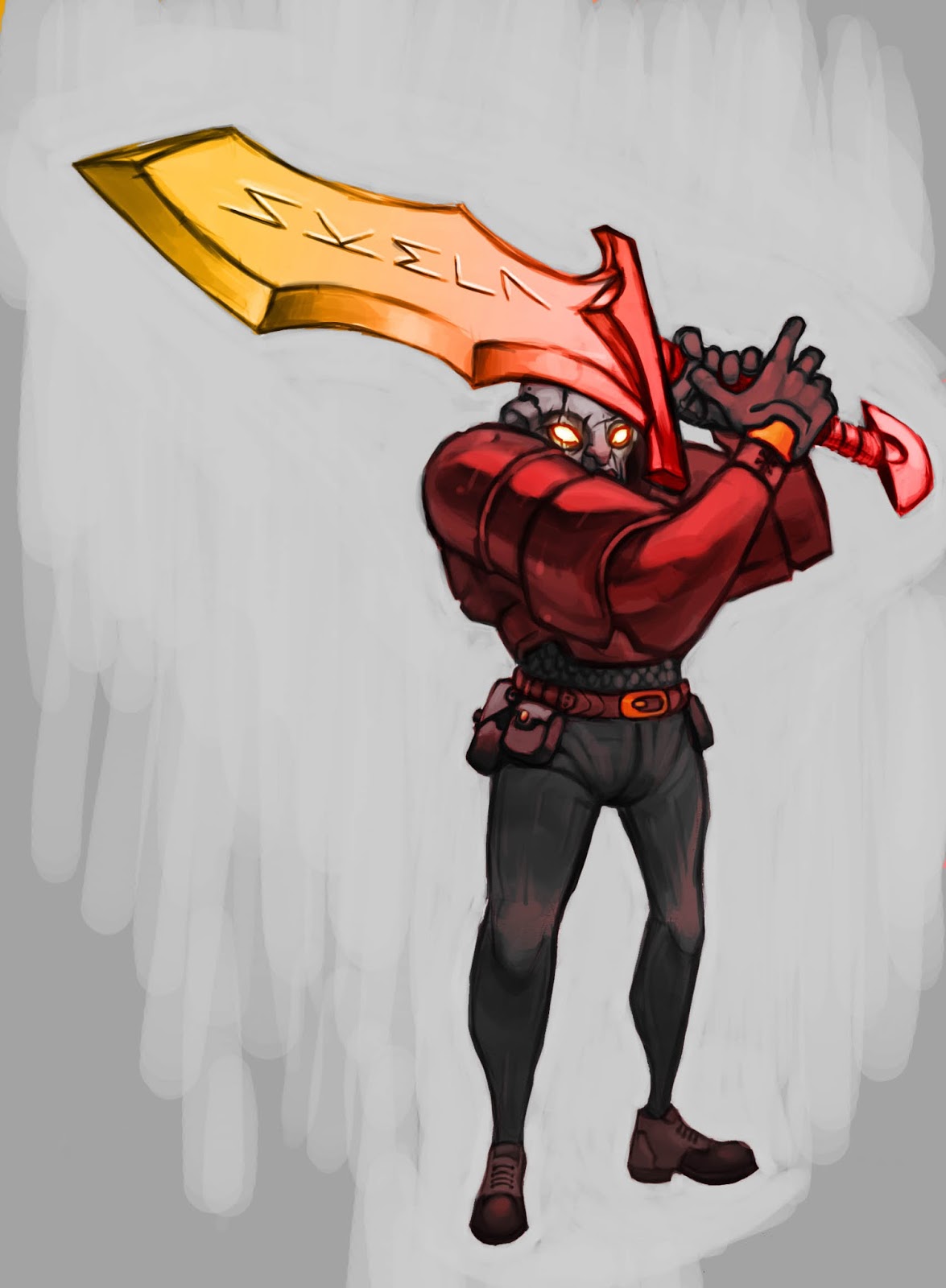
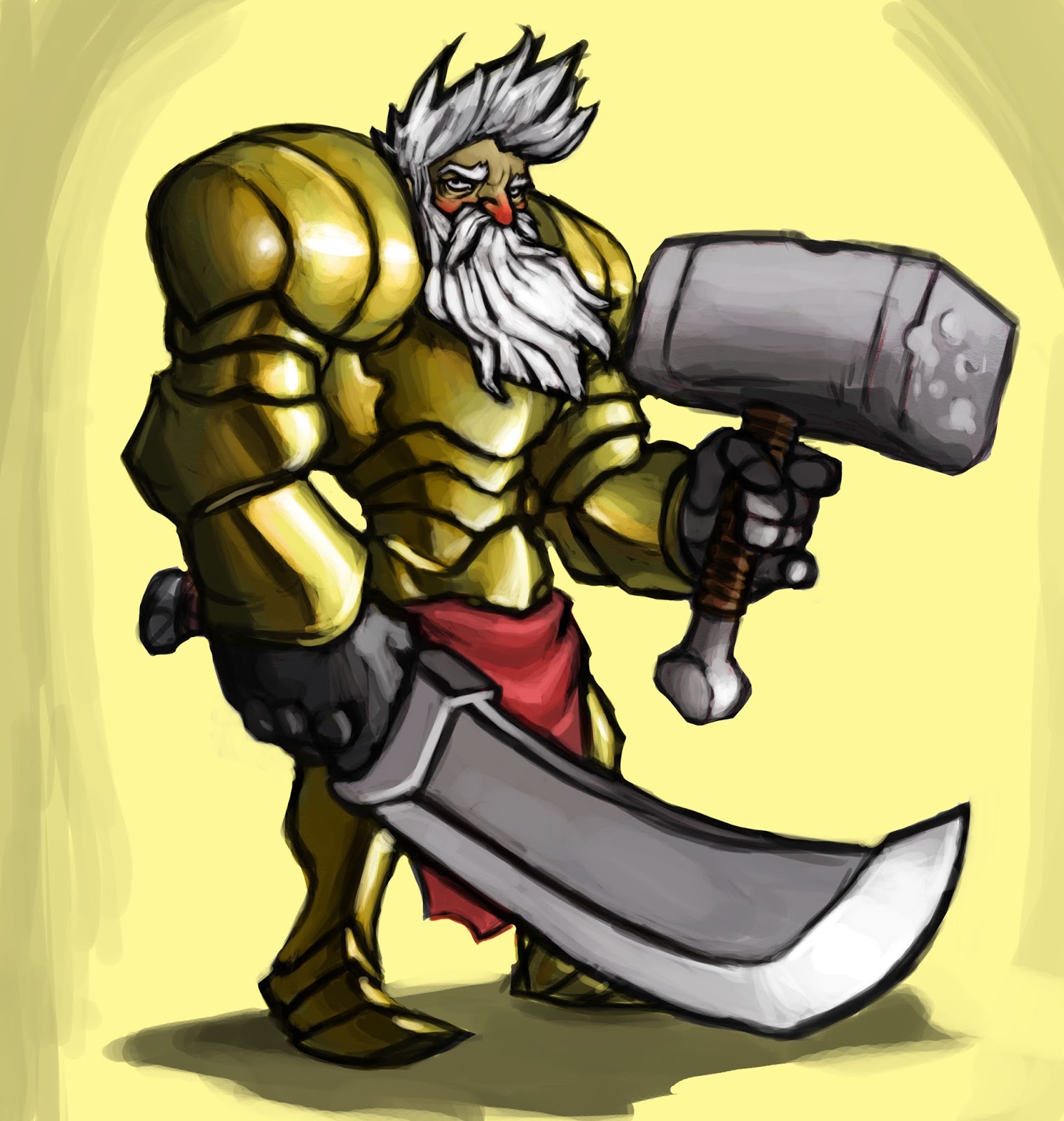
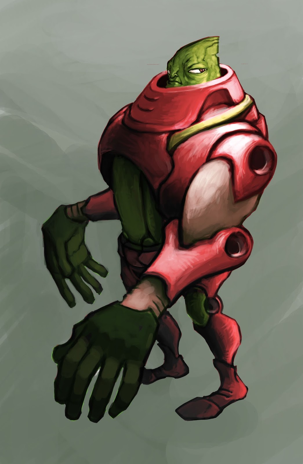
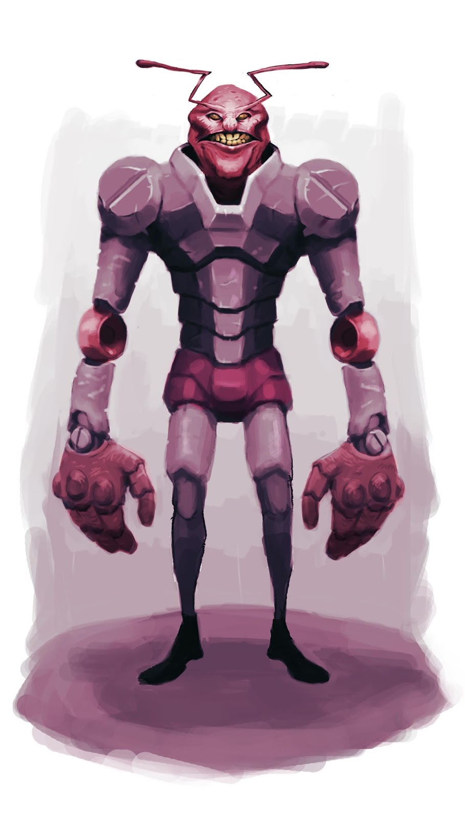


Replies
-Get color in your shadows, a quick way to get that going is to use a gradient mask, or color balance your dark tones. Then add the color over top
-If you want lines, try to make them a little thinner. Keep them separate from your painting, or don't have them in the final and just use them as a guide. It seems to muddy your stuff up when you paint over them like that.
-Try some new brushes! Here's my set https://dl.dropboxusercontent.com/u/5301613/Brushes/makkon_Jan2015.abr
-I showed you in class the quick rendering process, here's a documented breakdown that is definitely worth trying. Remember to keep your shading layer separate from your local color, and let the local color be the determining factor for it's values.
http://texahol.blogspot.com/2013/05/some-more-thoughts-about-thinkingabout.html
Talk to you soon, man
Thanks for the response, Dado. After I posted this I went looking around at some of the other threads and saw that one you mentioned (Good paintings vs good concepts) and realized I have that sort of a problem. I wonder if I'm so concerned with painting technique that I forget to tell a story or add real conceptual elements to the piece. I think that's part of one of your points- doing more finished drawings. This year is when I started taking characters to a more finished look (like the pictures I posted in this thread) but still, they lack a finished feel. I think even with no environments, if the concepts were more solid they'd feel more done. I'll work on this- I have a tendency to throw paint over something and move on. I think I need to spend much more time finishing stuff.
Colored shadows. Your comment made me realize that I don't really use layers effectively in Photoshop. I tend to tone over a sketch I did with a pen or pencil, render over the top of that by adding shadows and lights, then flatten and add a vivid light layer or color layer. I'm going to work on spreading things onto different layers so I can tweak things better. I didn't even know about using locks for layer transparency!
Thanks again for the feedback (and links to those other threads, I'm reading through them again). It's funny how in my mind I think "Shadows" and immediately think, "They're all dark, just use black!" That's just not how it works!
Hey, Makkon, thanks for all the feedback lately!
I need to get a thorough understanding of layer masks and how they work. It seems like sometimes I can't get them to do anything or work at all. Maybe I'm just doing things out of order, but in any case I don't understand them well. I agree that multiple, distinct layers will help me to color the shadows and keep things organized and easy to change.
I'm gonna try getting rid of all line traces as I work in your honor. I think using some new brushes might help with that. I'll give yours a whirl.
Lastly, I'll refer to that blogpost as I work on my next post. While this next one doesn't have <i>all</i> the things that you and Dado suggested I work on, some of the lines are missing, as per your suggestion. I'm on my way!
You guys are awesome, thanks for helping me. I feel like I have a good list of things to refer to now while I work on my next project. I can start keeping all of this in mind and not have it be such a hassle to work on.
I'd like to take it to a finished concept level. After re-reading the thoughts on this thread, I set things up a little differently layer-wise than I typically work (I.E. actually using layers):
And without the lines:
That's what I've got so far. Every color is on its own layer. Is it time to render the living daylights out of this? Otherwise, what might you do to continue the preparations? If you think I'm good to go, what advice would you give a young digital painter who's about to paint a stylized bearzerker? Things to remember about rendering fur? If not, I'll just go for it (After adding some dark shapes to the skulls, I think)!
Your rendering is very contrasty, using the entire value range on light objects, and almost all of the range on dark objects. But it's rarely this way, you only see that kind of lighting in a very strongly lit scene with no ambient light. As most real scenes have some kind of ambient light, there should be a limit to the values used an any one surface.
Here are some simple spheres with lighting on them, imagine they are under the same intensity of light, but the ones on top have a good amount of ambient light.
These ^^ look kind of right, the ones on top don't get too dark (except for occlusion) as they are in a light scene and it is preventing the objects from getting too dark. The ones on bottom can get a bit darker as there isn't enough lighting bouncing around for them to really get lit up.
Check this out:
The bottom ones look really off due to being in a bright background, similar to your paintings. The light backgrounds and strongly shaded objects really throw the paintings off as there should be more light bouncing around in these bright scenes.
Also, notice how dark the dark ones stay? A black object won't ever get too bright, no matter how much light you shine on it. That might be different with highlights and reflections:
But generally the main shading of these stays really dark, it's just the highlights and reflections that are bright.
Hope this all helps!
thank you, Avanthera. Thanks for the feedback! To sum up, are you saying that I need to keep the lights out of the darks and leave details to the lights or darks, but not both? I'm having a hard time getting my head around all of this. I bought Scott Robertson's new book, [ame="https://www.amazon.com/How-Render-fundamentals-shadow-reflectivity/dp/1933492961"]How to Render[/ame], with the hope that it can shed some light on all of this stuff. I had a figure drawing professor last semester point out that I had way too much going on in the shadows and to stop confusing the viewer with visual information (such as lights).
Anyway, I worked on that bear and hate what has happened. I did this before Avanthera posted feedback, just been debating whether or not to post (This is hard to post, but in the interest of improvement I'd like to have some help):
I am having the hardest time getting my head around stylized brushstrokes, maybe painting at all. It seems like sometimes I like how things turn out but a lot of time it just looks like pukevomit. I'd like to keep these frustrations to a minimum if possible... I'd like to find out why I'm so all over the place in terms of ability to see and paint! URGH! Back to the drawing board. I don't want to give up on this because I'm tired of never finishing anything.
Some of my favorite artists who I want to paint like are Garrett Hanna, Cory Loftis, Tyson Murhpy. In the meantime I'll go read over that texahol post Makkon left here.
Nono, what I mean is a bright material in a light environment will not have dark shading except for occlusion, like this.
The light skin doesn't get very dark except for occlusion areas, and the dark hair doesn't get bright, except for highlights. Your paintings have dark objects going up to almost white, and bright objects going almost down to black in the shading.
Also, most the detail you ever see on an object is in the beginning of the core shadow area. This is where lighting is the most abrupt for tiny scratches, details, and objects. In the lit area the light is blowing the details out and in the shaded area they are being covered up, like this.
Also, also, bounce light and cast shadows are the two things that always seem to add a ton of realism to my lighting.
Hope this helps!
Since we just moved, I was looking through some old sketchbooks from the last two years and realized that I've stagnated as an artist. I'm back here at Polycount because I need accountability. I've effectively been screwing around with no plan and wondering why I haven't been getting better. Part of that could be that I don't know what kind of art I want to do.
I feel like I'm rambling. I'm just here to say that I'll be posting or interacting here on Polycount every day. They say to make your goal manageable and achievable- I can absolutely post on a daily basis. It's a bare minimum, but my hope here is that as I do that and start painting daily (and posting those terrible paintings here) I'll be better about seizing those small moments of free time in my day to do the important thing (art) and then I'll slowly start getting better.
Here's some sketches from the last couple weeks I haven't gotten around to throwing up on Instagram. I've been posting there for exposure, but I think posting here to get demolished by critiques will be a far more effective thing to do.
Oh, and P.S. - Is there a way to rename this thread and change my nickname? Both were attempts at humor, but I feel like they don't reflect how I feel right now.
Also, I'm going to hold off on posting images until I can go read back over the forum rules and make sure there's no file size limitations.