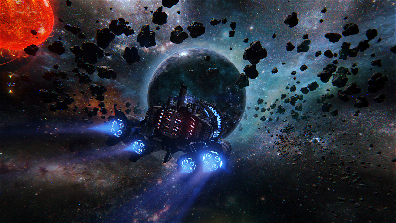
Into the Stars - UE4 Indie space captain game
Hey everyone, I wanted to share my latest project. I co-founded a company called Fugitive Games and we are making a sci-fi, space captain game that's Oregon Trail meets FTL. I'm the art director but also the only artist on the 4 man team, so I have to get really specific with my time and efforts. We outsourced the character models to my good friend Eric Valdez and also had Stuart Kim do some paint over concept work for us. I can't say enough positive words about those guys...top tier talent!
I'm using the Quixel suite to make all the textures. I'm planning on doing a video editorial later later this month showing some behind the scenes of the art challenges I had, so stay tuned for that. Turns out you have to get pretty crafty when the player is the size of an entire level and that huge mass is player controlled while also traversing at huge increments of units per second. The size of this game is so big it hurts my brain to do the math If you like it support it on Kick Starter, if not share with someone who might think its cool.
https://www.kickstarter.com/projects/fugitivegames/into-the-stars/


I'm using the Quixel suite to make all the textures. I'm planning on doing a video editorial later later this month showing some behind the scenes of the art challenges I had, so stay tuned for that. Turns out you have to get pretty crafty when the player is the size of an entire level and that huge mass is player controlled while also traversing at huge increments of units per second. The size of this game is so big it hurts my brain to do the math
https://www.kickstarter.com/projects/fugitivegames/into-the-stars/


Replies
I've been wanting a game like this for a while.
I have a few concerns though, between the two girls, is that a mini city? If not, I would give some more detail to tell the viewer otherwise.
Also what are the two girls looking at?
The glowing ring below the ship's wire frame is really bright. It distracts from the space outside of it.
When having the menu open I would have the camera zoom up on it to crop out the glow and detail near the girls. The problem is my eye wants to wonder off the menu screen and look at the details and glow.
Other then that, I LOVE IT!
It is a mini city but its super temp right now...you can see the city from the outside of the ship also. It's very temp now, and I intend to put key features on it so you can tell that the city you can see from the outside is the same one they are monitoring from the inside.
Thx for the input!
As for the Art Challenges would be nice to read, I had plans to do a Star Citizen inspired ship for GDC but saw the amount of work that was required would of taken longer than say my Kamov.
Good luck with your project!