Storm (Xmen) Redesign
Hello everyone 
I've started making a 3D redesign of Storm from Xmen.
I'm not really used to the "realistic style" in 3D so I thought that starting a thread could be a way to have some feedbacks and improve it as much as I can
Last update
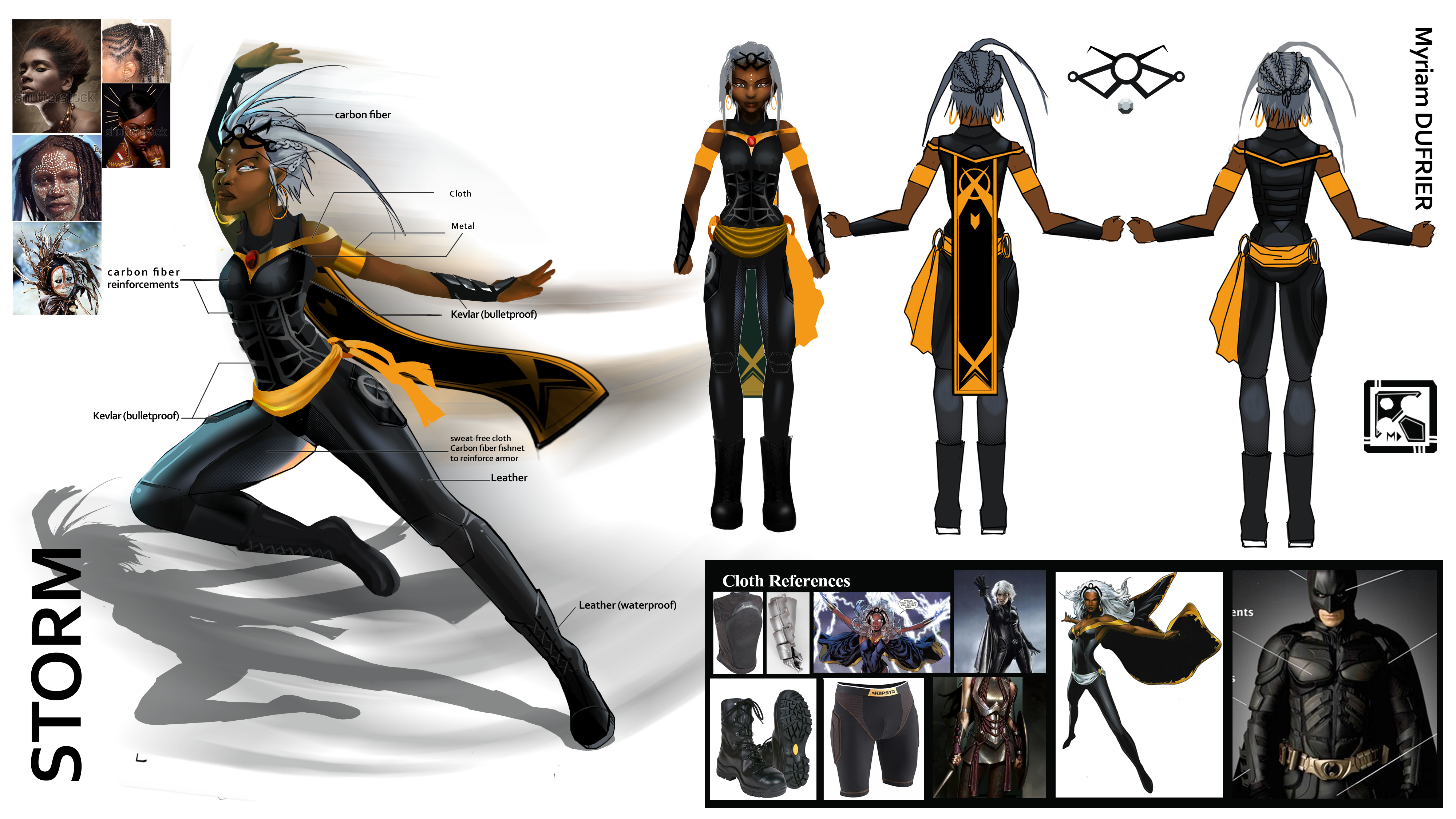
Here is the concept with some reference images
And here is where I am in Zbrush
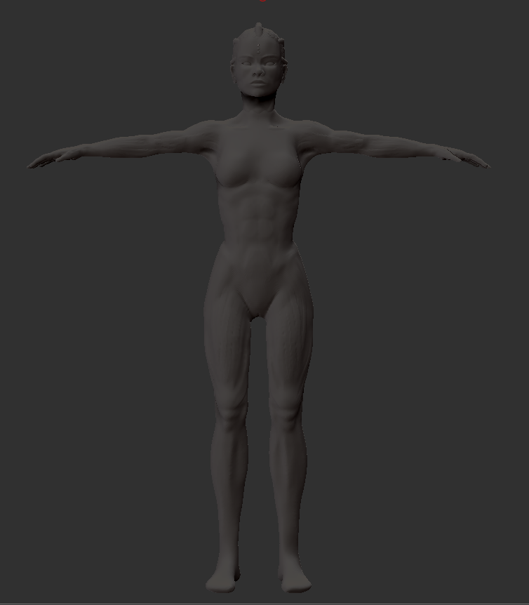
Is the head too small or big? I've tried to make it look as "normal" as possible but as I tend to make bigger heads all the time I never know ^^'
Also I've been wondering If I should merge the body and the head now or later ( after making the clothes, or when I make the retopology ?)
What do you think?
I've started making a 3D redesign of Storm from Xmen.
I'm not really used to the "realistic style" in 3D so I thought that starting a thread could be a way to have some feedbacks and improve it as much as I can
Last update


Here is the concept with some reference images

And here is where I am in Zbrush

Is the head too small or big? I've tried to make it look as "normal" as possible but as I tend to make bigger heads all the time I never know ^^'
Also I've been wondering If I should merge the body and the head now or later ( after making the clothes, or when I make the retopology ?)
What do you think?
Replies
Find some anatomy ref, some free samples from 3d.sk or some place like it, use the zbrush transparent feature or take a screen cap (in perspective) into PS, overlay the ref ontop of your model and find where the main issues are. Forget small details and just look for proportions.
At a glance your arms are too short and your legs feel too long, the hip shape is off and your armpits are webbed (!).
A decent start, with some good ref there, use ref to dial in your basemesh before moving forward as the proportions you make now will determine how almost everything else will look.
Good luck
I'll have to make the fingers bigger I think.
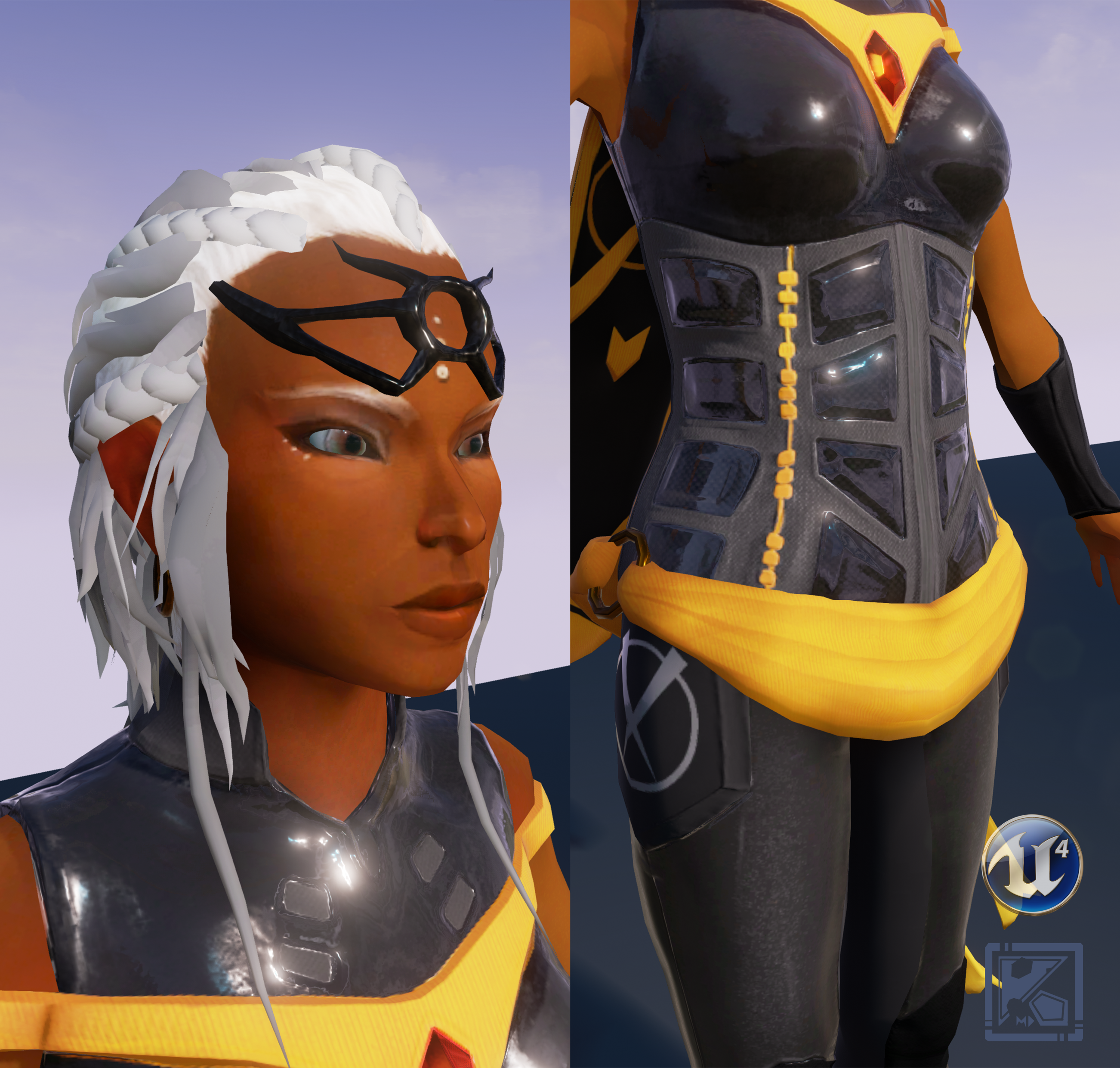
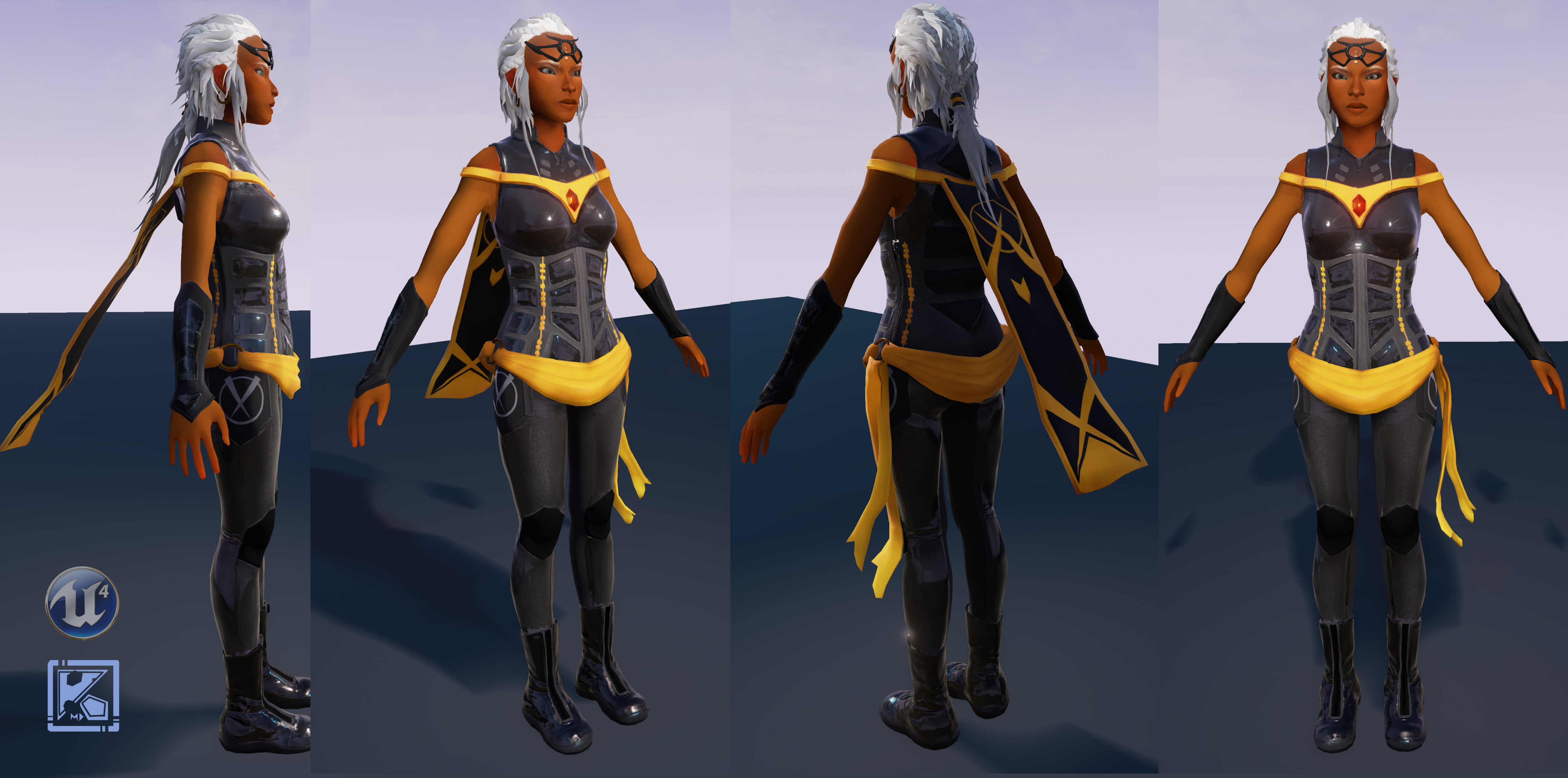
I made some progress lately !
I was wondering about where I should place the three long strands of hair I put in the concept? If I put it straight it kind of look like she has a crest XD.
Maybe I won't put it on the high poly and only on the low, as I want to apply physics to it when I'll put it in UE4 later ?
What do you think?
I would be really glad if you had any constructive comments, may that be anatomy-related or anything else that could help me improve it
The boots deserve some love as well !
Keep it up !
Thank you all for your feedbacks
i just think the skin and hair material definition could really use some work
the skin is like with no spec and the hair lost a LOT of detail compared to the highpoly
and also reads more like paperstripes
did you use ddo for texturing?
But I have to agree with skodone, the hair lost a lot of detail and it's a shame because it looks awesome on the highpoly model:
Keep up the good work!
(coolest thing is: I remember seeing the drawing on a wall @ sig and recognized it instantly :P)