Caitlin[FANART] - Elite Trooper concept. WIP
Hi everyone!
I will post here my process.
I want to make 2 fanarts and 2 static cycled animations.
Just started learning Cinema 4D and AE, so it will be difficult
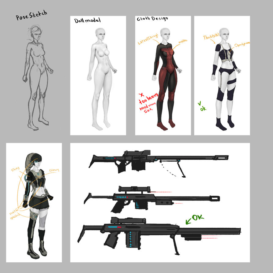
Started from design.
It will look something like this:
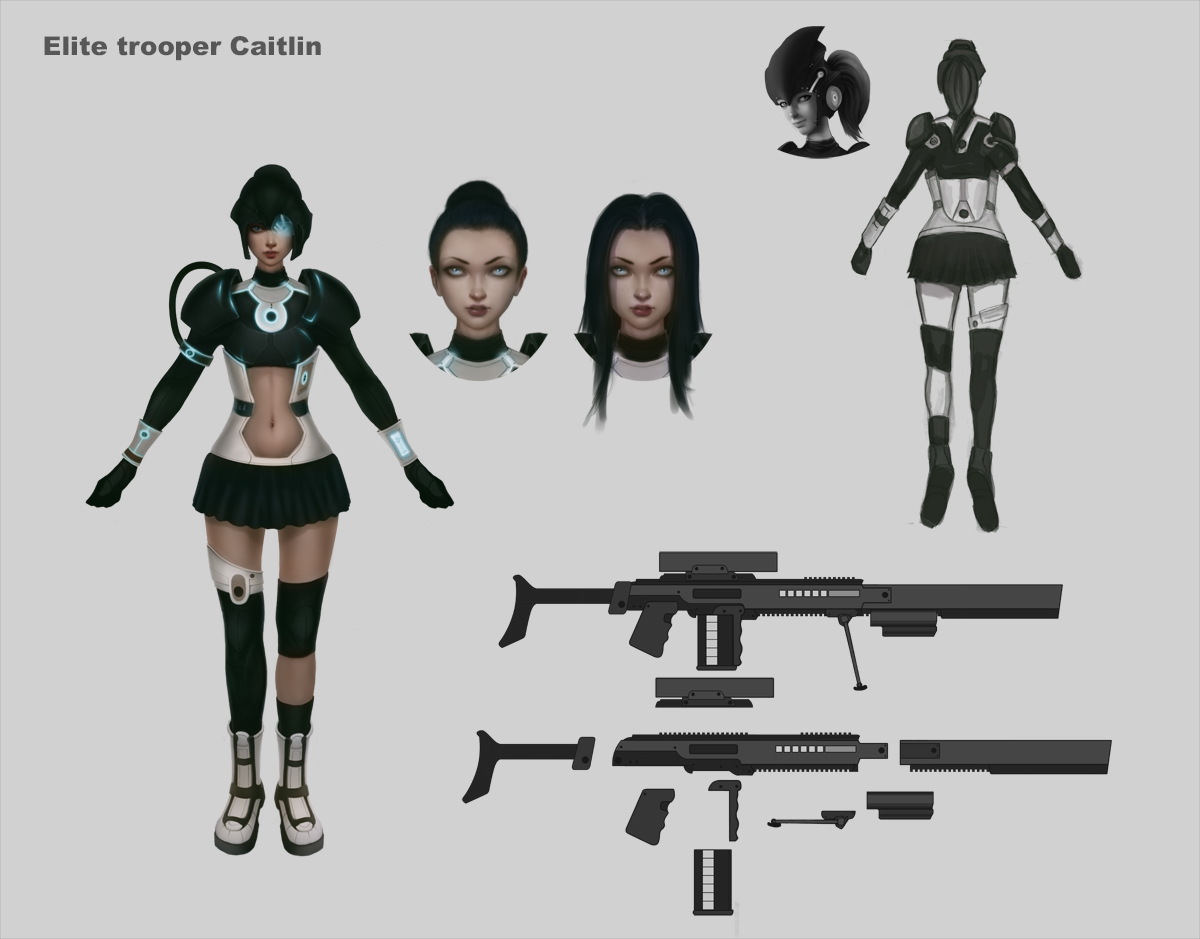
Then a more detailed render:
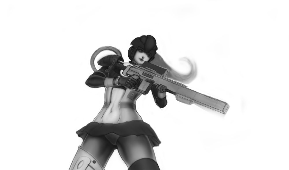
And now I'm working on 1 art:
I will post here my process.
I want to make 2 fanarts and 2 static cycled animations.
Just started learning Cinema 4D and AE, so it will be difficult
Started from design.
It will look something like this:

Then a more detailed render:

And now I'm working on 1 art:

Replies
What is your final goal for the composition of this splash screen? The pose is interesting and you could do a lot of things with it, but its not as dynamic as most of the updated splash art tends to be. It might be a good idea to start by roughing out the whole comp before sinking more time into render passes. That way your foundation is laid out for you.
Her design is very retro scifi/tron like. It's an interesting mix and would be a cool skin idea for a champion, but some things about the final design you chose seem off. For starters, the inital thumb you did for the design in your first post reads better to me. Perhaps some of the elements that didn't make the cut were worth keeping.
Personally I don't like the midriff cutout. the shape doesn't contribute much to the overall design. Not saying get rid of it, but maybe take advantage of it to create some more interesting shapes that echo the armor design.
I would make the skirt a tad longer to give you more fabric to work with and have it effected by the breeze like her hair is. That would make it look less float and add some dynamic lines to her pose.
Lastly, her left hand and arm seem awkward to me. I would move her hand down the barrel more which will put it in a more natural position, open up her pose and make it look like she can actually hold up her gun. If you haven't already I would find some ref for that hand as it is a trick angle and position to do.
And that's all I got. I know I threw a lot at you, sorry about that. I hope it helps. Looking forward to seeing updates!
Thank you! I just read your message. No worries about throwing this kind of things on me. It make me think more about her.
I have already begun the 1st phase render, but i'll try to apply some things from your message.
The main problem for me - how to turn my drawing into animation.
I want to do less dynamic pose, cuz it's my first time.
I'll do more dynamic through light and particles.
I don't know anything about making that kind of stuff so I would take any crits I give with a grain of salt
One thing I would consider moving forward would be to make her a bit larger on the canvas and give her slightly less headroom. Right now, barring any other additions the composition seems a bit bottom heavy and slightly off balance.
That's my only other crit for now. Keep at it!
Thank you, again!
First of all, I want to render this character.
Later, I will do some matte paintings on BG(2-3) to create 2.5D.
So...right now, I'm trying to render textures
Right now her skirt looks like it's just being worn over top of everything and isn't meshing well with the rest of your design. Perhaps showing it somehow attaching to her armor or have it being worn underneath her armor? That would help break up that very harsh line between the skirt and the armor which is currently rather distracting and odd.
Perhaps adding some sort of pattern or striping to the skirt along the bottom as well? Worth a try.
Anyhow, that's my 2 cents at the moment. Keep on trucking man!