UE4 - Old Post Office
polycounter lvl 6
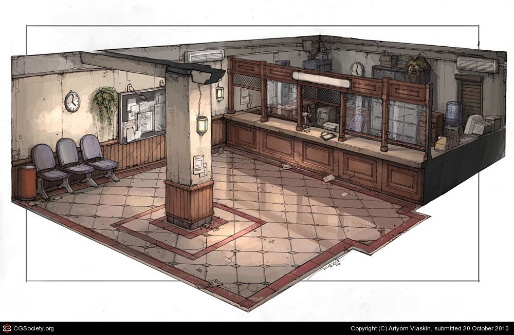
Hello, I'm currently working on a scene from a concept by Artyom Vlaskin, but taking my own interpretation of it by trying to mix the old style found in the concept with a cleaner more modern look, making it look like it was built in the era depicted on the concept but well kept and still used today. Looking forward to some C&C, also maybe some advice on not getting such wonky glass materials :poly142:
Original Concept:
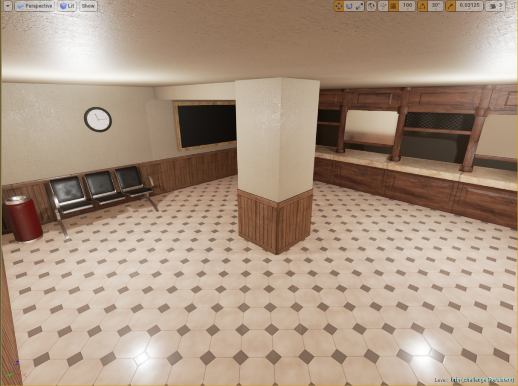
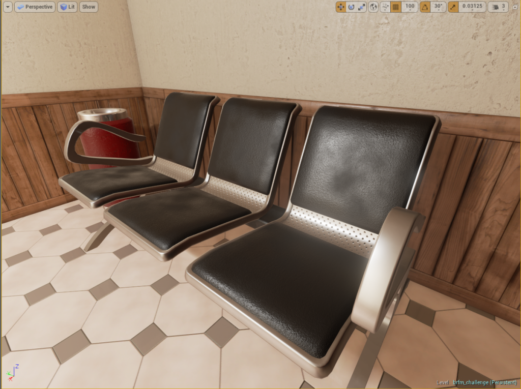
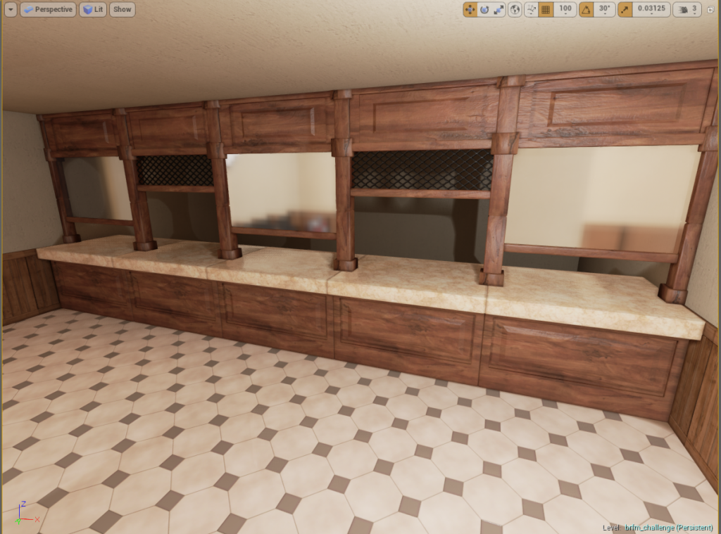
Work in Progress:
Original Concept:
Work in Progress:
Replies
I'd recommend fixing the proportions, especially with the front desk area, before you continue.
I will add the missing trim in the tile texture, also can you be more specific about the front desk area? What exactly is wrong about it? I can't really put my eyes on it.
Thank you very much! I will
I think overall, you should slow down. You're missing a lot of the smaller and important parts of the concept already. These beginning parts are essential for a great piece (in my opinion).
Proportion is always a huge killer. Eveverything can look amazing, but if proportions are off, it will take the viewer out of the scene you created!
Good luck!
I guess I should add that the reason I'm stressing the above so much is that you obviously have the skills (with what I've seen so far) to re-create this concept, but if you hurry, you won't end up with a phenomenal piece. I see the potential here, and I'm excited to see this develop
These are my thoughts on proportions mainly.
COMPLETED:
TODO:
After I complete this list I will proceed with everything else in the concept, enough talking, here's the screenshot
(the floor texture has barely some proportions blocked in)
Keep pushing! =D
I am enjoying your more modern take on the concept though. Keep it up.
More color variation (dead/brown bits), add a soft gradient going from dark to light (center to tip). SSS might be overkill for an indoor plant in a dark room, but might help.
SSS is already running although it uses the same color as the albedo (I don't know if I'm doing this right), I will definitely try and paint some dead bits, maybe on the edges, the soft gradient sounds like a great idea, hadn't thought of it!
You are right about the normals causing thickness on the edges, I'll give it another pass later today.