Death Knight - Version Z [WIP]
Update for rolling convenience :icon60:
mockup with overpaint and the rest:

Hey guys,
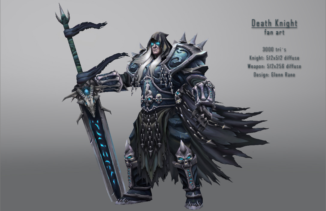
I started working on a low poly model aaaages ago, but had to put it away for various reasons, now I have dug up the pieces I had laying around on my HD and decided to complete this figure. It a 3D representation of the Death Knight figure designed by Blizzard artist Glenn Rane:

It has been done before many times by various skillful artists so it won`t be anything "new", but I`ll try to make it neat.
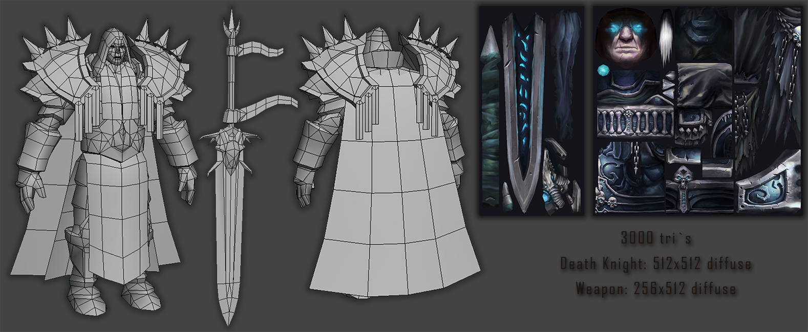
I`m keeping it low poly, and diffuse (+alpha) only, gonna add effects in form of billboards/alpha textures/lights in the render. Will probably tweak proportions a bit and invent/alter areas I can`t see on the design.
CnC is welcome! :icon60:
mockup with overpaint and the rest:


Hey guys,
I started working on a low poly model aaaages ago, but had to put it away for various reasons, now I have dug up the pieces I had laying around on my HD and decided to complete this figure. It a 3D representation of the Death Knight figure designed by Blizzard artist Glenn Rane:

It has been done before many times by various skillful artists so it won`t be anything "new", but I`ll try to make it neat.
I`m keeping it low poly, and diffuse (+alpha) only, gonna add effects in form of billboards/alpha textures/lights in the render. Will probably tweak proportions a bit and invent/alter areas I can`t see on the design.
CnC is welcome! :icon60:

Replies
I do not really like his feet, looks kinda flat. Also the cracks on the sword could be more pronounced. Just some of my thoughts.
Hope to see more and maybe in sketchfab?
I agree with you on the sword I`ll give the whole blade a single unique UV (as now it feels like the mirroring is too visible and I`ll paint isntead of "modelling it out"), and push those cracks a bit.
The feet/leg will be given some love as well, the lower area feels like it has too much contrast, i know the design does too but it doesn't feel right with the rest of the model. Will sort that with texturing, probably going to add a thicker sole to the boots as well.
Gonna make a 3d presentation once i`m done, might be sketchfab, or some form of presentation which gives you the illusion of 3d ^^
Looking forward to your next update.
Eye glare been shifted from a cold green to a cold blue, feels more like a DK now ^^
Plolycount is slowly crawling up to 3200 tris.
Posed version for the beauty shot will be posted sometime today, if the flu lets me :poly138:
Sword - The leather on the handle looks a little unfinished compared to the blade and guard, maybe up the saturation a bit and add a bit of wear and tear. The handle also looks thinner on the concept and I think that adds to the design of the sword, you're looks a bit too squared off. The eyes on the guard also seem to be more on the top of the skull on the model vs side of the head on the concept. Side makes more sense and would look a bit cooler too I think. Additionally you'll want to thicken up the snout a bit. The blade concept has a nice big slash in it that reaches the runes, I think that'd look good. I'd also suggest losing the blood, it's taking focus away from the runes and whatnot.
Character - Regarding his face, if you put the concept and your model face side by side the concept looks younger around the mouth area. I think there's a bit too much white in your skin colour, needs a bit more purple I think. Also, the dip in the top lip seems exaggerated in your model. Finally, maybe think about darkening the spikes on the shoulders, they're gonna be super bright in any well lit area.
Others have mentioned the boots, I'll just add that I'm really liking the shoulders (with a tweak), cloak and loin cloth. Really nailed those.
Overall though, liking it, you did ask me to flame it
- weapon : will take a look and tweak bits, will see how much i can change the hilt geometry wise, its already getting to big for his hands, texture will be tweaked and the skull too. The blood is a darling i rly dont wanna kill, I have the image of the final shot with some environmental noise which dulls it down a bit, will see how that works out, if it doesnt i just switch the layer off :icon60: same goes for the spikes value, if they ain`t work i`ll dull em down.
- face : will take a look at the lips, i see what u mean with the upper lips. The face I won`t change tho I want him to be old, much older than Arthas when he got transformed
I`ve been playing around with the final pose, ul-ing soon! :poly003:
These shots dont have the fixed up weapon/face ect, that will be something for tomorrow if i survive the 2kg steak challenge I have lined op on my schedule :poly009:
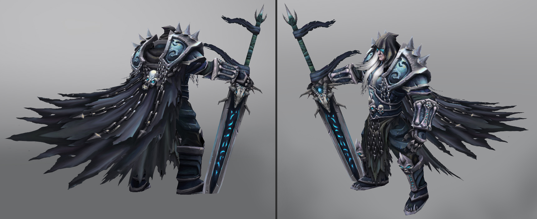
Two more shots just to show the guy, one side one from the back:
Ye I agree as it is now it is too much of an eye lure, in the final shot there will be some environment noise covering it, plus I`ll possibly reduce opacity a bit. If it ends up being still too much on the beauty shot I might just kill it completely... its just so hard to resist and not cover everything with blood :poly009::poly009:
great job though, love the color injections in the cloth
I`m sure I`ll be able to make the cape less noisy. Gonna give it a go! :icon60:
It`s almost there, just a few more tweaks to do :icon60:
Will consider it, first will check with adding a little bending and seein what`s the result, I`m trying to keep this guy simple as a stone, and focus on texturing detail instead of modelling it just like average wow models go.
Having two layers for the cape would counter that a tad, also knowing myself I would expect ending up playing with the idea of separating the chains and the skull on the cape and adding those volume as well, and then see what else can be improved this way... :poly009::poly009: I`m well bad with drawing the line :poly009:
mockup using model
Cheers