Home 3D Art Showcase & Critiques

Ganymede Hollow - Indie SciFi Horror Art Dump

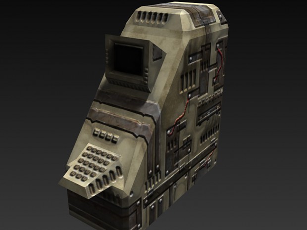
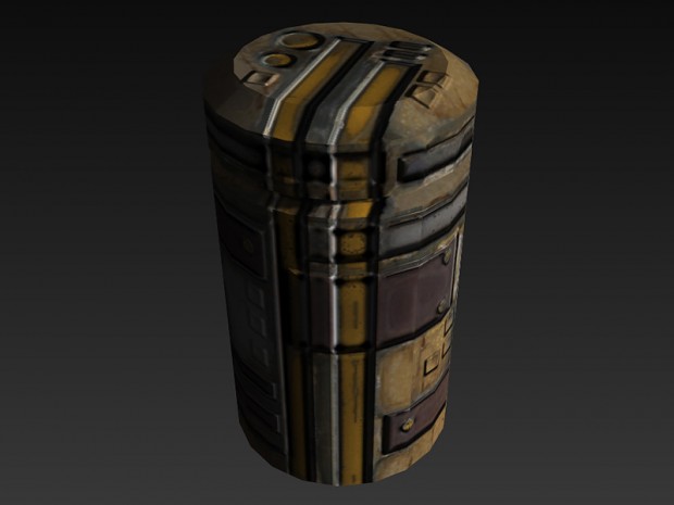
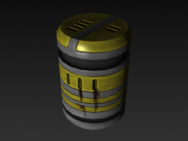
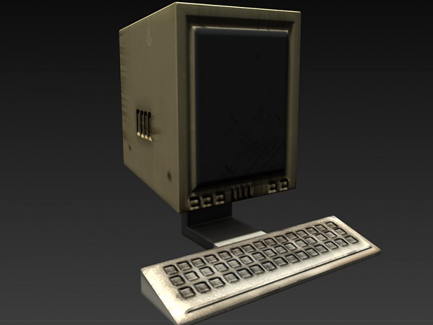
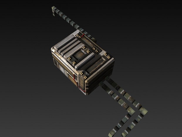
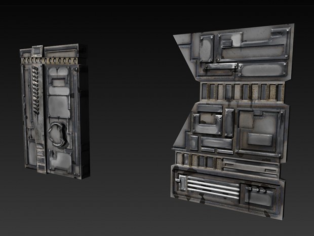
Hey, I'm going to start posting the assets, and maybe some screenshots from my indie horror game Ganymede Hollow. You can find out more about the game, including some videos of me making the art and talking about the workflow at: http://www.indiedb.com/games/ganymede-hollow

Thanks for checking it out.

-Ian
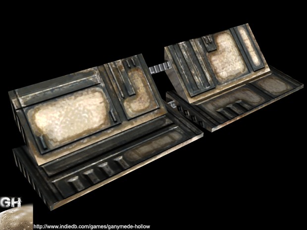
art12.jpg

art11.jpg

art10.jpg

art8.jpg

art7.jpg

art6.jpg

art3.jpg

art4.jpg

art5.jpg

art2.jpg

art1.jpg

Replies

  • ConnorDuke3DArt
    Offline / Send Message
    ConnorDuke3DArt polycounter lvl 2
    Looking really great so far! Also I'm wondering if you are interested in recruiting any other artists? :)
  • 3dcaspar
    Offline / Send Message
    3dcaspar polycounter lvl 10
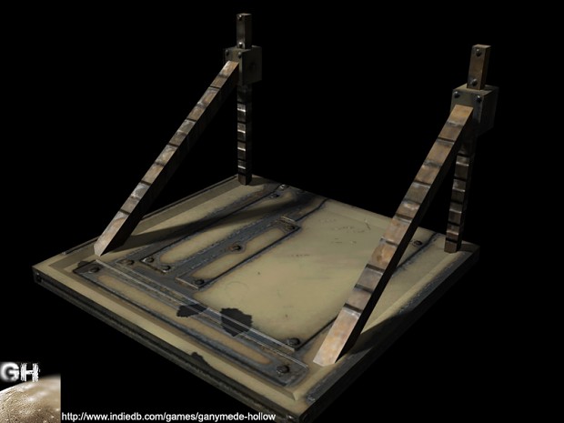
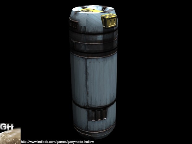
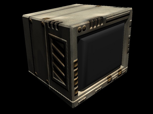
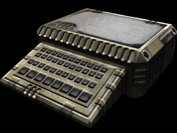
    To be honest: all these assets look like out of Doom 1 or some other game out of the 90's.
    Maybe you should put some more "love" into the assets, instead of pushing out one after another in a short time..
    Also: a lot of the shapes don't make any sence at all. Just bevels etc., but without thinking about them and why they are there.
    Same goes for the texture work. It's hard to make out, what material this should be.
    Also, there seem to be a lot of uv mapping and smoothing errors.. (think on each model ^^)

    Don't take it personal ;)
    Just an advice.. More love on individual assets will pay out later on.
  • blinKX10
    Offline / Send Message
    blinKX10 polycounter lvl 7
    I agree with caspar; there are lots of fasseted edges, UV seams and just overall poor planning here.

    I can't tell what any of the assets are or what they might do. You should take more time modeling and texturing to make things more clear
  • achillesian
    Looking really great so far! Also I'm wondering if you are interested in recruiting any other artists? :)

    Thanks for your words, but at the moment we are not.

    art14.jpg

    art13.jpg

    art15.jpg
  • Uberren
    Offline / Send Message
    Uberren polycounter lvl 11
    er...I'm really struggling to identify what some of these props are supposed to be...it all looks really rushed.
  • Higuy
    Offline / Send Message
    Higuy polycounter lvl 9
    I think you should try upping the texture resolution and polygon amount on all of your objects. Right now everything is super low res and the most immediate issue is that things are hard to identify and recognize. Of course some things are computers, wall panels, etc... but I mean really, alot more effort could go into all of them. Are you making high polys and baking them? Or are you just unwrapping a texture sheet onto objects, or what? Overall I think you just need to take some more time and care into the assets, and push yourself farther in the detail amount but also making sure that they are retaining recognizable elements.

    Perhaps to make it easier on us to critique your work, put them all together in a scene so we can see what things look like as a whole.
  • AlexCatMasterSupreme
    Offline / Send Message
    AlexCatMasterSupreme interpolator
    You should start listening to crits because these are no good and people are telling you, but you wont listen.

    The best advice is follow 100% a tutorial for basic asset creation. That will instantly teach you a ton.
    http://3dmotive.com/series/the-briefcase-workflow.html

    I highly recommend this one.
  • Justin Meisse
    Offline / Send Message
    Justin Meisse polycounter lvl 19
    art1.jpg

    I like this wall the best, it's still a little too monotone for my tastes. All the advice is good but indie dev means making art as fast as possible; I don't think the Polycount always gets that. Maybe focus on creating a very high quality library of sci-fi greebles that can be kitbashed together to make new assets.
  • axxic3
    You should start listening to crits because these are no good and people are telling you, but you wont listen.

    I wouldn't expect him to listen if your talking like that. It was good advice afterwards but don't bash on people, the purpose of the site is to help each other out.
  • Greg DAlessandro
    Offline / Send Message
    Greg DAlessandro polycounter lvl 6
    I like this wall the best, it's still a little too monotone for my tastes. All the advice is good but indie dev means making art as fast as possible; I don't think the Polycount always gets that. Maybe focus on creating a very high quality library of sci-fi greebles that can be kitbashed together to make new assets.

    any tutorial or a link for making greebles and kitbashing them together?
  • Justin Meisse
    Offline / Send Message
    Justin Meisse polycounter lvl 19
    axxic3 wrote: »
    I wouldn't expect him to listen if your talking like that. It was good advice afterwards but don't bash on people, the purpose of the site is to help each other out.

    Yeah, don't make this a continuation of past conversations.
    any tutorial or a link for making greebles and kitbashing them together?

    Not off the top of my head. I figure you want to re-use pieces as much as possible and use something like substance designer to quickly generate materials. I saw that the OP is using DDO, I don't know if that's as good for batch processing textures as substance.
  • achillesian
    Higuy wrote: »
    Perhaps to make it easier on us to critique your work, put them all together in a scene so we can see what things look like as a whole.

    Starting to put everything together a little bit more. Messing with various post processing things. It's dark, it's blurry, I enjoy it, It's starting to set a mood for me that I like.

    Any tips or links to tutorials about making cool lights/light sources in Unity would be helpful.

    78YGstX.jpg
  • AtticusMars
    Offline / Send Message
    AtticusMars greentooth
    Glaucoma: The Game

    I think you really need to dial that blur back
  • achillesian
    Glaucoma: The Dark Descent


    screenshot8.jpg
  • achillesian
Sign In or Register to comment.