Male Character inspired by Prometheus (Critique please)
Hi Folk,
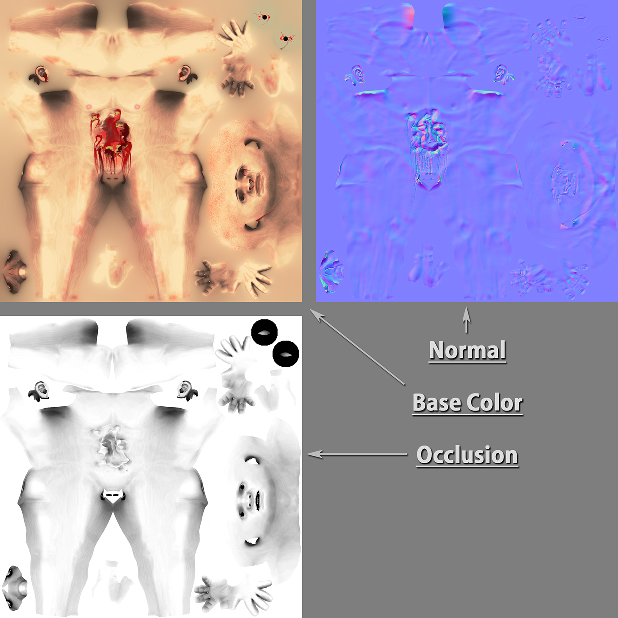
I made this Character few weeks ago for an Arttest in School. I hope you have some feedback and ideas for me so i can improve myself. It's my first Post here on Polycount so even if the feedbacks refers to the post and presentation itself.
Tris:
- 8.780 (Character)
- 4.742 (Monster)
- 992 (Base)
More Pictures
[sketchfab]45e4de056b514f1a832174098e73ce2e[/sketchfab]
Human Chest Explode by aboulicious on Sketchfab
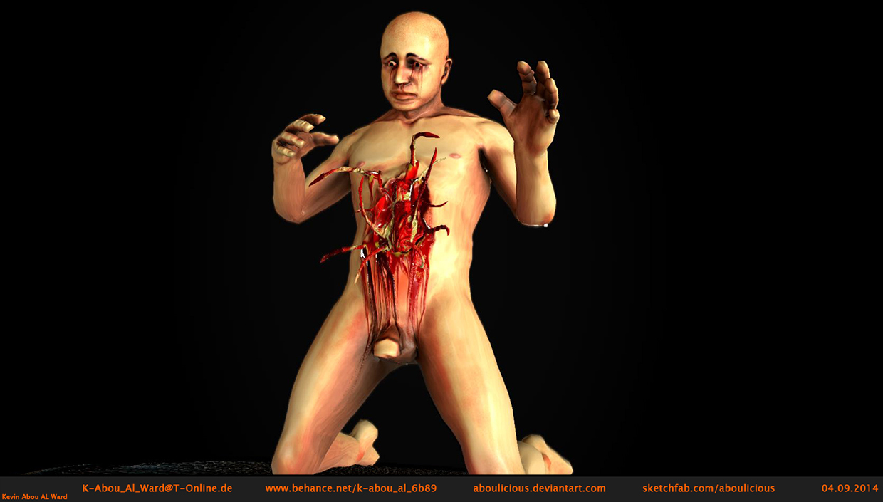
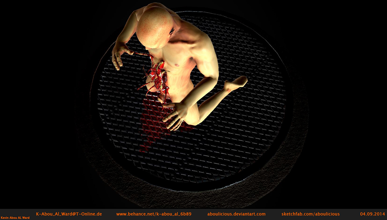
High Poly
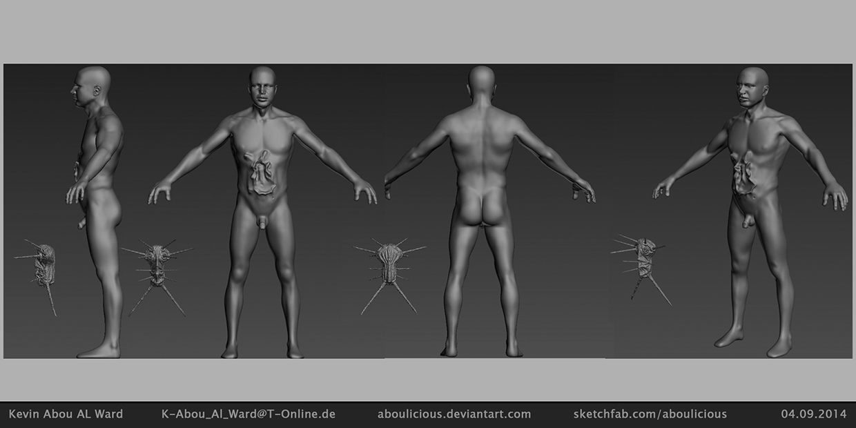
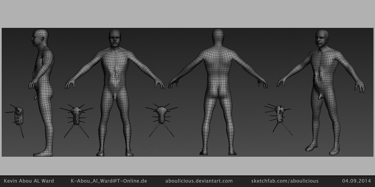
Low Poly
I made this Character few weeks ago for an Arttest in School. I hope you have some feedback and ideas for me so i can improve myself. It's my first Post here on Polycount so even if the feedbacks refers to the post and presentation itself.
Tris:
- 8.780 (Character)
- 4.742 (Monster)
- 992 (Base)
More Pictures
[sketchfab]45e4de056b514f1a832174098e73ce2e[/sketchfab]
Human Chest Explode by aboulicious on Sketchfab


High Poly

Low Poly


Replies
In my opinion the alien has boring shapes and is not really a eye catcher. If you had not say that there is an alien in your scene, I have not recognized it
And your textures could have more variations. It looks a little bit flat.
Google ysalex skin texturing tutorial, that may help you if you have ZBrush.
Oh yes, i've edit the Post.
What exactly do you mean with "boring" and "more variations"?
I have no ZBrush. I used Mudbox. Is it necessary?
For example ..
You can see the warm parts of his face, like nose, ears etc.
In my opinion your alien or parasite needs a little bit more love. The Facehugger has a very strong shape, also the little creatures from Dead Space.
I think you have the problem, that you cover your whole creature with blood, so the details are very hard to notice.
Maybe I could help you with my criticism
yes of course!!! Every creative Criticm is helpful!
I will to pay attantion to it in my next character of course!!!
Thx
Maybe look at some scan data expressions for reference, like this one. ( Kind of looks like he could be baring the pain)
Bottom one could work....
Hope this doesn't sound harsh in anyway,
Cheers
Thx for the examples!