The BRAWL² Tournament Challenge has been announced!
It starts May 12, and ends Oct 17. Let's see what you got!
https://polycount.com/discussion/237047/the-brawl²-tournament
It starts May 12, and ends Oct 17. Let's see what you got!
https://polycount.com/discussion/237047/the-brawl²-tournament


Replies
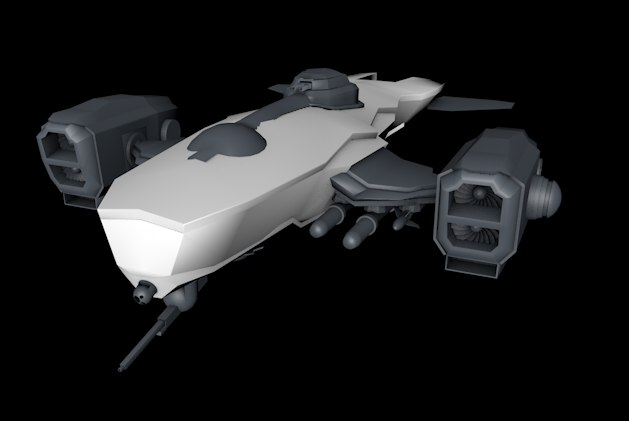
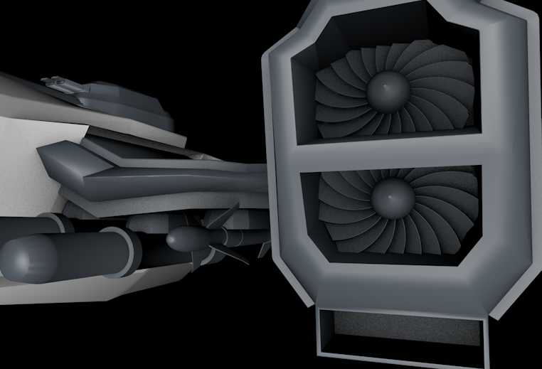
my final decision was to remove the lower engine, it allows for retaining the shape of the engines while removing the issue.
here's the version post grilles. What do you think?
@John
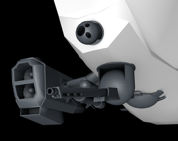
@Rekt: Thank you. I agree, but it might be to late to actually do that part. Might try but it'll definitely look nasty. And yes, but I have no idea how I might imply that. If you look from the inside (Here) it's a lot more clear (And even more when textured).
thanks for the help guys
Another question: Does the kitbashing at the top help or make it nastier?