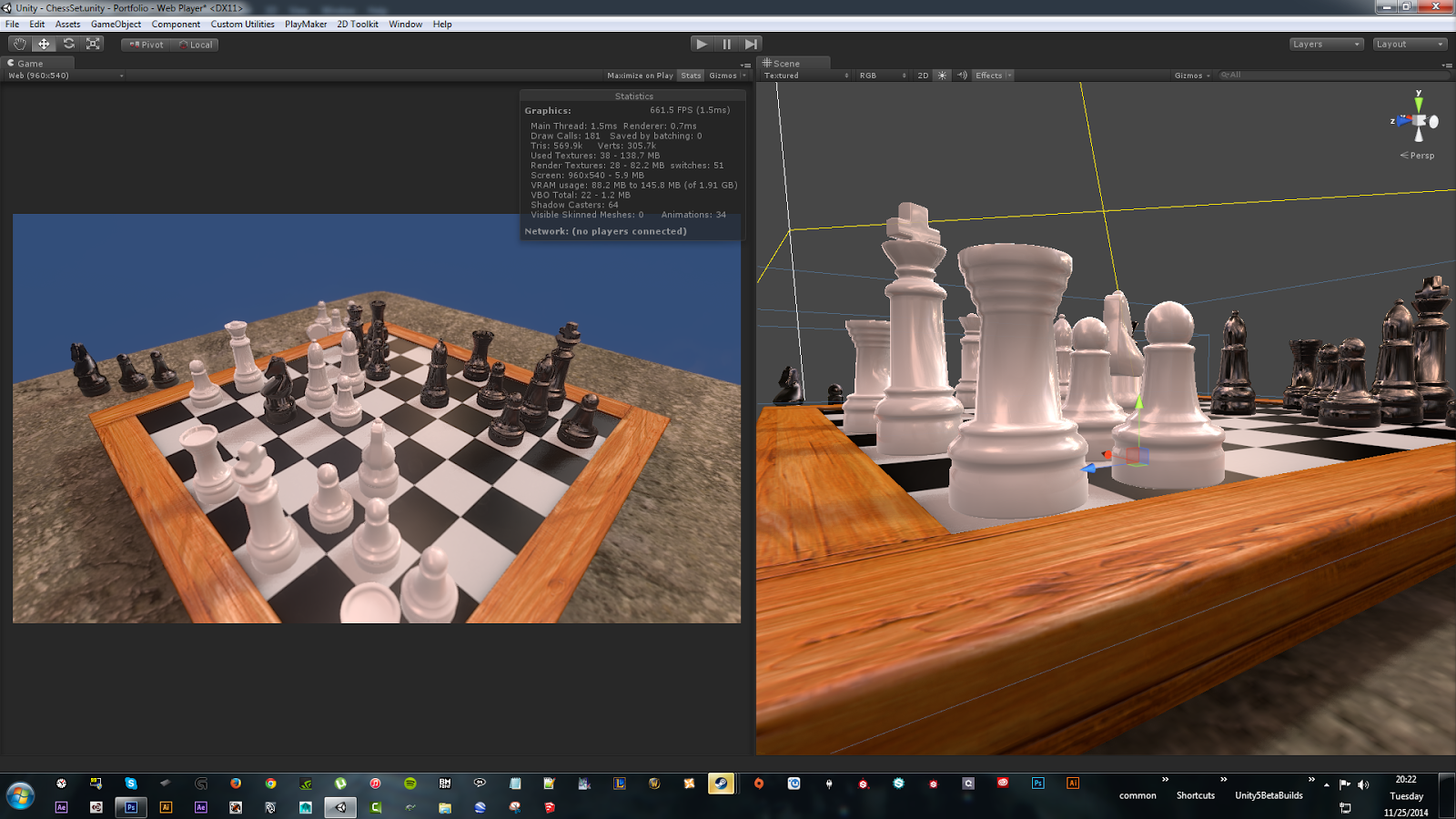
Chess
Hello,
Just showing something I'm working on.
Comments are always welcome!
I haven't posted in a while... so here we go.
I start out by modeling from an interest I have... I'll typically shy away from fantasy, I prefer a more tangible subject matter. Unless it's fan art, then I'm there!
Afterwards I'll add some base textures, just to get a feel for how I think it should look.
I keep my scenes fairly simple, but I try my best to push what I have.
That's where I'm at now. After stepping back, I see many improvements I want to make.
And If you guys have any suggestions, I am more than happy to hear them out!

Replies
You can view the Unity web demo here.
thanks! Still tweaking textures, still looks too new for me. More to come.
@ProjectEagleeye
I would agree with you about the materials, but this should go without saying... This is still a work in progress.
You can blame the engine all you want, in the end it's in the hands of the artist to create
great content. I've seen several things done in Unity that have left me in awe.
As far as the polys... unless you have a reason to limit yourself, then yes I'd agree.
But not in this case. In my line of work, I am fortunately not restricted by poly count (within reason of course).
Unity is not just used for games, there are also non-gaming apps out there.
And since all of my scenes are fairly small, I tend too push all I can, even polys.
Bit of crits, definitely too shiny on the board and black pieces, I guess it's not noticeable on the white ones.
I've always wanted to make my own chess game, I love chess and play regularly but I fear my coding knowledge is too limited for such logic based mechanics. Should be interesting to see how far you get with this!
Push them details buddy, The detail right now is incredibly primitive and could benefit with a little sculpting... heck it's a pretty good mix of things to play with too... a horse, a castle, a king which could do with loads of royal stylistic shapes...
forget the shaders and get back to the models! just my opinion though, you can choose to ignore me but it's just what I feel when I look at this piece atm.
Things like this, you know?
Again like ProjectEagleeye... This isn't me being harsh, just that there's definitely room for improvement.
Keep going! it's all love from where I'm coming from ;P
I agree, this scene is very "primitive". My goal for this scene is to learn a few new software I've been putting off for a couple of months. There's also a time constraint on this one. (and another one I'm working on)
This was why I did not feel the need to go all out with the meshes.
Afterwards, I may revisit this one, because I actually do think that the chess pieces need some more work.
Now... I was finally able to find some time to use Substance Painter.
I have to say, I was really surprised at how quickly and easily it was to get to this point and in such a small amount of time!
I may tone it down a bit in some areas though.
Still want to paint a few more subtle details.
The target platform is Unity, as it is the engine that we use at the company I work for, so I figure it couldn't hurt gaining more experience using it.
I saw what you were referring to.
I managed to lower the visibility on the seams. Some may still linger, but you have to be hunting them down to find. All of them pretty much had that going on , a seam from top to bottom. The knight was a special case, he had multiple seams. One of the more noticeable ones was on the neck.
I raised the roughness a bit. So now it looks more like wood.(?) I have to come back to it, been staring at it for too long. Its pretty easy to get tunnel vision after staring at the screen for a long period of time.
I added some extra scratches. Some discoloration in general and other miscellaneous details.
I almost don't want to bring this back into unity
I kinda like the progress within Substance Painter.
Thanks for the feedback. It was very helpful!:thumbup: