2D art - progress thread
So, I have decided to create a thread to show progress of my 2D skills, it is an area I want to get better at. I don't have all the time in the world to practise but when I can, I will try and create stuff!
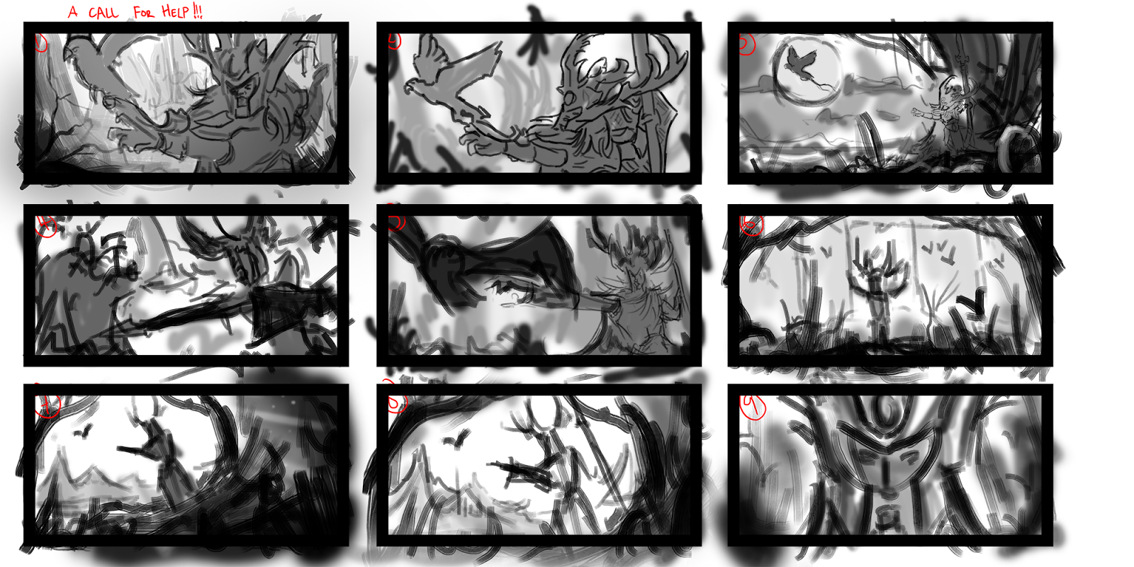
So my first image is some thumbs of one of my fave characters from the warhammer universe, I have a soft spot for wood elves and this is one of their main dudes Araloth...
Let me know what you think of these compositions and if any are worth progressing or if you are confused my any.

So my first image is some thumbs of one of my fave characters from the warhammer universe, I have a soft spot for wood elves and this is one of their main dudes Araloth...
Let me know what you think of these compositions and if any are worth progressing or if you are confused my any.

Replies
Been working mainly on the background and have filled in where I think my hero should be. I have been looking at all the amazing entries for the LoL competition and have learnt loads of great tips from those artists its so great to see their progression.
Here it is with just a background shot so far and the character.
I don't think that its a good idea to paint the environment and the character so split apart from each other. Theres also soooo much stuff you didn't need to paint if you had planned your image before.
The environment on its own looks very solid and can stand on its own no problem.
What can now happen is, that you can get a lot of places where stuff overlaps in ways you don't want. You could have saved yourself the trouble by planning both character and background together.
You might also want to look over your drawing again. The head seems offset from the body, the arms appear to be a little too short. This lineart would not suffice for me to paint properly with it. It contains too little information on what stuff actually is. Like the thing around his nexk, can't tell what it is.
Your thumbnail looked kinda better in way of proportions and overall image design.
Do you want to color that afterwards?
I guess its because i noticed someone doing it like this in the LoL competition and thought it was a good idea
I would;d like to add colour to this as well, i looked at a few youtube videos and most people seem to create a new layer and set it to overlay, would you say that is correct?
Also i have a piece i am working on from work... Here it is so far... the piece shown so far is what i am doing at home.
I wanted to have a massive battle going on but didn't know where to start
Also i have a blog where i put all this stuff - http://simonharveyconceptart.blogspot.co.uk/
You should start out different. Don't work on parts of your artwork - work on your artwork. See it as a whole, plan it as a whole and execute it as one thing.
If you compare for example with animation. Sure, there is a background painted seperatly, but beforehand everything is tightly planned out and the battle scene would be existant in a animatic and the background painter would have to stick rigorously to it.
Perhaps try one artwork where you just paint on environment and a character at the same time.
I am continuing with the wood elf piece and have put a bit more thought into the image, I felt that the man was a bit random and have decided to have him being hunted by some nasty mounted orcs and he is letting loose of his bird. Im not sure if this image is going to succeed for me but it might be a learning curve to be more organised and think about things instead of going into detail and not being able to change much.
Well here it is anyway
Unless anyone would like me to progress osme other options i might have the horse dud flip and come towards the screen and i might have an army marching with him...
The face still needs a lot of love and a majority of other bits, I still want to add the orc chaser to the piece...
I haven't had as much time as i would have liked to get into 2D, i am moving house and other things getting in the way i am still working on the pictures above.... I find it hard to put detail into buildings especially in the distance, what should be put in, what should i leave etc. I think what i have is OK, but need to flesh it out a bit more, i also thing the trees to the right are a bit obtrusive.
But i have also been thinking of some new stuff as well, i have these three concepts and i want to push one forward for now and do some more studies get some colour in and do some model sheets in the future then when that's done make it in 3d. A tall order...
The only thing that I could really say is that I wish the focal point was more emphasized, maybe some vignette around the left side of the image, and stronger contrast between the white sphere and something dark behind it?
I like your thumbnails and rough sketches above, too. Keep it up!
Thanks Avanthera for the feedback i totally agree the orb was an extra at the end as i felt the piece was lacking some sort of focal point and what better way than to add a weird orb
Since then i created the second thumb used a view photos on this one.
A lead at work also sent round some photobashed environments and i decided to give it a go... This was really fun!
Its been awhile... Progress on anything has been slow i am going through the stressful time of moving!
So here is some art; i did a few more photobashes...
I have also started a new project which i aim to take into 3d, it is mainly based around the mesoamerican era/architecture. It initially was going to be a sci fi project, but decided to move away from that. Here are my first pieces to get some inspiration.
But i am hoping to pick things up again.
This is just a WIP of a new piece i am working on i felt it lacked a focal point so have added some sort of structure thing on a cliff.
Let me know what you think and its good to be back here
These people have just discovered it!!! Day after tomorrow sort of thing