Home 3D Art Showcase & Critiques

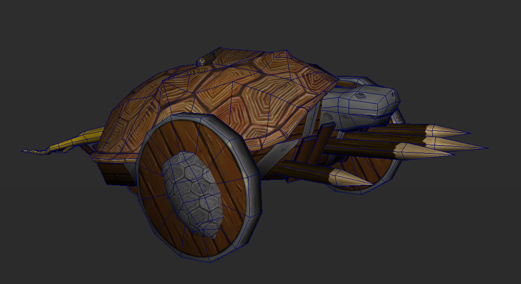
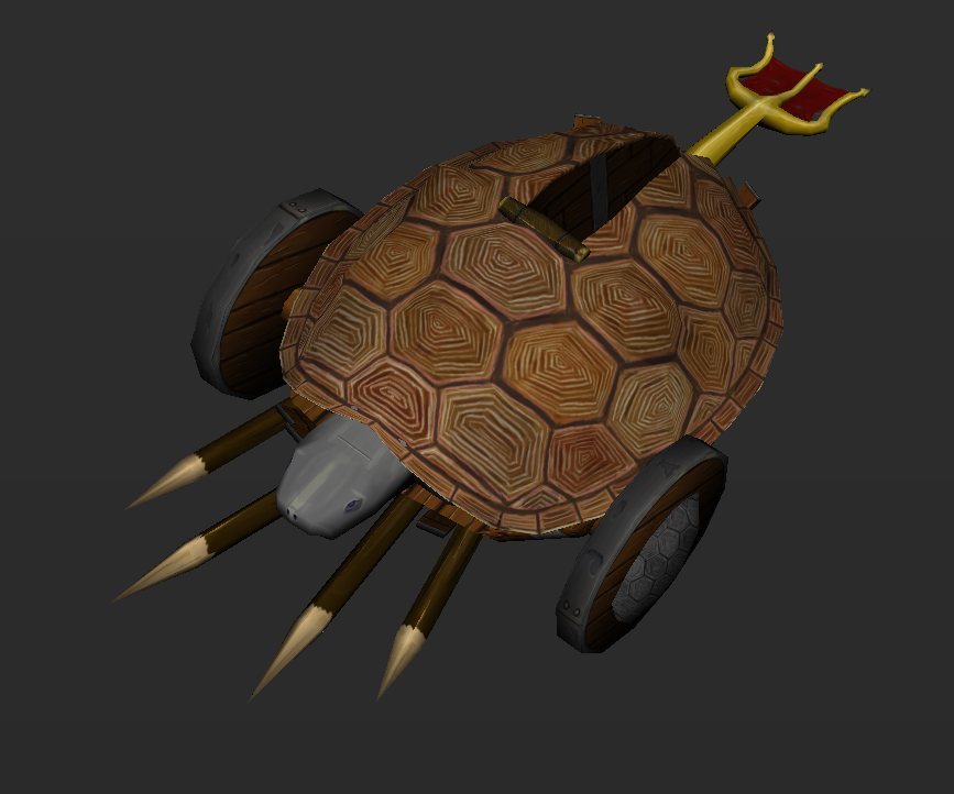
I call it a tortapult

I made a siege weapon over the weekend and I wanted to make it have a tortoise inspired theme. This is what came of it!
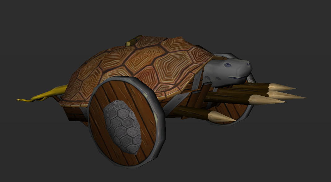
3.4thsTextured.PNG

3.4thsWF.PNG
topDownTextured.PNG
Here's the first pass. Things That I plan to go back and do are:
Add some spokes to the wheels.
Change the color of the shell, it's all a bit too brown between the shell and the wood.
Make the head look more metal.

I'd love some critiques.
Now that I look at it I'm not too happy with the trident launching arm. Anyone got an idea how to improve it?

Replies

  • SomethingFishy
    Got a second pass in today and got to the major points I wanted to change. Had so fun playing around with color schemes. Critiques are always welcome!
    3.4thsTextured2.PNG
    SideWFTextured2.PNG
  • Brian "Panda" Choi
    Offline / Send Message
    Brian "Panda" Choi high dynamic range
    You doing last gen texturing, or PBR?
  • ScottHoneycutt
    Offline / Send Message
    ScottHoneycutt polycounter lvl 14
    With this style of work (particularly in the textures) you could really benefit from taking the painting further. How much time have you spend on the paints? How deep into learning texture painting are you? There are levels of detail you can add to make the texture pop much more.

    http://aliceandthetextures.blogspot.co.uk/
  • SomethingFishy
    @JadeEyePanda I was gong to leave it as just a diffuse map but after seeing the link ScottMichaelH posted I want to try to go the PBR route. So there will be certainly more to come.

    @ScottMichaelH I've spent a few hours on the textures (3-5hours). I'd say I'm a bit below average. Thank you for the link it gives a good idea of what to shoot for. When you say levels of detail are you referring to pushing my diffuse (pushing shadows and highlights, adding dirt) or to add normal and specular maps?
    I don't have a great eye for hand painted textures but I really want to learn, could you point out something particular to give me an idea of what you mean?
  • Xaragoth
    Offline / Send Message
    Xaragoth polycounter lvl 8
    I literally expected a catapult firing turtles. I am now a tad bit sad D:
  • ScottHoneycutt
    Offline / Send Message
    ScottHoneycutt polycounter lvl 14
    @JadeEyePanda I was gong to leave it as just a diffuse map but after seeing the link ScottMichaelH posted I want to try to go the PBR route. So there will be certainly more to come.

    @ScottMichaelH I've spent a few hours on the textures (3-5hours). I'd say I'm a bit below average. Thank you for the link it gives a good idea of what to shoot for. When you say levels of detail are you referring to pushing my diffuse (pushing shadows and highlights, adding dirt) or to add normal and specular maps?
    I don't have a great eye for hand painted textures but I really want to learn, could you point out something particular to give me an idea of what you mean?

    Go in the direction you want to go in. Pick a style, know what you are trying to accomplish, etc. Then do that to the best of your ability.
  • Crazy_pixel
    Offline / Send Message
    Crazy_pixel interpolator
    Cool idea :)

    I agree with the others, polish your texture a little bit more and please give your tortapult turtle grenades :D:D
  • SomethingFishy
    Thank you for the feed back everyone! I went back and reworked the shell and got a much better result. I added a few dents and dings about the texture and a bit of dirt layering. I could still go grungier though.

    And by request I made a turtle-bomb. It's simple so let me know what you think!
    3.4thsTextured3.PNG
    SideWFTextured3.PNG
    TortaBombs.PNG
  • Youngy798
    Offline / Send Message
    Youngy798 polycounter lvl 4
    I think you should rework the little caps on the sides of the wheels. I think that is pulling the piece down in my opinion,
  • Brian "Panda" Choi
    Offline / Send Message
    Brian "Panda" Choi high dynamic range
    SomethingFishy, I have this bad feeling that no matter what you do to improve the texture work, the design overall is not helping this concept of a catapult that is designed like a tortoise.

    I really think going to back to sketches and thumbnails would be best, so you can tackle this with a better design.

    Shells as wheel caps. Turtle bombs as simply turtle shells stuffed with dynamite. I'm not buying it.

    I'm assuming this is just a personal project, so hopefully you have all the time in most of the world to get this done to tip top form. I really encourage you, if you're committed to this idea, to go back to concepting out what this tortapul can look like.
  • Deathstick
    Offline / Send Message
    Deathstick polycounter lvl 7
    I actually kind of liked the very first version better, namely because the color palette felt a little bit more cohesive and made sense material-wise. I'm not sure but that could just be my personal tastes, since theoretically the colors you chose aren't ridiculous. I will say though that that red/green combo on the tiny turtle bomb is definitely going to stand out more than the big turtle color-wise, which is something you may or may not want. (Why everyone wears red in the green jungles of Farcry is beyond me :) )


    It also could do with the fact that you're showing screencaps of what looks like directly from 3d Studio Max's preview viewport, which IMO does not do a real-time model's textures justice at all. Not to mention the colors might actually look different in something like marmoset or unreal due to the whole sRGB/rgb thing of doom in Max.
Sign In or Register to comment.