The BRAWL² Tournament Challenge has been announced!
It starts May 12, and ends Oct 17. Let's see what you got!
https://polycount.com/discussion/237047/the-brawl²-tournament
It starts May 12, and ends Oct 17. Let's see what you got!
https://polycount.com/discussion/237047/the-brawl²-tournament
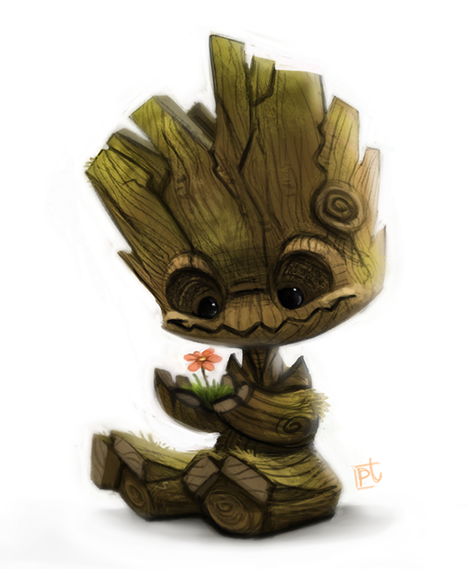
Cute Baby Groot
Hey
Current state:

I've been working on a 3d model from an awesome concept i found:

Though i have taken a few design liberties.
heres what i have right now:


oh. and im kinda struggling with the arm and hip joints. Not quite sure what i should go for...
And also. should i always model in T pose, to be able to add detail(which is problematic in the pose he's in right now), or do anyone have any tips on maybe dynameshing the body into one piece and then keeping/adding details?
I would love some comments and ideas:)
Current state:

I've been working on a 3d model from an awesome concept i found:

Though i have taken a few design liberties.
heres what i have right now:


oh. and im kinda struggling with the arm and hip joints. Not quite sure what i should go for...
And also. should i always model in T pose, to be able to add detail(which is problematic in the pose he's in right now), or do anyone have any tips on maybe dynameshing the body into one piece and then keeping/adding details?
I would love some comments and ideas:)

Replies
In terms of your 'design liberties', have you altered the character's personality? The original seems quite innocent and curious, whereas yours looks more mischievous and a tiny bit menacing. I think it's his eye sockets, but if that's intentional then that's fair enough!
I particularly like the cracks in the top of his head. Very well sculpted!
about the joints, my thought is basically that right now i have a socket to stick the legs in. But maybe i shouldnt have that, and just have a connecting body...
@WesleyArthur
It was not actually my intention to alter his personality. I'd like to preserve the innocent personality Groot also has in the movie. So, good eye
i fixed his eyesockets a bit, to make him less mischievous. And i havent quite decided how to handle his mouth, in these terms. The zigzagmouth from the concept has turned out more like something from a haunted movie, so im not gonna do that at least:P
I have fixed his shoulders and hips, like ive been so unsure about. But it gave a better silhouette. But also a very hexagonal butt. We cant have everything :P
@JadeEyePanda its coming
i would love some feedback on the bodys proportions. he doesnt look quite right yet.
but anyway. here is some of the progression, ive decided to go with a different painting scheme than what im showing here; where i stay more true to the concept. Maybe too true to it, but hell, thats how itll end up.
bumpviewermat:
colorized: (though as mentioned, im going a different direction with it, just havent finished enough to post)
this is what i mean by different coloring scheme:
bumpviewermat:
flat:
Comments/critiques are always welcome
thats why you can see the shadows in the black and white bumpviewermaterial.
good eye!
I have also experimented with a closer to the original concept design, (especially the mouth), but i found it to ruin the cute look, which this concept was going for. The zigzag mouth became too much, and the shape of the head ended up like a subtle arch, and not a roundish shape.
so the short answer is: meh. close'nuff
I have also been speculating on making a lowpoly render of this model as well...any thoughts on that btw? is there a point to it?
I appreciate all comments and critiques, as always