The BRAWL² Tournament Challenge has been announced!
It starts May 12, and ends Oct 17. Let's see what you got!
https://polycount.com/discussion/237047/the-brawl²-tournament
It starts May 12, and ends Oct 17. Let's see what you got!
https://polycount.com/discussion/237047/the-brawl²-tournament
Blizzardfest Goblin Tinker
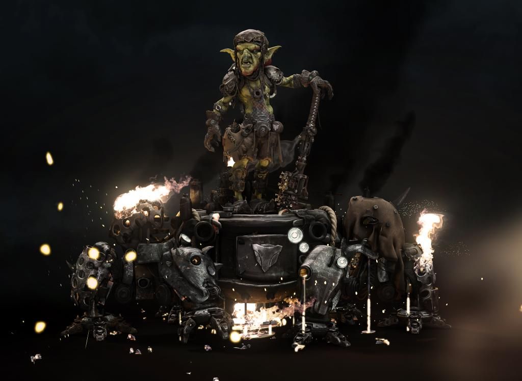
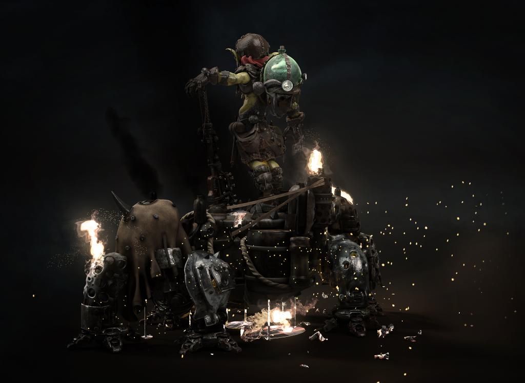
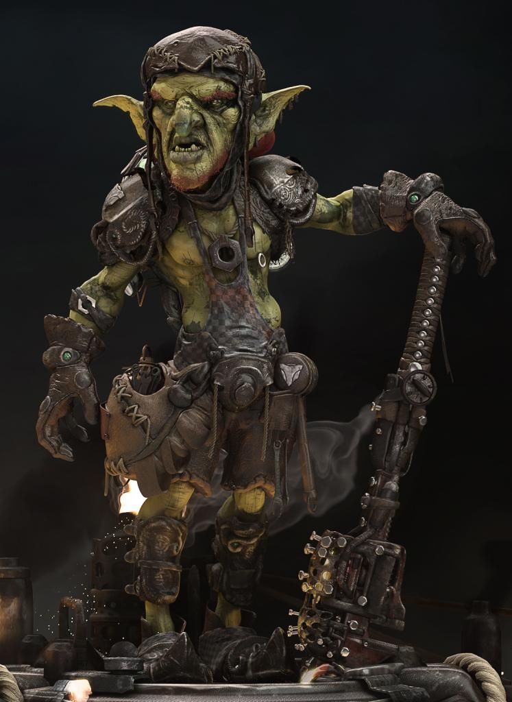
I would like to share my entry for the blizzardfest. The concept was to recreate an secondary character into a hero type. I started with a goblin tinker. It ended up being quiet a challenge going into different directions. Here are the results of that journey:
The mental ray renders:
The mental ray turntable:
https://vimeo.com/111869109
https://vimeo.com/112113432
The sketchfab turntables:
[SKETCHFAB]90448731246b4672837d8b9a85bbe26a[/SKETCHFAB]
[SKETCHFAB]703cd357e44d4a9c93e6642b08d8b7a5[/SKETCHFAB]
The Marmoset Toolbag screengrabs: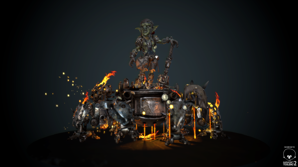
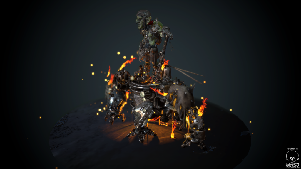
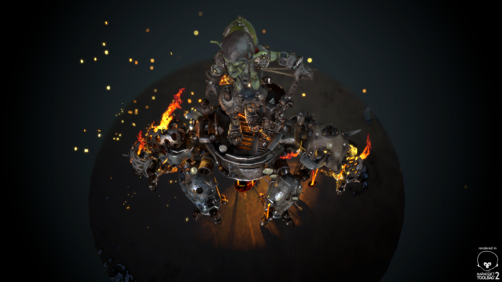
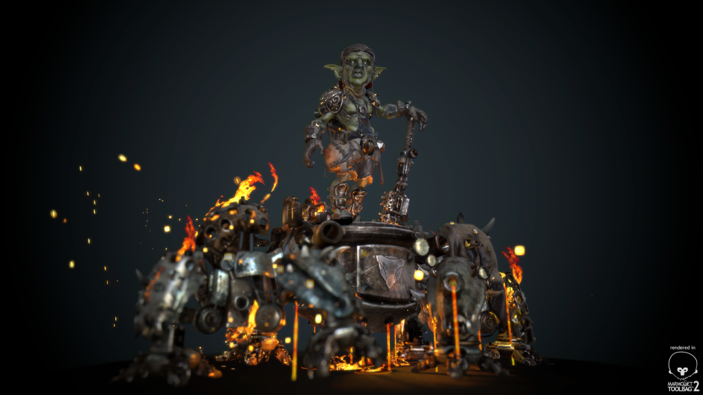
Some Zbrush renders and due to deadline the entry I submitted:
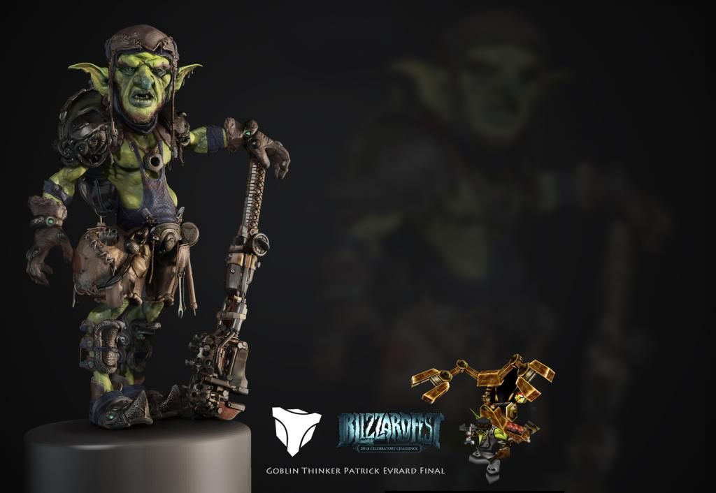
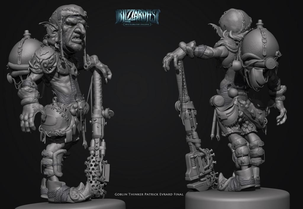
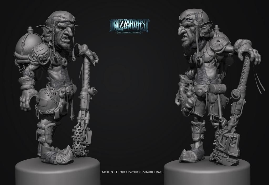
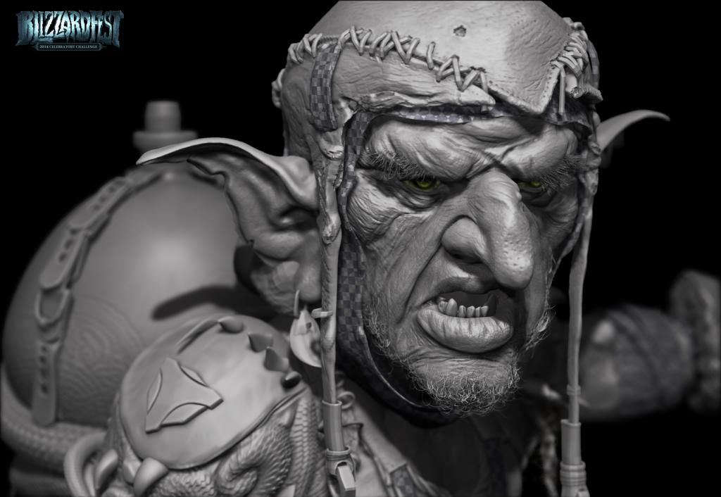
Hope you like!
The mental ray renders:


The mental ray turntable:
https://vimeo.com/111869109
https://vimeo.com/112113432
The sketchfab turntables:
[SKETCHFAB]90448731246b4672837d8b9a85bbe26a[/SKETCHFAB]
[SKETCHFAB]703cd357e44d4a9c93e6642b08d8b7a5[/SKETCHFAB]
The Marmoset Toolbag screengrabs:


Some Zbrush renders and due to deadline the entry I submitted:


Hope you like!
Replies
the pose is incredibly boring. you can see that both hands have an almost identical posture, even the arms don't look different outside of a 90 degree shoulder rotation.
@TeriyakiStyle yeah must agree with you I used the same lightsetup as for the clay render. I found the uplighting in Marmoset but didn't get it right in Maya. Which is a bummer cause he is standing on a sort of grill which would indeed give nice lights. The fire doesn't give enough light.
@almighty_gir h
For a better presentation for a portfolio piece I would sugggest to tone down particles, just a light-setup that focusses on your gobiln with the spider thing as a supportive element.
Depth of field should only be added for the close-up shots.
So far you have a great model, great highpoly. It would be a shame to have the presentation drag down the otherwise great work.
I guess as I modelled it it's much easier for me to recognize the shapes than someone that looks at it for the first time. Yeah the metal doesn't help. Should have made some parts of the legs more even. For the particles there are also some glowing metal parts that are too pronounced...
Should make a paintover and change things but there is some much wrong with it I'll probably move on. That's the downside of participating at challenge for me. I don't have enough time to finalise it at a good level because I always keep adding stuff. But you don't get result that are portfolio stuff just some funny ideas. Therefore the next project wont be for a challenge were I hope to get good result in the end.
But I think there is nothing wrong with changing camera angle and create a new light setup after a competition has ended, to get the best out of a project for your portfolio. At the moment the presentation pronounces some weak areas of the design. Changing some things will make this less aparent.