TMNT - Bebop
Latest Progress:
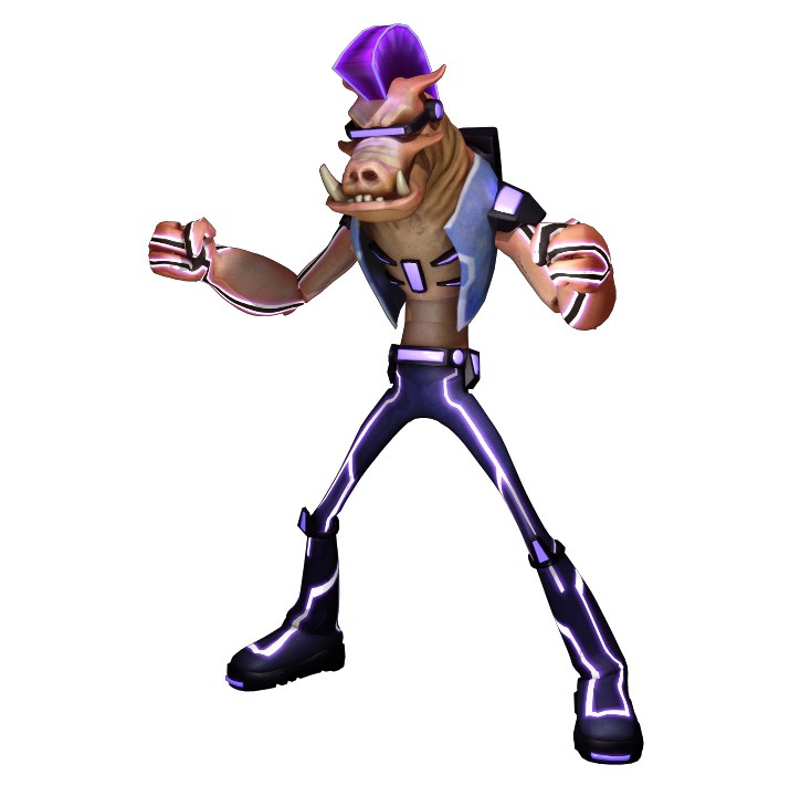
I've been wanting to do something in a cartoon-animated style for a while now. And since I am a huge fan of the ninja turtles, I thought I would start with something from the new series. Bebop's concept art surfaced not to long ago so I decided to model him since he is a new character that will at some time appear on the show. The only problem is that there isn't much concept art out there for him so I'm going to have to use some imagination for some of the design. However, I did find some Anton Zeck screen shots to reference from when he appeared on the show. Not much else outside of that though.
Any who, my current progress is below. Thanks for checking it out and do feel free to offer some constructive crits if you have the time.
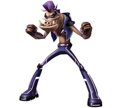
concept I found online
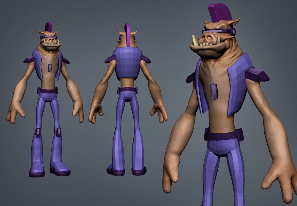
first progress shot

I've been wanting to do something in a cartoon-animated style for a while now. And since I am a huge fan of the ninja turtles, I thought I would start with something from the new series. Bebop's concept art surfaced not to long ago so I decided to model him since he is a new character that will at some time appear on the show. The only problem is that there isn't much concept art out there for him so I'm going to have to use some imagination for some of the design. However, I did find some Anton Zeck screen shots to reference from when he appeared on the show. Not much else outside of that though.
Any who, my current progress is below. Thanks for checking it out and do feel free to offer some constructive crits if you have the time.
concept I found online

first progress shot

Replies
that being said, I think whatever lights you have are too close to the model, cause homeboy is lookin blown OUT.
PS I agree with JHOY, them wireframes would be nice. and the skin flaps
I had a little extra time to work on him today. Made some of the changes based on the feedback...especially with the lighting
I think the texture on his arms is looking a little wobbly. The part connecting the hair to the back of the neck is looking mushy too.
One tricky thing about this character will be to give it a cartoony like rendering while maintaining some of the realistic elements you have there. I think its a really cool concept tho and you are on the right track here. Keep it up man!
Brad - I think you're right about the head. I didn't catch that until now. Good idea about the pose for comparison too.
Thanks for all of the feedback guys!
So today was mainly a fail day. Had all sorts of tech issues with posing and I should have given up a lot earlier...but I tried to chug through it. I say tried because once I went to export the geo from ZBrush, all sorts of verts disappeared and those that didn't were stuck to the center point of the grid. I'm pretty sure I know what the cause of the madness is but figured I'd post the pose anyway. And yeah, head definitely looks smaller.
Also, here's a another test render I did yesterday...I added an AO pass this time. I'm still trying to match the render style of the show.
I am not a character artist myself, so I'm always in awe when I see posts like these.
Keep it up!
The whole point of Bebop is that he is a mean pig, and a pig having a long thin body like the thin-men from X-Com doesn't really make any sense character-wise to me. I think he looks better as a character with the usual hulking, thick upper body with the stocky, squat lower-body. In the concept it looks like he hasn't eaten for a month and is a marathon sprinter.
Anyways just my two cents about the concept itself so you can take from that what you will. Otherwise keep it up!
Deathstick - yeah I hear ya man. He's definitely not the classic character we're use to. In fact, I didn't recognize the connection between Bebop and Anton Zeck on the show...until I saw the concept art. This may be the only character they've changed up this much. I'll have to look again. But overall, I've liked the design of the characters in the series. Veck had some cool techy gadgets..I'm assuming Bebop will use the same tech also, maybe that's why he is so skinny.
Did a quick test pose today to match up with the reference. Seems a few things are a little off so I'm going to go back and adjust the proportions a bit. Still getting that crazy trouble with the verts moving after posing with transpose master in ZBrush. I was hoping to avoid having to rig in maya for a quick pose but it seems I'm getting more trouble doing it in ZBrush than I expected. If anyone has any ideas on this I'd love to hear it.
One thing you can try is simply not using transpose master. Like simply collapse everything down to one mesh and doing some dirty posing just for the sake of figuring out stuff now Then at the end do a proper rig and pose for a beauty render.
I think if you are posing in zbrush just using masks and stuff on a single mesh you won't have any issues like your having now. Also you can make adjustments in zbrush on a layers that way you can always get him to deform back to tpose. So like pose on one layer, then make size adjustments on another. Then delete the pose layer when you are happy and adjust the hp and rebake. Something like that might work well. Personally, I also like to take screen shots of poses and stuff and do paintovers on the pose (in a seperate layer) in photoshop so I can clearly see what changes I need to make to get it just right. This especially helps when trying to create likeness sculpts but pretty much works well whenever you are trying to match a reference.
Ultimately, I resized the head, tweaked the arms a bit and made the legs a tad bit longer. Did a rough pose...but still, after the adjustments, the 3D version looks a tad off from the concept. I am however more pleased with the new adjustments than before. At this point I am going to work on the textures a bit more and try to finish this guy up.
Thanks for all of the comments and suggestions...it really helps to have another eye on your work.
Again, thanks for all of the feedback guys! Hope ya dig him