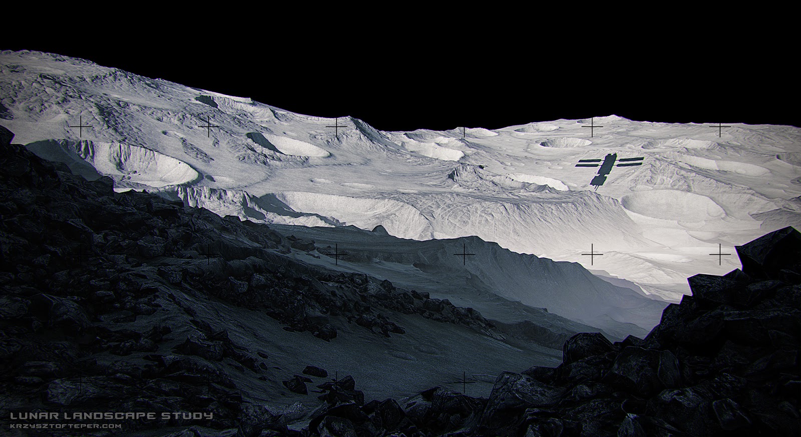
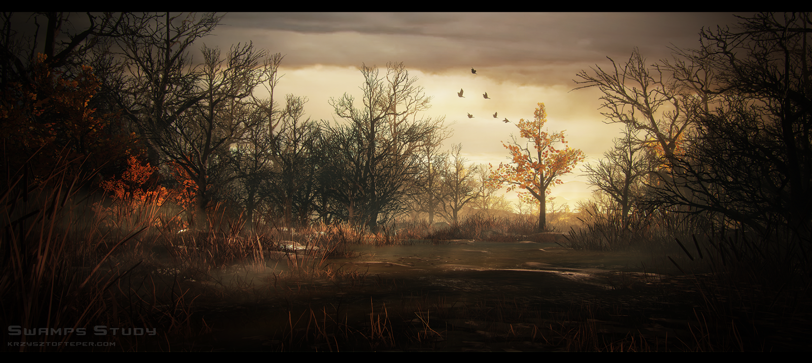
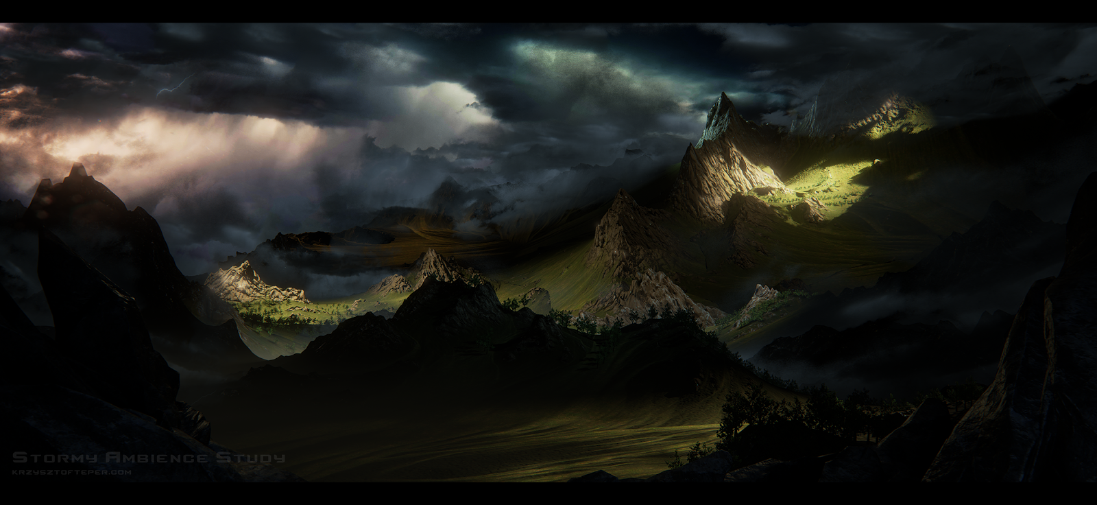
I decided to setup a thread for my mini environments finally. There will be more and I'm going to do some workflow time lapses since some of you guys were interested in the process (not able to stream with this rather ridiculous upload speed here). I'm reusing some stuff from old projects to make it a little easier for myself. I do believe that sculpting a tileable cliff for each new scene is a good practice but it's not always necessary
Any feedback or suggestions for stuff that you would like to see in the future are welcome here.
Also, pretty weird fact I found about my work. I tend to place primary focal elements in the right hand side of an image subconsciously. Is that normal? How do you guys approach layout and compo stuff in general? Share your thoughts!
These are great! Well done! I really love the moon study. Funny about how artists have natural tendencies to gravitate toward certain compositions. I always end up putting some sort of super bright focal point in my work.
@Tris - thanks man, I think that bright spots and desaturated color palette in your artworks work really well. It makes them very memorable.
@Stirls - This one was actually inspired by the swamps area they showed in Witcher 3, damn that game looks tasty. However, a couple hundreds of hours I spent in the Zone may have some impact there as well ;p I think I'm gonna do a proper tribute to STALKER with next environment.
@Alec, mats, Jamie - To be perfectly honest, I'm not sure how to approach detailed breakdowns for these. My workflow for terrains is same as for one of my previous projects, I did a full breakdown for this process here + to make things as fast as possible here, I'm using some pretty dirty tricks that would be unforgivable for standard production Anyway, I'll be recording the whole process for next environment, so you guys let me know if there is anything specific you'd like me to break down after that.
That looks stunning. I'm also using World Machine here and there.
I see on the material editor that you are using normal textures so I assume you are converting the World Machine results into actual meshes and just applying the textures like you would do on any other asset.
Are you using the mesh exporter from World Machine or doing something else? When exporting from World Machine how do you reduce the mesh, by yourself with some plugin or the actual reduced mesh that can also be exported from WM?
I will give this a try as well, as until now all the times I've exported meshes it was usually for just one mesh and did some very rough mesh reductions with ZBrush.
Fantastic work You managed to do artistically complete sketches (speed painting style) in a full 3D game art workflow! That's an achievement by itself.
That looks stunning. I'm also using World Machine here and there.
I see on the material editor that you are using normal textures so I assume you are converting the World Machine results into actual meshes and just applying the textures like you would do on any other asset.
Are you using the mesh exporter from World Machine or doing something else? When exporting from World Machine how do you reduce the mesh, by yourself with some plugin or the actual reduced mesh that can also be exported from WM?
I will give this a try as well, as until now all the times I've exported meshes it was usually for just one mesh and did some very rough mesh reductions with ZBrush.
Yeah, I used normal map for Lunar landscape but it's tuned down a bit (R=0.5;G=0.5;B=1). I don't normally use it for terrains, especially with high mountains, as it will make the side opposite of light vector unnaturally dark.
Eg back side of a mountains may appear completely black for no good reason. Tiling detail maps are much more efficient and add this nice crispness to rock formations.
And yeah I use Mesh output and do either decimation master pass in zbrush or check simple reduction in WM mesh output node. It may be hard to get it look right under 15-30k tri but for game production I'd probably export just one or two mountains separately that I can scale and rotate in engine, thus build the vista manually with more control.
Check the exterior of the UE4 Effects Cave demo, really nice example of that there.
Fantastic work You managed to do artistically complete sketches (speed painting style) in a full 3D game art workflow! That's an achievement by itself.
Haha, thanks man. Yeah just trying to find bypasses and justify my laziness I need to learn how to properly draw finally!
Tepcio, thanks for the suggestions. I usually just export the height map and a couple weightmaps to UE4 and do the work over there, and only bring meshes when it's just a single mountain or something like that.
Had a try at the Moon stuff last night, but didn't really think much about the composition and the result is kinda... bad. The fact that all I had in that UE4 project was a couple rough meshes of pipes and stuff didn't help to populate the image either, hehehe.
This is really dope! Thanks for sharing your process. Are you comping all the different render passes in photoshop? Or are you capturing it and all the post process volume effects inside UE4?
Tepcio, thanks for the suggestions. I usually just export the height map and a couple weightmaps to UE4 and do the work over there, and only bring meshes when it's just a single mountain or something like that.
Had a try at the Moon stuff last night, but didn't really think much about the composition and the result is kinda... bad. The fact that all I had in that UE4 project was a couple rough meshes of pipes and stuff didn't help to populate the image either, hehehe.
Still learning my way through some of the nodes in World Machine.
Cool to see it inspired you! As said in PM, shadow in the foreground is drawing too much attention. Also, try to scale a few of the terrain pieces in Z, it will give some variety in craters depth.
This is really dope! Thanks for sharing your process. Are you comping all the different render passes in photoshop? Or are you capturing it and all the post process volume effects inside UE4?
Hey, it's a buffer visualization (new view mode for UE4). But yeah it's possible to call specific render passes (Like AO or translucency) in material effect, as there was no easy way around it in UDK.
Cool to see it inspired you! As said in PM, shadow in the foreground is drawing too much attention. Also, try to scale a few of the terrain pieces in Z, it will give some variety in craters depth.
Hey, thanks for the reply and also the PM. I will work on a couple smaller rocks to add detail and also try modifying the Z scale of some pieces. Also will work on the shadows. It's true that it draws too much attention, but making it very light also looked kind of weird... I will try to find a nice spot in-between.
Thanks and keep posting environments done in UE4 here if you can!
No worries, I thought I will be able to carry on this weekend and record some time lapses but can't look at terrains atm, need to give myself some hard surface happy times Anyways, if anything is up I will post it here.
Dang impressive stuff, man. I love how bold and vibrant everything is.
Got to ask a dumb question, do you bake lights on your terrain? If so, is it supposed to take an entire day, or is there a faster way of doing it?
Thanks man, yeah lighting on landscape system is a huge pain in the ass. I'm using a static mesh with 1024 lightmap per instance and static lighting scale of 5.0 - the last scene built under 5 mins.
Unlit scene shots (camera break-away, high up looking down on the scene?) With a good view of the lighting set up?
Wire shots
Individual asset shots
Textures
These are interesting but its hard to give feedback without knowing how they were constructed.
As mentioned earlier, these are not supposed to be standard production environments. The wires are mostly bad and textures bigger than they should be.
I totally get your point but I'm looking for lighting/comp feedback:
Are there elements that shouldn't be there?
Does anything distracts the eye from focal points?
Aren't the values too dark?
And most importantly, do I repeat same mistakes over again?
Speaking of dark values, here comes new one:
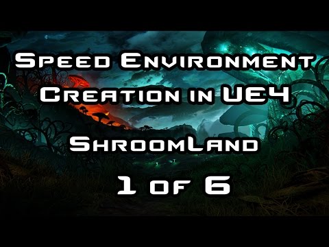
Including workflow time lapse this time (first of six parts, should manage to upload rest by Friday):
Contents (time stamps will be included in YT descr):
- World Machine landscape development
- UE4 - Scene set up + some shader work
- Mushroom block out in Maya and Zbrush sculpting
- Small section dedicated to working with fractals using Structure Synth. Used it for those funky trees.
- Putting it all together in UE4
The total run time for it was pretty long so I sped up some sections by x3.
My respect for people who stream/record tutorials and workflows increased by 1000% (and it was pretty high already). It was a huge challenge, composition couldn't 'click' for quite a bit, suddenly stuff that should work in zbrush and world machine didn't. What is more, uploading single 3h video took almost 2 days and YT crashed around 90%... so decided to split it into parts eventually. I tried to clean up the video but some of my epic fails are still there I think.
I did not record the whole process but grabbed several of snapshots during and after the recording:
(also started reusing grass and some stones from previous projects at some point sv_cheats 1, lol)
I love these so much, really nice work. As for criticism, What are these lines you've marked all over the screen in the gif? Are these just for points of reference, or is it something similar to a guideline for your composition?
While I like the fantasy one, it does sorta feel a bit.. much? There's a lot to take in, but that mightn't be a bad thing.
Yeah, forgot to mention that. These are compo grids attached to post process. I've made a version for UDK in the past. I will share my UE4 version next time.
Totally agree that it's too busy and contrasty mate. Not even trying to justify myself, I'll try to a better job next time
Going to sit down and read/watch though all the awesome info in this topic now
As for feedback though one thing that stood out to me was on the left and right of that latest post there is a yellow light but, i can't see any kind of light source for it?
The idea was that the light is coming from behind the camera but yeah I should have sold that better.
And here come next one!
This one uses some pre-made pieces from UE4 demos and was super fun to put together.
I want game environments to look like this and play well. Is it possible to optimize these scenes so they would be viable for a game? This last one especially. Holy crap.
Should be possible, but would have to get programmers on it specifically. There's always more to do, so picking and choosing priorities is often a tug of war between who wants what and when.
Frankly, while the recent focus on image quality and materials is all well and good, playing Dragon Age Inquisition reveals just how much work there is to do in terms of LOD, polycount, and draw call optimization until we can get to something like the above.
Thanks for the reply to my post! As exercises in composition and lighting these are really nice. Have you tried applying this to tighter, closer scenes as oppose to vast landscapes?
Love the whole idea and concept behind these as well as the results. It's a really nice way to produce concept art for your projects without actually having a lot of concept art painting skills. Might be something especially for smaller indie studios to really think about using.
I'd love to see a scene breakdown of the Castle one, with shots from different angles and such
@Makkon, locater16
Yeah, I do think it's possible. It's pretty much what locater said, good LODs would do the trick. Even seamless terrain mesh shouldn't be a problem if set up with custom tesselation thresholds. Thanks guys!
Thanks for the reply to my post! As exercises in composition and lighting these are really nice. Have you tried applying this to tighter, closer scenes as oppose to vast landscapes?
Thanks Adam, it means a lot. I definitely want to give it a shot, especially after seeing the stuff that Snefer has been posting lately. It's so inspiring!
Love the whole idea and concept behind these as well as the results. It's a really nice way to produce concept art for your projects without actually having a lot of concept art painting skills. Might be something especially for smaller indie studios to really think about using.
I'd love to see a scene breakdown of the Castle one, with shots from different angles and such
Thanks man, visual targets will not always replace good concept art but yeah they may be quite handy sometimes. I actually started doing these to bypass lack of painting skill. This series motivated me to start practicing and I did my first value sketches last week
Not sure if these will be of any help but posting them here:
So yeah not relying on GI too much and controlling bounces manually with
spotlights/pointlights. There is no global directional light in the scene.
these are great, i think its a great exercise in composition and color. I really like how relatively simple they are when you break them down, thanks for the info, looking forward to more of these
Little side project to rest from tons of hard surface. Had a chance to play around with GeoGlyph at least. A bit overpriced but amazing set of macros nonetheless.
@mrgesy - when you look at the Moon surface photos the sky is pretty much black. I think it might be due to the dust layer in the "atmosphere" that catches the light reflected from the surface and blocks weak incoming light. Similarly to Earth's atmosphere gases during daylight. Additional sky detail could be interesting but I was going for most realistic effect possible.
The moon's sky is black in photographs due to the camera being exposed for photographing subjects on the surface. If the camera were exposed to see stars the lunar surface would be completely blown out.
@mrgesy - when you look at the Moon surface photos the sky is pretty much black. I think it might be due to the dust layer in the "atmosphere" that catches the light reflected from the surface and blocks weak incoming light. Similarly to Earth's atmosphere gases during daylight. Additional sky detail could be interesting but I was going for most realistic effect possible.
Oh that's true! Just checked reference now and saw it
Replies
@Tris - thanks man, I think that bright spots and desaturated color palette in your artworks work really well. It makes them very memorable.
@Stirls - This one was actually inspired by the swamps area they showed in Witcher 3, damn that game looks tasty. However, a couple hundreds of hours I spent in the Zone may have some impact there as well ;p I think I'm gonna do a proper tribute to STALKER with next environment.
@Alec, mats, Jamie - To be perfectly honest, I'm not sure how to approach detailed breakdowns for these. My workflow for terrains is same as for one of my previous projects, I did a full breakdown for this process here + to make things as fast as possible here, I'm using some pretty dirty tricks that would be unforgivable for standard production Anyway, I'll be recording the whole process for next environment, so you guys let me know if there is anything specific you'd like me to break down after that.
As for craters process, yep its fully automated. Here is a tutorial and a macro available for download.
And snapshot for my setup:
A good example of dirty trick here: the diffuse sharpen should be done on actual texture to save shader instructions but yeah it was faster that way
I see on the material editor that you are using normal textures so I assume you are converting the World Machine results into actual meshes and just applying the textures like you would do on any other asset.
Are you using the mesh exporter from World Machine or doing something else? When exporting from World Machine how do you reduce the mesh, by yourself with some plugin or the actual reduced mesh that can also be exported from WM?
I will give this a try as well, as until now all the times I've exported meshes it was usually for just one mesh and did some very rough mesh reductions with ZBrush.
Yeah, I used normal map for Lunar landscape but it's tuned down a bit (R=0.5;G=0.5;B=1). I don't normally use it for terrains, especially with high mountains, as it will make the side opposite of light vector unnaturally dark.
Eg back side of a mountains may appear completely black for no good reason. Tiling detail maps are much more efficient and add this nice crispness to rock formations.
And yeah I use Mesh output and do either decimation master pass in zbrush or check simple reduction in WM mesh output node. It may be hard to get it look right under 15-30k tri but for game production I'd probably export just one or two mountains separately that I can scale and rotate in engine, thus build the vista manually with more control.
Check the exterior of the UE4 Effects Cave demo, really nice example of that there.
Haha, thanks man. Yeah just trying to find bypasses and justify my laziness I need to learn how to properly draw finally!
Had a try at the Moon stuff last night, but didn't really think much about the composition and the result is kinda... bad. The fact that all I had in that UE4 project was a couple rough meshes of pipes and stuff didn't help to populate the image either, hehehe.
http://i.imgur.com/1IeUUb9.jpg
Still learning my way through some of the nodes in World Machine.
Hey, it's a buffer visualization (new view mode for UE4). But yeah it's possible to call specific render passes (Like AO or translucency) in material effect, as there was no easy way around it in UDK.
Hey, thanks for the reply and also the PM. I will work on a couple smaller rocks to add detail and also try modifying the Z scale of some pieces. Also will work on the shadows. It's true that it draws too much attention, but making it very light also looked kind of weird... I will try to find a nice spot in-between.
Thanks and keep posting environments done in UE4 here if you can!
Got to ask a dumb question, do you bake lights on your terrain? If so, is it supposed to take an entire day, or is there a faster way of doing it?
Thanks man, yeah lighting on landscape system is a huge pain in the ass. I'm using a static mesh with 1024 lightmap per instance and static lighting scale of 5.0 - the last scene built under 5 mins.
These are interesting but its hard to give feedback without knowing how they were constructed.
As mentioned earlier, these are not supposed to be standard production environments. The wires are mostly bad and textures bigger than they should be.
I totally get your point but I'm looking for lighting/comp feedback:
Are there elements that shouldn't be there?
Does anything distracts the eye from focal points?
Aren't the values too dark?
And most importantly, do I repeat same mistakes over again?
Speaking of dark values, here comes new one:
Including workflow time lapse this time (first of six parts, should manage to upload rest by Friday):
https://www.youtube.com/watch?v=dPZ384Ych-c
Contents (time stamps will be included in YT descr):
- World Machine landscape development
- UE4 - Scene set up + some shader work
- Mushroom block out in Maya and Zbrush sculpting
- Small section dedicated to working with fractals using Structure Synth. Used it for those funky trees.
- Putting it all together in UE4
The total run time for it was pretty long so I sped up some sections by x3.
My respect for people who stream/record tutorials and workflows increased by 1000% (and it was pretty high already). It was a huge challenge, composition couldn't 'click' for quite a bit, suddenly stuff that should work in zbrush and world machine didn't. What is more, uploading single 3h video took almost 2 days and YT crashed around 90%... so decided to split it into parts eventually. I tried to clean up the video but some of my epic fails are still there I think.
I did not record the whole process but grabbed several of snapshots during and after the recording:
(also started reusing grass and some stones from previous projects at some point sv_cheats 1, lol)
While I like the fantasy one, it does sorta feel a bit.. much? There's a lot to take in, but that mightn't be a bad thing.
Yeah, forgot to mention that. These are compo grids attached to post process. I've made a version for UDK in the past. I will share my UE4 version next time.
Totally agree that it's too busy and contrasty mate. Not even trying to justify myself, I'll try to a better job next time
As for feedback though one thing that stood out to me was on the left and right of that latest post there is a yellow light but, i can't see any kind of light source for it?
The idea was that the light is coming from behind the camera but yeah I should have sold that better.
And here come next one!
This one uses some pre-made pieces from UE4 demos and was super fun to put together.
Frankly, while the recent focus on image quality and materials is all well and good, playing Dragon Age Inquisition reveals just how much work there is to do in terms of LOD, polycount, and draw call optimization until we can get to something like the above.
I'd love to see a scene breakdown of the Castle one, with shots from different angles and such
Yeah, I do think it's possible. It's pretty much what locater said, good LODs would do the trick. Even seamless terrain mesh shouldn't be a problem if set up with custom tesselation thresholds. Thanks guys!
Thanks Adam, it means a lot. I definitely want to give it a shot, especially after seeing the stuff that Snefer has been posting lately. It's so inspiring!
Thanks man, visual targets will not always replace good concept art but yeah they may be quite handy sometimes. I actually started doing these to bypass lack of painting skill. This series motivated me to start practicing and I did my first value sketches last week
Not sure if these will be of any help but posting them here:
So yeah not relying on GI too much and controlling bounces manually with
spotlights/pointlights. There is no global directional light in the scene.
Gwendeith (2 days)
translucency
color
Your proficiency and efficiency are mind blowing
@mrgesy - when you look at the Moon surface photos the sky is pretty much black. I think it might be due to the dust layer in the "atmosphere" that catches the light reflected from the surface and blocks weak incoming light. Similarly to Earth's atmosphere gases during daylight. Additional sky detail could be interesting but I was going for most realistic effect possible.
Oh that's true! Just checked reference now and saw it