UE4 Projector Room
Here is a small scene that I created in UE4. It is based off of a digital painting I like that I found on the interwebs (painting by artist Timothy Rodriguez). :poly136:
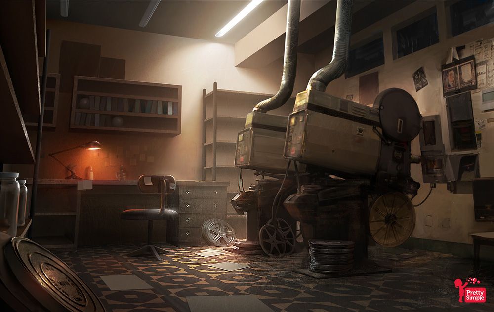
Original painting (by Timothy Rodriguez):
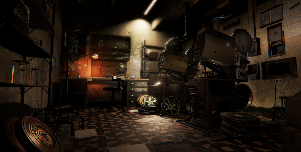
My UE4 render:
And here a few breakdowns of the scene...
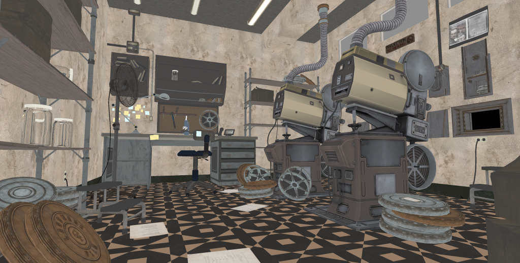
diffuse only: (not sure why decals disappear when lighting is off...)
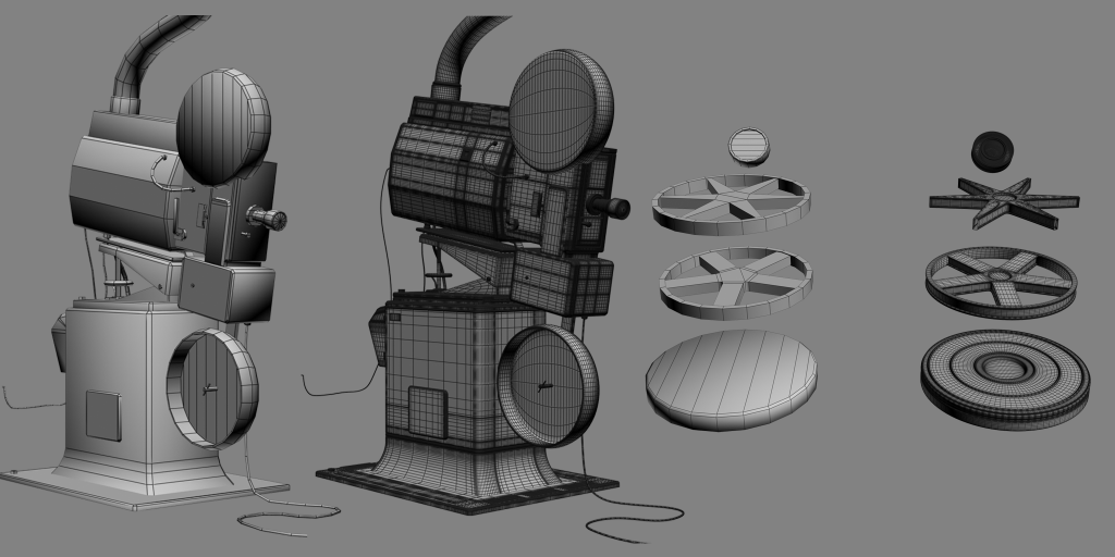
mesh breakdown:
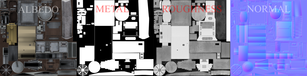
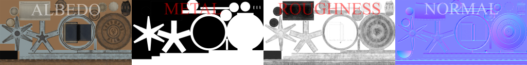
textures:
Original painting (by Timothy Rodriguez):

My UE4 render:

And here a few breakdowns of the scene...
diffuse only: (not sure why decals disappear when lighting is off...)

mesh breakdown:

textures:


Replies
Thanks for the info Swarm22...guess I'm so used to baking the AO into the diffuse that I didn't think about it when creating my Albedos!
I would say it still a bit dark, you can try to add some volumetric fog to your light and some dust particle going under them
Also a lens flare with some dusty effects like naughty dog used in Last of Us.
I would also try to unsharp those render, where the gloss is hitting when you look at them there is a lot of aliasing going on. Either in photoshop and UE4.
And I would drop a bit the bloom and or gloss on some part, they look a bit wet, plastic part of the projector, and the big pipe coming from the ceiling.
As it is probably a portfolio piece, I would add some geometry in the paper sheet to get them bend and more used then they are right now.
Overall I really like what you have already.
Also, the desk lamp's light is going through the desk. It's great work overall
I agree that there is too much AO in the diffuse/albedo textures. Even though technically there should be none at all I always tend to use a small percentage of AO as a rough guide 5-10%.
For the lighting the original concept has a greater intensity of ambient light. This is still a case in the newer render. One option to simulate GI would be to have a few low intensity point lights with a small radius in areas such as under the shelves to act as light bouncing from the floor and hitting the underside of the shelves as it is in the concept. This will help give the render that warmer feeling you get from the concept.
Alternatively these could be of use:
https://docs.unrealengine.com/latest/INT/Engine/Rendering/LightingAndShadows/Lightmass/index.html
https://forums.unrealengine.com/showthread.php?530-How-to-enable-Light-Propagation-Volumes-GI-WIP-AND-BETA
I am not fan of the floor...perhaps more shiny with no spec/shiny in the scratches if you see what i mean....the scratches looks too big imo but i guess it is a matter of tastes.
Other than that, great piece
I can see that you fixed the light from passing through the desk by reducing its range, but why wasn't the light blocked by the desk in the first place? I'm using U4 and never really had that kind of issue. Is there a big gap between the desk and the wall?
I would also play a bit with the windows above the projector, light them a bit having a cubemap of some sort of theater interior room can bring some depth into them instead of having a black hole.
For the light on the desk you can also try to find an IES profil of a similar lamp and get something accurate. This will also maybe help you with shadow passing through the desk, a hidden plane can also do the trick to get back the intensity of the light without anything passing through.
Bedrock: the light was passing through because I set the attenuation radius a little too high...
DespicableCheese: not too sure why the film reels on the floor are not casting shadows....looking into that here soon!
Noise: I totally brain farted when it came to adding an invisible plane to block the light...DUH, right? lol
Again, thank you everyone for checking out my little project and giving me some very helpful critiques...keep an eye out in the next day or two for an even more updated render!
I removed some unwanted distractions, such as the bright orange-ish light from the back of the scene and lightened up some of the floor scratches.
Finally, I added some depth behind the projector beam windows...the emptiness behind the windows was killing me!
I'm kinda over the concept at this point, it's more of a reference than anything else. It wasn't translating well into 3D without it looking too boring in my opinion...
Hope you enjoy!
And I think I wanna be that ass that says this. "It doesn't look like the concept anymore...."