[Riot Art Contest] - Mirar
Heya,
I've seen some amazing artwork so far, and wanted to join in on the friendly competition. Despite being a month short, I'll try to knock out something with these couple of weeks I have before things get hectic again.
UPDATE:
I've been pushing myself, but I probably won't be able to finish the tower in time, but I hope you like my Creen Den design. Amazing entrees from others!
Tower Submission:
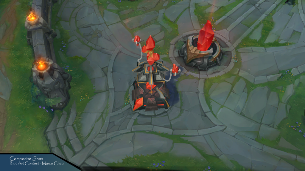
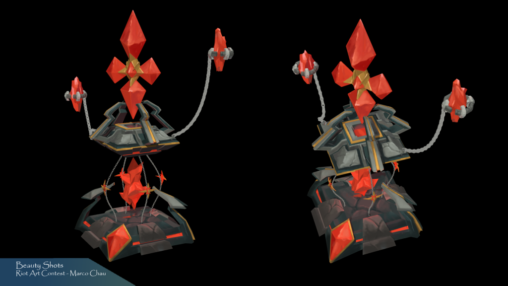
Just made it I think! Here it is.
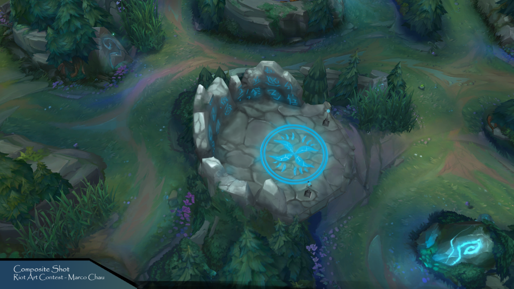
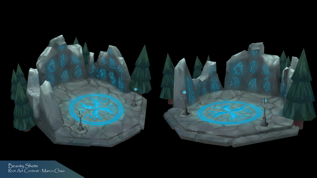
Creep Den Submission:
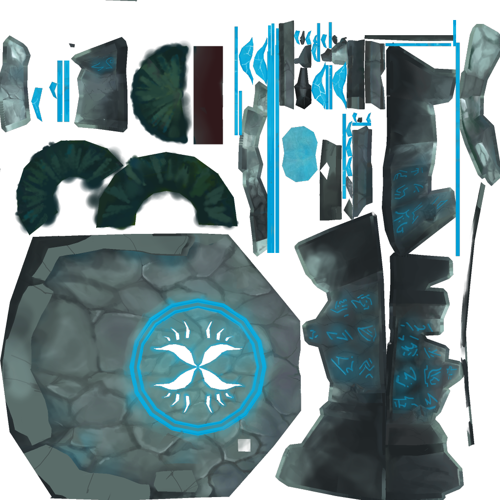
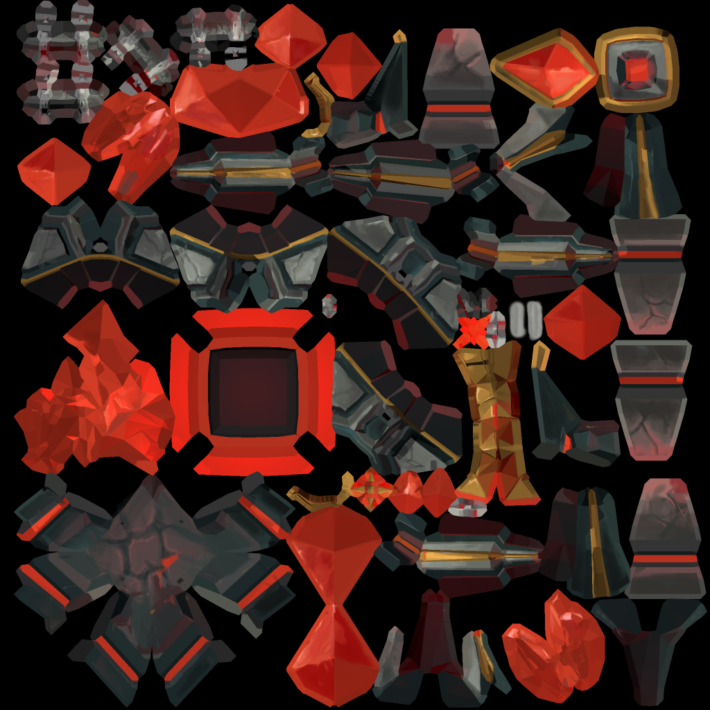
2048x2048 Texture sheet
Here are the concept art I drew up so far for the Tower designs.
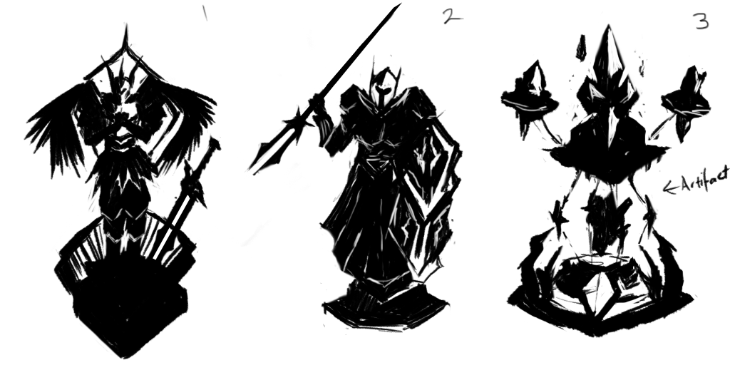

Currently debating which is the most appealing vs fits the LOL universe vs crafting practicality. 1-2 Seems to be the most fitting designs, and with some development the armor would look better. 3, 5, 6 Are practical to make but less interesting. 4 Is just a wildcard but it would be fun to make.
I would love some feedback on to which idea stands out to you, and which one you believe fits in with LOL more.
I'll be working on the creep den designs later on, after I get a decent blocking out of the tower model up.
I've seen some amazing artwork so far, and wanted to join in on the friendly competition. Despite being a month short, I'll try to knock out something with these couple of weeks I have before things get hectic again.
UPDATE:
I've been pushing myself, but I probably won't be able to finish the tower in time, but I hope you like my Creen Den design. Amazing entrees from others!
Tower Submission:
Just made it I think! Here it is.


Creep Den Submission:


2048x2048 Texture sheet
Here are the concept art I drew up so far for the Tower designs.


Currently debating which is the most appealing vs fits the LOL universe vs crafting practicality. 1-2 Seems to be the most fitting designs, and with some development the armor would look better. 3, 5, 6 Are practical to make but less interesting. 4 Is just a wildcard but it would be fun to make.
I would love some feedback on to which idea stands out to you, and which one you believe fits in with LOL more.
I'll be working on the creep den designs later on, after I get a decent blocking out of the tower model up.
Replies
About 60%~ through modelling the Tower design that I've chosen:
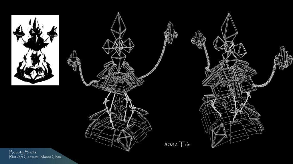
Quick Renders:
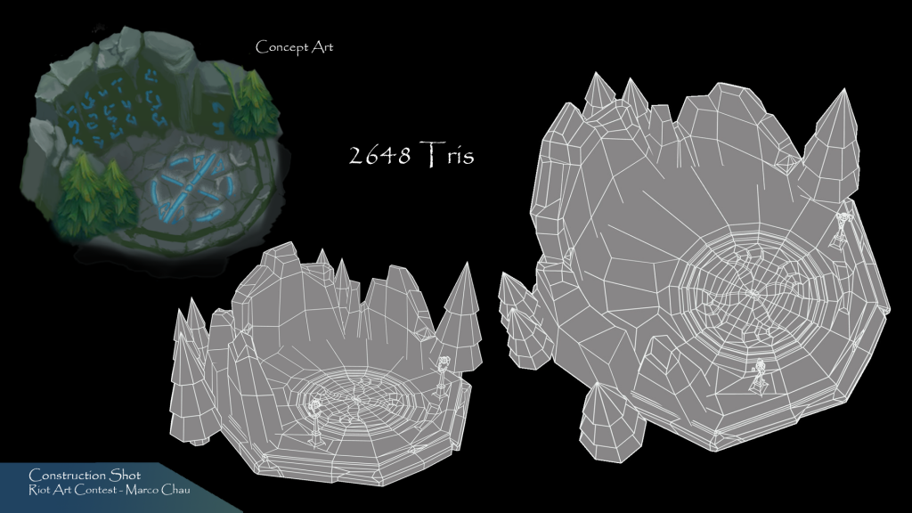
Overall I've tried to keep this lower poly and true to the illustration. I did end up adding in two small pillars near the front, not sure if they're a suitable scale though. Unfortunately with my busy schedule I won't be able to include too much more progress archiving since I have to move quickly on to texturing these both assets quickly then composite them in.
Wew that was very hectic, with 5 minutes to spare. Basically unwrapped and textured the tower in the last 5-6 hours. Still bumped into a wall couple times (lost progress on texture : <), I made a couple last minute changes like switching to an older floating pillar because my new one was way too high poly for no good reason. Would have loved to spend more time polishing the tower and creep den, but I got the gist of my concept out.
Major mistake I made was not getting the in-game screenshots earlier, as they provided key reference on colour, space and camera angle for the 3D composite. Anyway, it was great fun! Cheers to all other competitors.
UV layouts that were a little rushed : p