UE4 - Futuristic cathedral
Final update:
Video render:
[ame]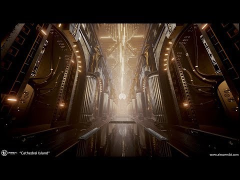 https://www.youtube.com/watch?v=ZJggkZlhass&feature=iv&src_vid=-LJ1LR6p7_s&annotation_id=annotation_4152564285[/ame]
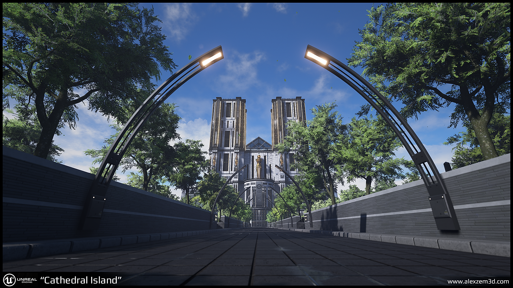
UE4 screenshots:

Interior

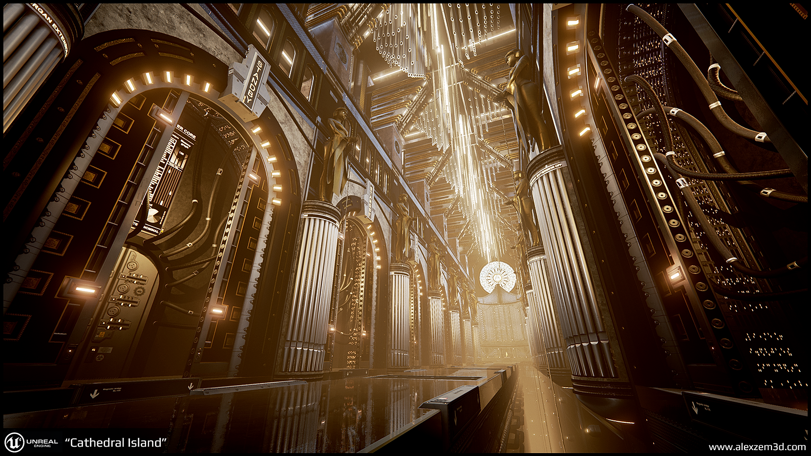
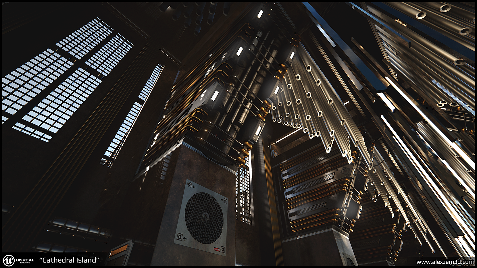
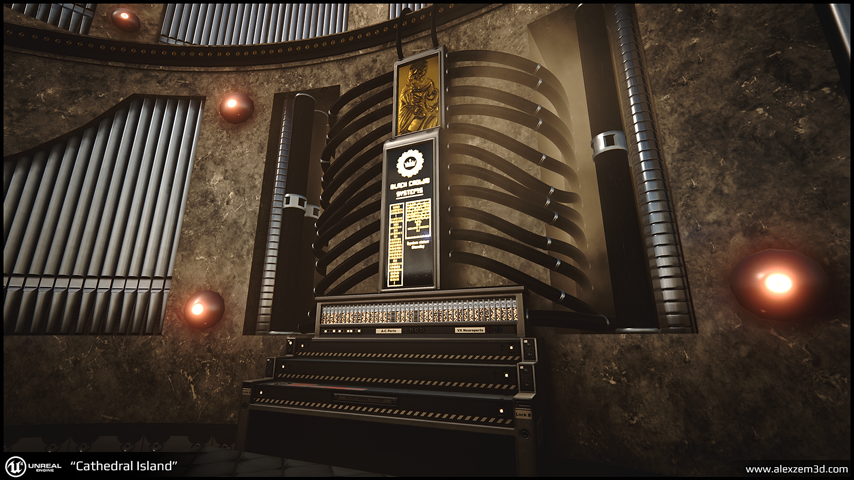
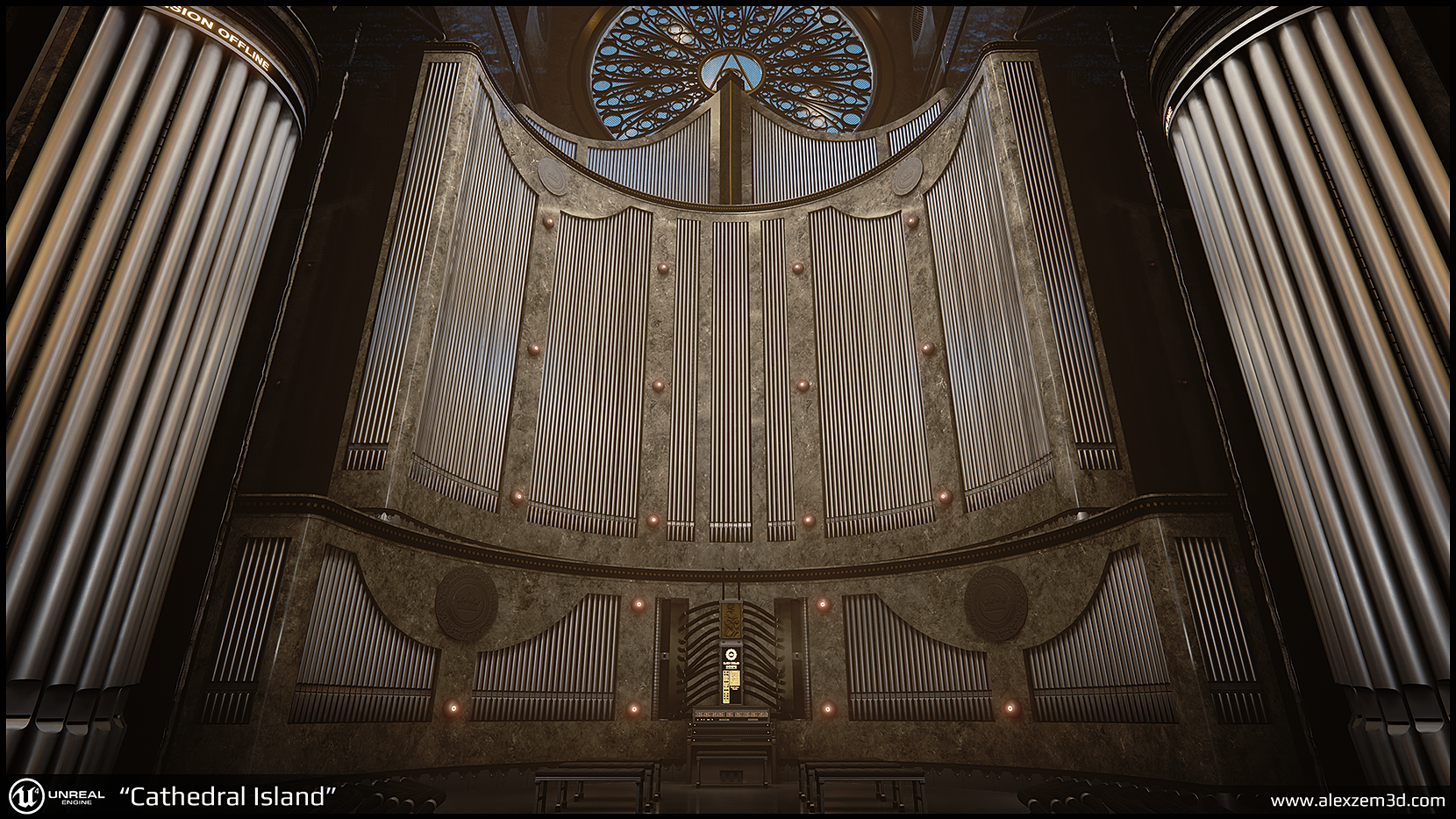
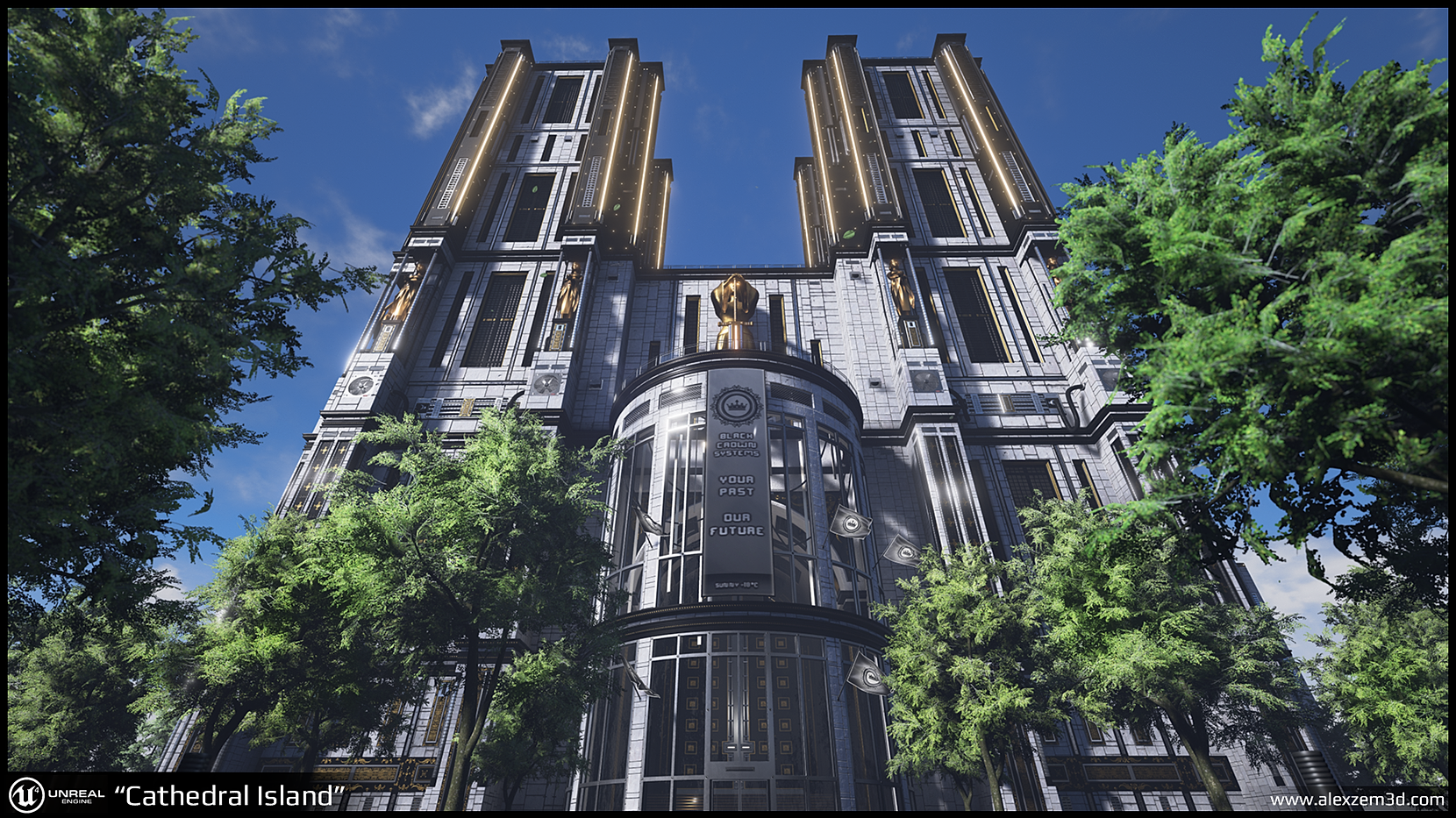
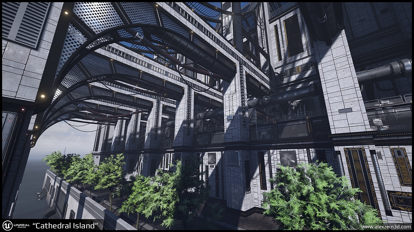
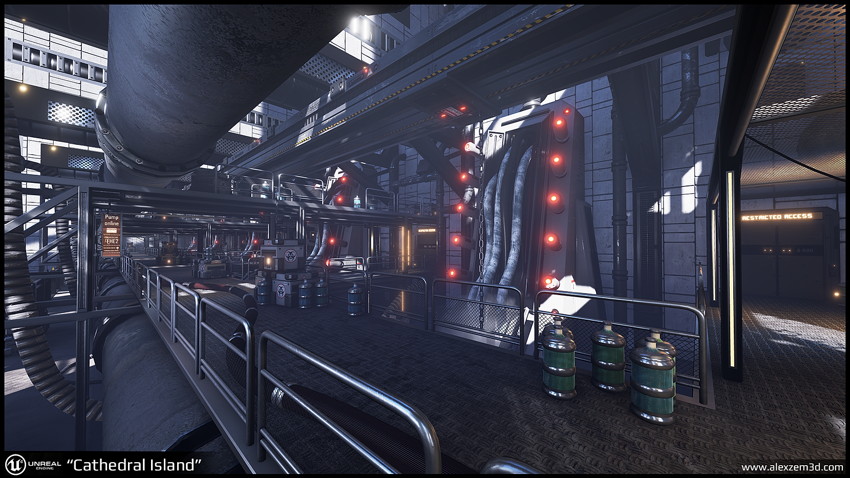
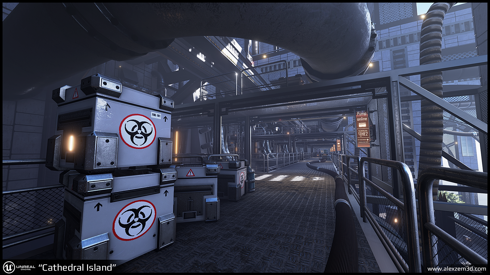
For current project I am essentially trying recreate a 12-15th century cathedral in a sci-fi setting. Geometry wise, the building should have an identical silhouette that is seen on structures such as Reims cathedral, yet the materials and props should look fairly modern. While building should look modern, it doesn't mean that it shouldn't utilise materials such as stone or concrete,however. There always should be a solid balance between organic,stone structures and "sci-fi/tech" related props.

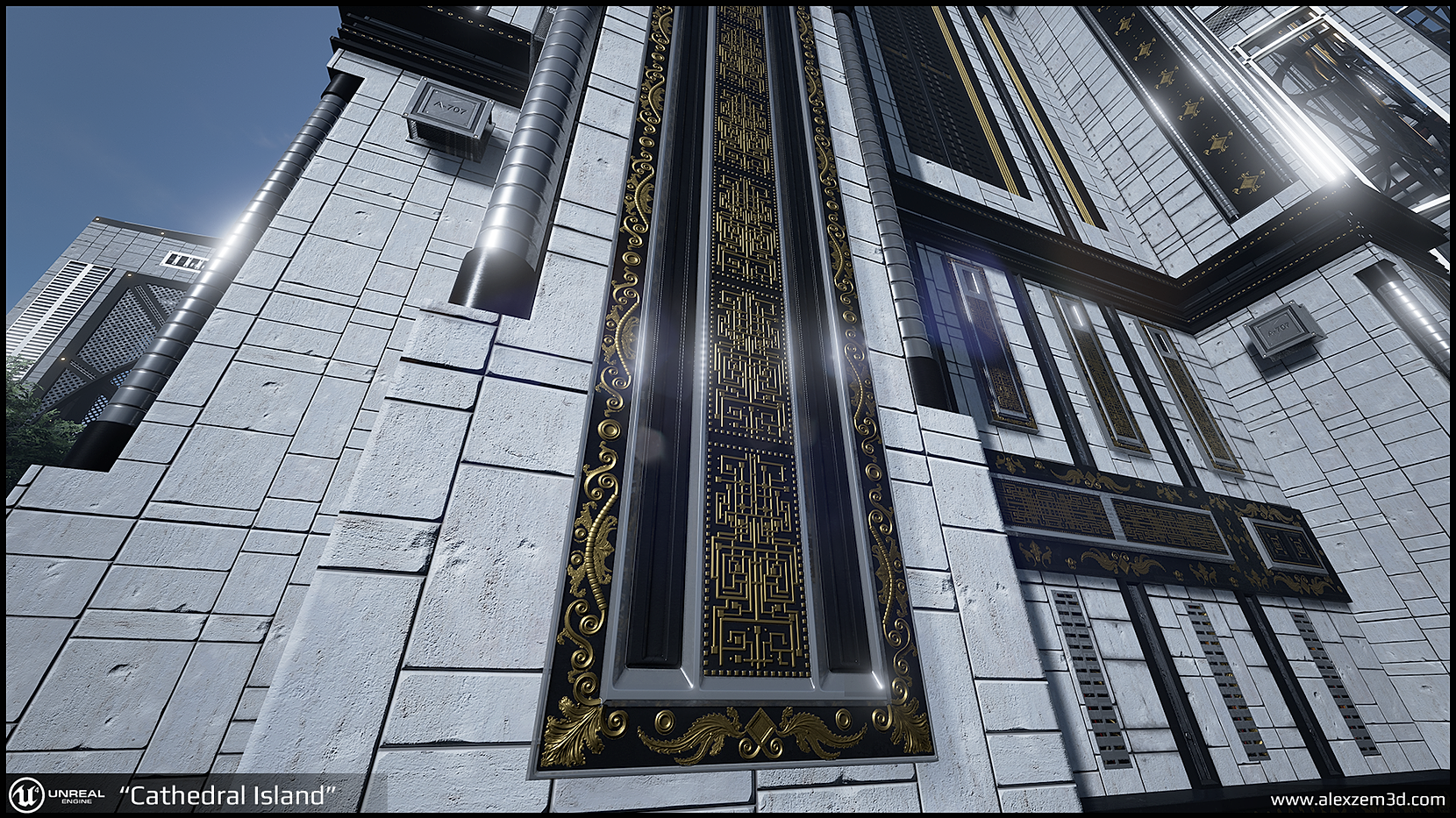
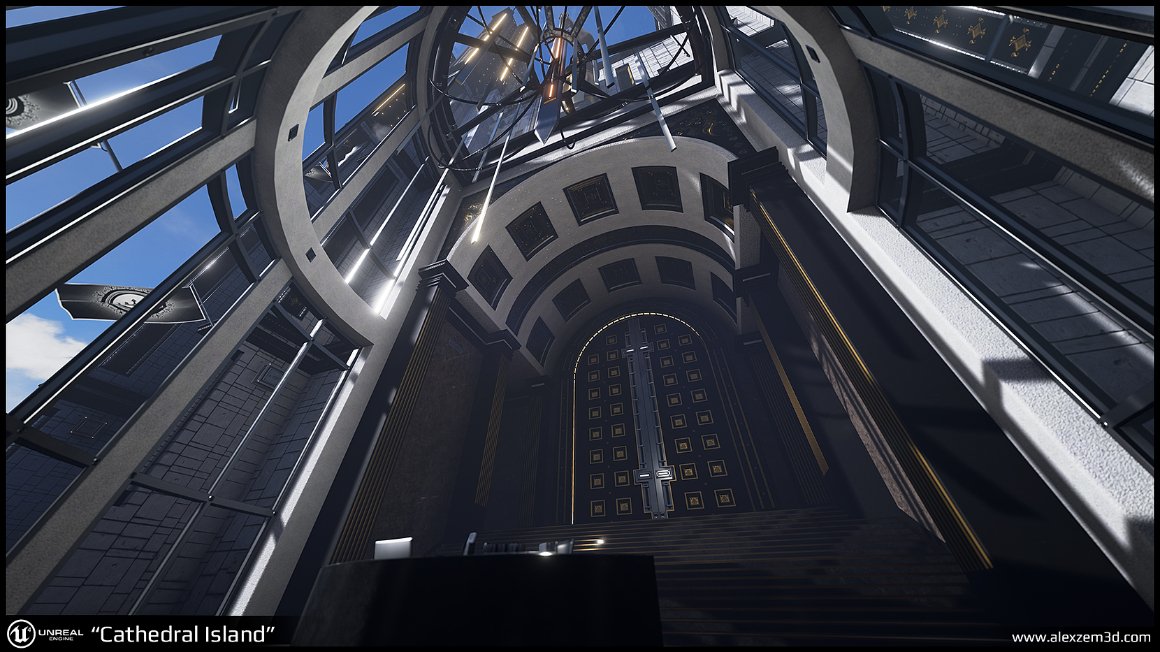
When it comes to intricate architectural details, I really want to try and cover an entire cathedral with golden floral and square shaped props to make it look a bit more rich.

Last but not least, for my game industry references I am primarily focusing on games like: Gears of war, Deus ex, Castlevania:LoS series. Also, last week I got extreeeemely inspired by latest trailers for Final Fantasy XV.
Video render:
[ame]
 https://www.youtube.com/watch?v=ZJggkZlhass&feature=iv&src_vid=-LJ1LR6p7_s&annotation_id=annotation_4152564285[/ame]
UE4 screenshots:


Interior


For current project I am essentially trying recreate a 12-15th century cathedral in a sci-fi setting. Geometry wise, the building should have an identical silhouette that is seen on structures such as Reims cathedral, yet the materials and props should look fairly modern. While building should look modern, it doesn't mean that it shouldn't utilise materials such as stone or concrete,however. There always should be a solid balance between organic,stone structures and "sci-fi/tech" related props.

When it comes to intricate architectural details, I really want to try and cover an entire cathedral with golden floral and square shaped props to make it look a bit more rich.

Last but not least, for my game industry references I am primarily focusing on games like: Gears of war, Deus ex, Castlevania:LoS series. Also, last week I got extreeeemely inspired by latest trailers for Final Fantasy XV.

Replies
If you're going for bright, gilded surfaces, then look at Eastern churches - especially Russian - rather than western ones. Western cathedrals tended to have rather drab surfaces with ornate stone work; the only color was typically on the windows.
Also, after taking a look at Russian churches, I can now definitely see what you mean. I can't unfortunately envision how the pillars and walls will look like with solid or drabbed paint, so this is something I'll have to test out in engine. My only worry is that if I go with a solid paint like this, won't I lose too much detail on flat surfaces of walls/pillars to the point where black and gold pieces become the focal point of an asset, putting everything else to shame?
Before trying out painted texture instead of stone/concrete one, I decided to mess around with colour grading of what I have at the moment first. While 20% still seems to be acceptable, everything else look "meh".
I will also try and redo the stone texture with something like that's seen here:
Thanks for feedback! :thumbup:
Finalhart - Will do my best!
I get the impression you know very little about were to go with your church at this point. start looking for a design in 3d and engine doesnt seem to be the best way.
you might create more concept in 2d first, getting overall and detailed forms clear. as well as colorpalette.
or lets put it that way: you dont design a cathedral from the first floor upwards
After I gathered all references I made a couple of simple 3d sketches inside 3ds max:
And eventually everything ended up me doing bsp blockout inside of UE4 to have a modular base to work on. All assets that were created so far do not match presented concepts at all, specifically because I had new ideas flowing at that point when I was doing modelling itself.
While I do have a strong vision of how the building should like on geometrical level at the moment, I do have to agree, color palette definitely needs to be sorted to progress anywhere at this point. I will try to get even more reference now, considering that yours and DWalker's feedback is leaning towards the same direction where the core of all problems is my selected material definition. Most likely will end up making some refined concept pieces to represent the final version of the "cathedral" as well. :thumbup:
As you've shown you did a model in Max at the start to thrown down some ideas, which is good for structure and silhouette but I would recommend taking that a step further and doing a few paint-overs or photo-bashing with it to work out the direction you want to take this piece in.
This should really help with your colour palette too, as DWalker posted, I'm not sure what yoy have colour-wise works. Whites and Blacks compliment gold well (for the exterior).
I'd be tempted to set this piece at night as well with some up-lights to really push through the materials and make the golds glimmer, but that's more of a personal choice than anything else.
Keep at it, it's an interesting piece (Y)
After going through all feedback, I decided to take a step back an reassess the situation and sort out the concept. Eventually, I ended up with a simplified version of a cathedral combined with industrial and sci-fi'ish elements. Some stuff looks a bit disconnected here and there, but it's all WIP
Can't wait to see what you do with the inside.
Apart from slightly redesigning the sides of the building and calibrating certain materials, I was primarily focusing on creating statues. From this point on I really want to focus on the front entrance as it lacks any sort of detail.
So I'm finally starting to wrap things up with this piece. Currently it needs a bit of tweaking here and there, as well as adding blueprints to the level so that player could navigate around the whole environment...or 70% of it at very least. The whole thing, depending on different locations, runs around 55-28 fps on GTX 680.
Any feedback is appreciated!
*Moved progress to the top of the page*
This should finally wrap things up with this project!
One thing I'd revisit is the long exterior shots in your vid where you do more than one camera move.
Excellent work