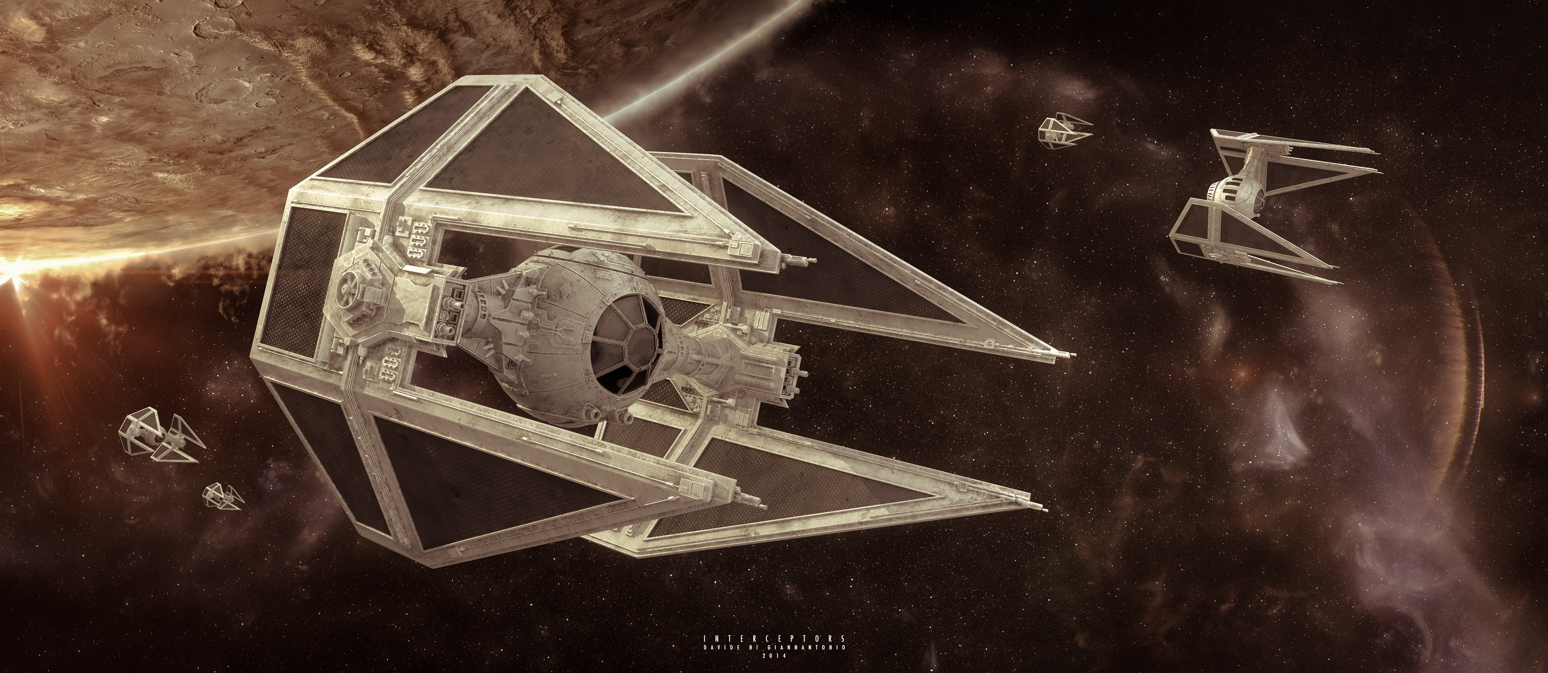
Tie Interceptors strike back!
This is a new version of a very old personal project, a Star Wars classic, a squadron of Imperial Tie Interceptors.
I revamped an old model in order to practice (and have some fun) with HDR painting and compositing. I've always been inspired by 2D science fiction illustrations and movies from the 70s, so I tried to convey a little bit of those ambiances in this image.
Modeling in Maya, it was the first attempt I did to an hard-surface model. Texturing using procedurals in 3dsMax, rendering with V-Ray, Painting and more compositing in Photoshop and a bunch of other software: Looks, HDREfex, AfterEffects for the flares. Final color grading in Lightroom.
Breakdown and more info on my website:
http://www.davidedigiannantonio.com/tieinterceptor.html
Comments and critiques are very welcome!


Replies
I love it.
Tie fighters are really fast, thats their thing, get some motion blur in there
maybe some engine trails. also the final angle/shot is not that dynamic.
EDIT: also checked your step by step on your webpage, I think the second to last step, before the color grading is probably your best shot.
"EDIT: also checked your step by step on your webpage, I think the second to last step, before the color grading is probably your best shot."
With the color grading I tried to "pull everything together", but maybe I killed too much colors.
Nice stuff though overall
Next project I'll focus on materials and photorealism of a little prop, so I should have the chance to show some progress on that points
The two things that I noticed immediately are that the Interceptors should have more of a gunmetal blue-gray color rather than white-gray. The only time we really see any white-gray TIE Fighters are in A New Hope and that was a compromise with the use of blue screen at the time. In both The Empire Strikes Back and Return of the Jedi, the TIES go to blue-gray. The second thing is that on the ILM models, the cockpit instrumentation is visible throughout the canopy window.
http://img1.wikia.nocookie.net/__cb20060705184051/starwars/images/6/65/Tieinter2.jpg
http://img2.wikia.nocookie.net/__cb20080321161631/starwars/images/2/23/TIEcockpit_btm.jpg