[Riot Art Contest] - Becoming Elise - Critique and Discussion encouraged!!
Hey everyone! I'm Jasper, I'm currently freelancing and looking to update my portfolio and eventually move in to a studio position. Working at Riot is a big goal of mine, they've had that illustrator position open for a while now and I'm gunnin for it! I thought this would be a great chance to get some League of Legends art into my portfolio. I love the characters and themes they have already so working with the IP is always a blast. I need your help though!
I see a lot of artists going the action packed, gameplay oriented, splash screen direction, but I'm going to try something a little different, at least for the contest. I feel like their artists are already top notch for that kind of thing, so I'm going to try and show a little more story in my piece(s). Something that might give the player a more emotional connection to the character, that they would feel for the champion and what they've lost, accomplished, etc.
I might try a couple of ideas, but the first one for now is Elise, and her transformation into the Spider Queen. I don't believe her current lore covers that, so I think that would be a fun topic jump into. The ideas I want to come through with this piece are conflicting emotions of fear and ecstasy. Fear as she watches what is happening to her, and ecstasy as she realizes how powerful she's becoming. In the moment, does she regret what's happening? Does she accept it?
With that said you guys know what I'm trying to accomplish, so critique and discussion are greatly appreciated! If any one would also like some feedback in their thread, feel free to drop a link to yours at the end of your post and I'll check it out!
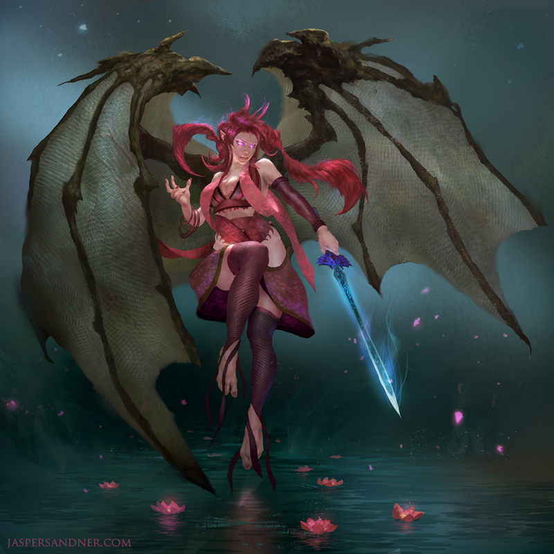
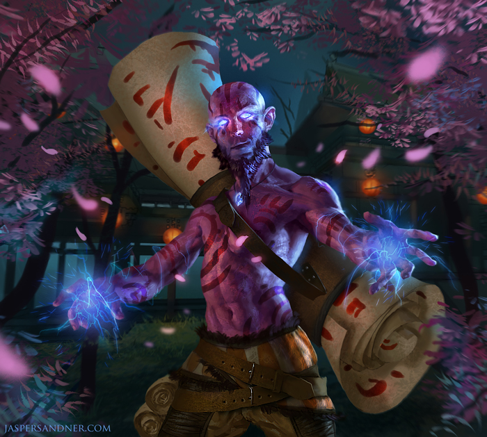
To start out, here are two previous pieces I had done for League of Legends contests, a couple years ago. I'm of course looking to top them! I'm not sure if I should keep the tight look of these pieces or go a more painterly route with the finish, but we'll see as we go!


Replies
Here is the final sketch. I don't like spending too much time with lines unless there are complex designs I need to solve, otherwise I feel more comfortable moving into values and paint as soon as possible.
Throw down some values, anatomy still needs some fine tuning, gotta solve them lower legs
Some color! Working on the rhythm/design of the magic consuming her body, loosely based on her current art. This is where I'm at currently, lots of work to do yet!
a few keywords for finding expression examples...posessed, fear, pain, orgasm(no for real haha).
also remember that the minimum width of the image is 3000 pixels according to the contest rules!
following!
eCupcakes - Thanks a lot for your feedback! I didn't show it in the other sketches, but the original idea I wanted was for her to be staring at her hand, as tiny spiders crawled along or, as I ended up drawing, the creepy spider magic covering her hand. Almost like someone looking at their bloodied hand and realizing what they've done. Does that make sense? I will still work more on the expression for sure though.
Marcsampson - Yep, thanks! Will hit them when I refine the hands, always tend to do those last
DefiledVisions - Thanks my man, missing those CA days you know?
shotgun_becky - Hey thank you! I appreciate it
Velsen - Thanks for the support!
As a friend mentioned, the Illustrator job description is definitely pushing for splash screens, so after this one I will do a more splash screen styled piece.
As far as this one goes, I went back in the refine the main torso anatomy to have a stronger base to work on, and started painting in some of the textures. Also sketching in spider values, but I'm not sure exactly how I want to go about rendering it, in terms of value relationships with the figure and background. Any ideas? Thanks guys!
Here's a quick paintover
I think the hands are too small as well.. I'll see if I can do a paintover during the weekend. As for the lighting, I'm really liking the spotlight you've got going. I think you can play around with the silhouette a lot and dark against light/light against dark.
Looking forward for more!