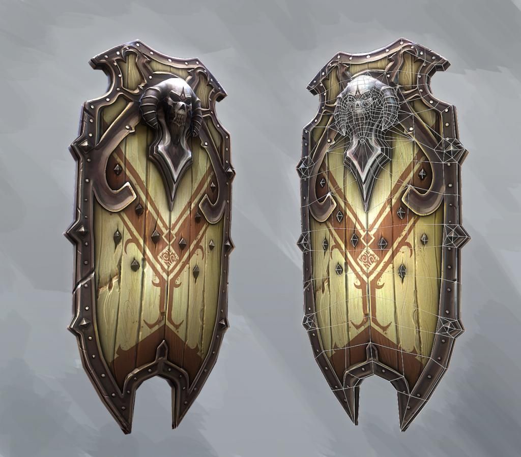
Hand-painted shield
Hi PC,
I'm working on this shield concepted by Artyom Vlaskin, to try practice hand painted maps.
I do mix it up a little, though, so I did toss in my normal map as well.
If I want to go pure diffuse, I can just bake that lighting info down, I guess.
I had a huge load of trouble painting the metal. How do you guys usually handle that?


Replies
On the skull it's from above and then on the metal bits next to it, it's from below?
Looks awesome though!
Those pieces are supposed to be indendted, so they have a raised border, but low in the middle, which means the light should come from there.
But, I understand perfectly how you see it. Any idea how I can make it more clear in the texture?
I'll do a rough paint over.
This is how I think it should be based on the lighting:
And this is what I think you want?
If the second one is the one you want I think the reason it's not working for you is because of the edge in red:
Paint over:
Sorry for the rubbish paint over... I'm in a bit of a hurry.
No shit? That's some good stuff right there. Grate color choices. MORE EYE NOMS.
I see exactly what you mean now. The reason I dont have a border there, is because they are supposed to both be indented in profile, like this.
EDIT: How did you make your dropbox pic shareable? EDIT2: Ah, you skipped dropbox.
But, if that doesnt read clearly, I must clean it up somehow. Though it lookst much better the way you have drawn
So I think I will try to make this work so I can learn from it, otherwise I will be flipping it like you drew, as it honestly looks much better.
Again, thanks a lot for taking time to do this
Haha, hello Patrick? Thank you! That is probably the best compliment I have gotten on these forums, even though you seem drunk xD
What are your opinions?
And the one on the right looks better!
Nothing wrong with changing the original concept if you think it's an improvement.
Thanks for feedback, AlphaMix
Appreciate your comments, both of you